Earth Tribe: My Logo Design!
Hello Steemians, how you doing?
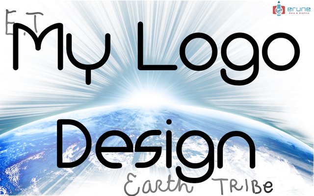
I hope you are very well, I come today with my proposal for the contest @EarthTribe, who want to give a new and more appropriate air to your logo, all this trying to give a touch that comes well with your image and with your idea, so thinking about this, I present now what has been my proposal for the change of image that I hope oles serve a lot and be the right one, here we go then!

The Sketching Process
My idea was to create a logo that would be impressive, but at the same time it would work all together, to make an image contained with a clear and direct message that would be able to impact and define what the group is.
For this I made a series of sketches, based on the idea that both "earth" and "tribe" are words of 5 letters, and that gave me the idea that I could join them in a circular way, which would resemble the idea of a certain planet that we all know.
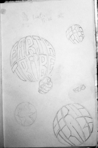
I had the initial idea of adding an element of hands to integrate a little more the group idea, but then I thought it was not necessary, nor would it give an adequate visualization of the element I had already created, so I decided to eradicate that idea and leave it alone with the letters.
The Digital Process
I then went to the part of the digitized, in which I wanted to use circular elements in its vast majority to create the letters in the most organized and symmetric way possible, here is the process:
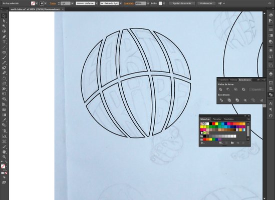
I made a circle that I then cut into the areas I needed to create what would be the letters, all this following the direction of the sphere and the perspective of the form in general.
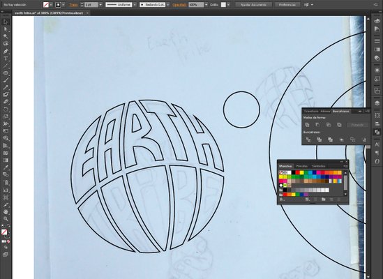
I continued using the circular shapes, splicing them and cutting them between them until forming what came to be the upper letters, being the R one of the ones that gave me the most problems, but that in the end I was able to solve the way they see in the image.
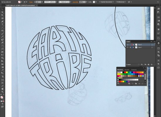
The finished lower part gave us as a result this cool logo to which we would only add the remaining identity elements and the different effects
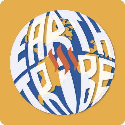
The Final Product
Once the creative process and construction of the brand was finished, I defined the parameters to realize what would be the effects and the concept of the logo as such, and in the general idea, there had to be two key elements to define the logo: the planet Earth with its continents and the logo of Steemit.
I decided then to do 2 different tests which I will explain below:
1st Final Art
As you can see, I used the typical colors of the planet for this representation, adding lighting effects and shadow to give a more realistic effect to the letters and the overall shape of the planet, and I added the steemit logo indicating one of the directions of the group as such, which is to create a community within this great platform.
The letters have a white outline that gives them more visibility at various scales, however the logo has certain limits of use more than anything for its colors. The same was a proposal that I liked very much.

Now I will show you the banner:
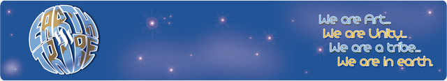
And the paragraph separator:

2nd Final Art
The idea is basically the same as the previous case, only this time I decided to make a change of colors that in my opinion favors a little more the visual effect of the logo and its elements, and highlights them better on different scales, especially in small , since you perceive yourself a little better in the separators, for example, usually you judge on your own.
the use of complementary colors gives a feeling of strength a little larger than in the previous case, and although both proposals I like a lot, I think this has a slightly greater strength to be used. The decision is yours!
Now I will show you the banner:

And the paragraph separator:

I hope my proposals have been to your liking, and that regardless of the result, I thank you for taking the time to come by and appreciate this process, thank you very much and I look forward to seeing your final announcements!
Many greetings and I hope this is the beginning of a great society!
| Category | #GraphicDesign #Art #creativity |
|---|---|
| Tools | SketchBook, Pc |
| Edition | Adobe Illustrator Cs6, Adobe Photoshop Cs6 |
| Located | Caracas - Venezuela |


I love the divder! Great work!
thank you very much!
Congratulations @erune! You have completed the following achievement on the Steem blockchain and have been rewarded with new badge(s) :
Click on the badge to view your Board of Honor.
If you no longer want to receive notifications, reply to this comment with the word
STOPDo not miss the last post from @steemitboard:
Excelente diseño amigo, y muy creativo también. Suerte con tu proyecto te mando un saludo.
muchas gracias brother, saludos igualmente!
Looking good buddy, fantastic concept.
thank you pal! that was the idea! crossing fingers!
I like it a lot, I think you should mess with colors some more... heart chakra green somewhere?