Steemit Exclusive : A Graphic Design Class! Lesson 2 - Logos
Hello again!
Welcome to the second lesson of my Graphic Design School!
Previous lesson was about an overview of the field, and I recommend checking it out before you start with the second lesson!
Anyways, let's get to it!
Lesson #2
Logos and their meaning
So what is a logo?
Simply said, logo is a medium that defines an organisation. Logo is a medium that separates you from the others.
What should a good logo look like?
It should be simple. Quick to understand. Deliver a quick message.
Complicated logos are not essentially bad, but they often fail at their purpose. To deliver a quick message.
So, let's make this more understandable, and let me show you some of the best examples!
![]()
Take a good look on this one. That is a very smart use of a logo.
Skarsgard is a name of the owner, thus the S, and the general shape of the logo is to symbolize a nail, used in construction. Also notice how thick the S is, to represent the strength and reliability of the company. What more do you need?
![]()
What about this one? This is one of the most famous examples of a good logo.
The FedEx logo is a perfect example of using a negative space.
Have you noticed that arrow there? Between the letters E and x? Pretty cool right? Once you see it, it cannot be unseen. You also get a little rewarding moment for figuring it out. That's what a creative logo should aim for.
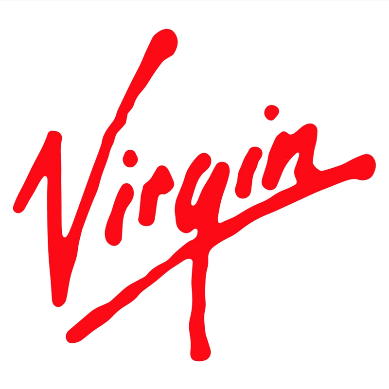
This is a logo of Virgin Records, created in the late 70's when Virgin was a small company.
It is done as a wordmark, and the energy of the writing and the angle of it, represents the company vibe very well.
So, when do you use a logo, and when a wordmark?
Generally, if you are a small company, you should go for a wordmark, rather than logo.
That is because it takes a lot of advertising and marketing to have enough power to just represent your company with this :
![]()
or this
![]()
These two are huge companies, that don't need to use words anymore. A viewer looks, a viewer instantly knows.
Logos are also known as having more emotional impact on the viewer. Let's look on an example.
Which of the two has a bigger impact on you?
This :
.png)
or this?
![]()
And that's about it!
Always remember, Logo = simple, creative, with a message. Quick message.
Thank you for your attention and see you at next lesson, this time about packaging!
If you want to keep up, follow me @deus
Have a great day!
Interesting post. It would be interesting to read about how you come up with a simple, creative logo with a message :)
Thank you! That's a great idea, I will think about it :)
This wll be very intresting for my soon , thank you for posting )
Thank you @patelincho !
Another lesson is coming today!:)
Hi! Have you heard about @krwhale? It is similiar with @randowhale. For your information please click on.