Concept Art Under The Hood - Digital Painting Break Down - The Village
Hello fellow digital art enthusiasts!
My name is Francis, I am a Concept Designer from Germany, who has worked on projects form game development over movies to product design and illustration. Today I wanted to try something new for me on this awesome new platform and share the creation process of a piece I did for commission last year. Hopefully this gives folks some ideas, inspiration (laughing points? ;) ), at least I know I enjoy these kinds of breakdowns.

Click here for higher resolution!
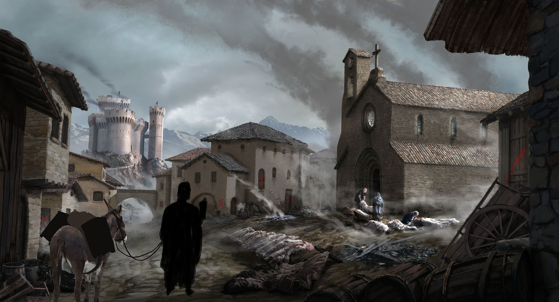
The artwork in question is part of a historical setting, placed in medieval Northern Italy during the time of the bubonic plague, the so called ‘Black Death’. The task at hand was to create a small market village, overlooked and governed by a nobleman’s castle, in which the ominous Black Death wreaks havoc among the desperate population.To this village comes a traveling physician and his arrival at dawn in the central square should be captured with a concept painting.
So far so good. Of course at this point, the mind of every halfway creative person already buzzes with ideas and possibilities, and while I habitually take notes of all interesting ideas, that keep bubbling up, I always start with the necessary due diligence to be exercised, especially with historic projects, specific real world settings or such projects, that deal with a fictional, but complex world:
1.Research! - Put the brakes on for a moment.
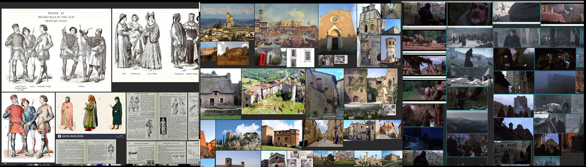
Truly the best thing since sliced bread for this are Google, Wikipedia and the likes. At least to start with. Although it is sometimes hard to chew through some LONG pages of textual facts, and daunting to get a grip on complex topics, it is not negotiable if you have to be accurate on historic facts.I just dig in at promising search results and continue from there, follow key words that pop up, branching off into media searches along the way. That usually includes ebooks, documentaries, sometimes movies and podcasts, and of course lots and lots of images.It is most important though to get the knowledge base right first, because the devil is in the details as always and if you want to avoid mistakes, the flashiest and seemingly obvious image search results are NOT what you need.In this case for example the obvious pitfall was the ‘plague doctor mask’ something that you tend to have in your head instantly, as soon as you hear ‘plague’. Unfortunately, these masks only came up at a later point in history, than the time specified by the client, so if I would have gone after this without proper research, it could have ended in trouble and in the worst case with a poor reputation, which you surely do not want to have ;). When the factual corner stones are established, THEN I head full throttle into the details, i.e. architecture (important for the village and the castle), geography, fashion, every-day life facts of the time, level of technology, customs and social details etc. Of course this can be a quite time consuming process and you have to assess if it is relevant for a project, but in general the more you know about the area in which you are designing, the better!As soon as I am satisfied with the research I tend to compile links to relevant textual facts in my browser and gathered imagery in a reference collection app. I use PureRef these days, because it is fast, free and very powerful. My project reference board would look something like this, with the picture ‘islands’ being the rough categories (from top left to bottom right) architecture, castles, equipment, fashion, fashion historic, landscape and movie screenshots.

Click here for higher resolution!
Of course you can move, scale, rotate, clip, auto group the images etc., put as many as you want on one board and save these collections for further ease of use. If you don’t know it, check out PureRef (www.pureref.com), I find it to be a really great tool.

Click here for higher resolution!
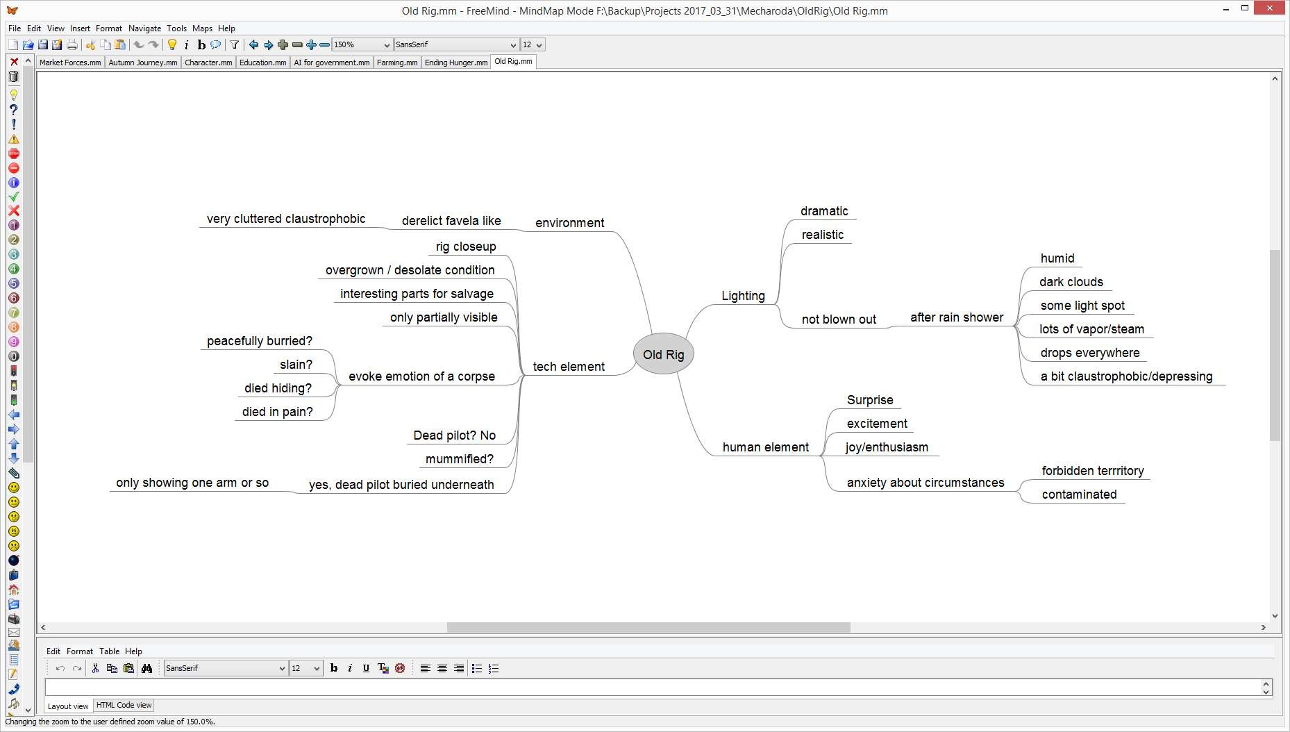
2. Mind Mapping! - Gather the inspiration
When I got my facts right and the correct inspirational material at hand I proceed to structure what I want to show. I bring the loose notes, which I mentioned above, into a mind map, together with everything else I can brainstorm up on the task at hand.It does not matter, if you do this digitally or on a piece of paper, but since my paper mind maps tend to get really messy really fast, I prefer to use another freeware tool for this: Free Mind (http://freemind.sourceforge.net/wiki/index.php/Main_Page). Nothing fancy again, but useful to keep things orderly and also a bit more condensed and with more relational order than pure bullet point lists ;). The following is not an image related to the actual project, but you get the idea about Free Mind

Click here for higher resolution!
Most of the time I have multiple mind maps for a project. For this one it was one with general facts about the setting and one with the specific notes for the environment painting. The latter one contained notes about the mood, the visible elements, possible arrangement comments and alternatives etc. Basically the necessary elements of the painting in words.
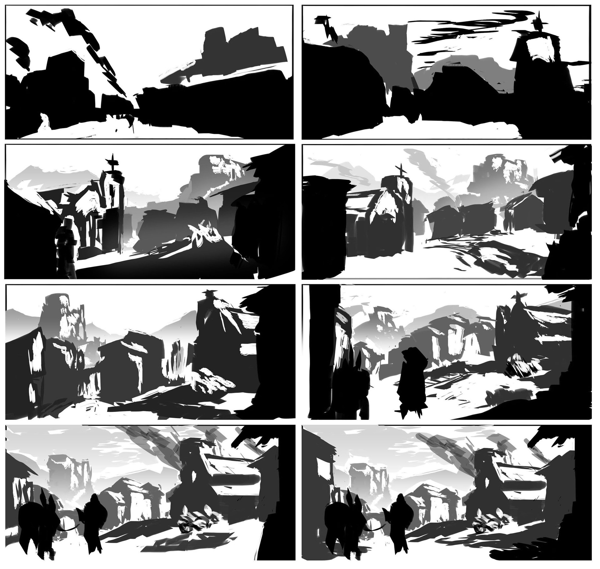
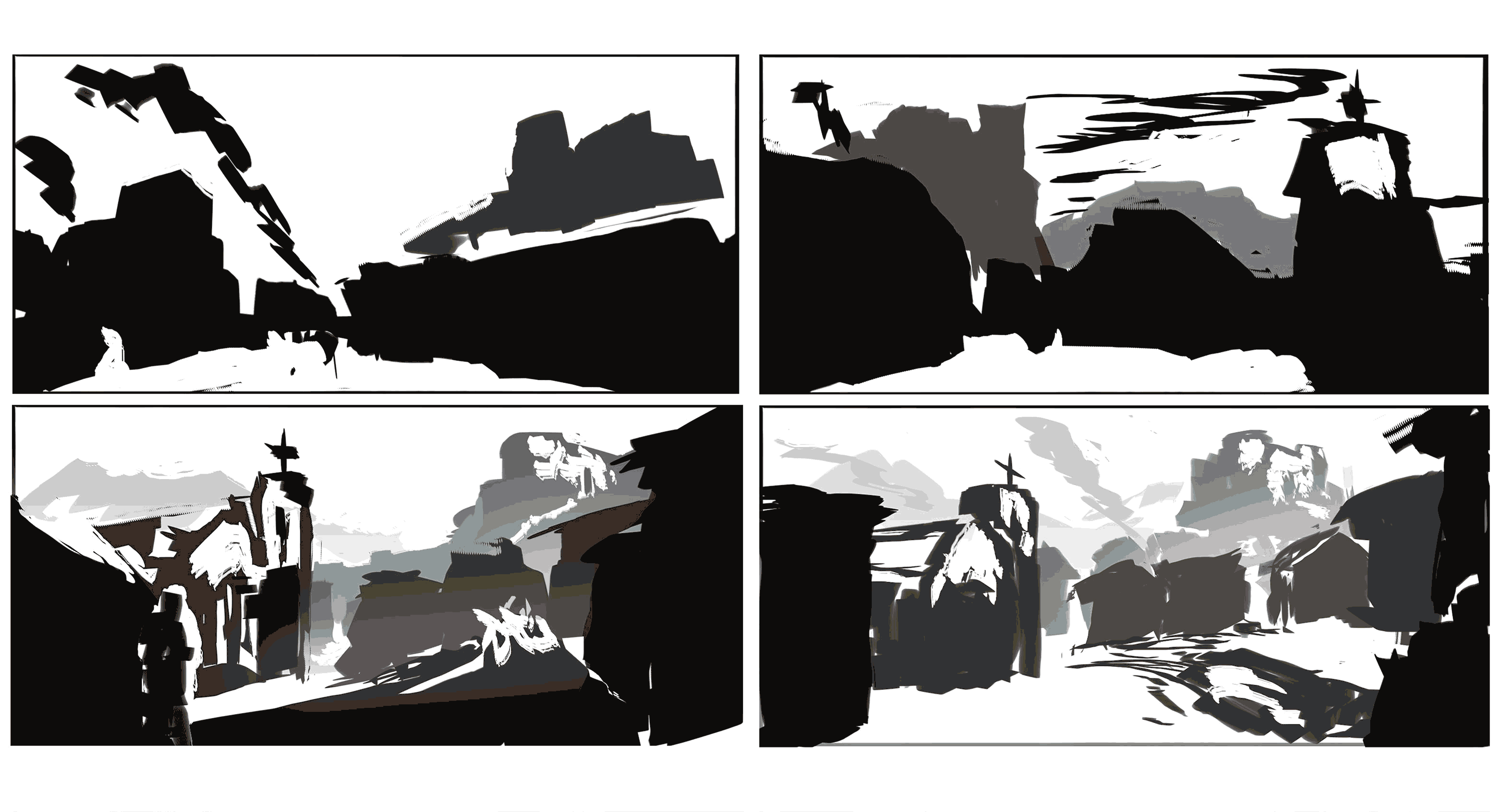
3. Composition Sketches! - Laying the foundation

Click here for higher resolution!
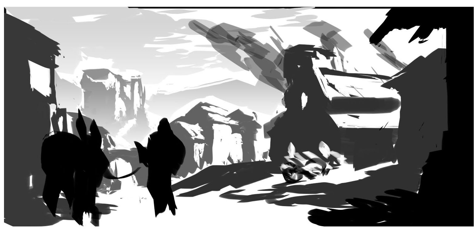
Now that I have facts and a theoretical plan, it’s time for some sketches! I try to nail the composition first and eventual details (like singled out characters, props etc.) later, so I can make sure they fit into the composition first.This of course depends again on the specific task and since mine was the arrival shot of the doctor in the village, I set out to find a composition for that. If I can, I do these sketches in Photoshop just because of the invaluable versatility and time saving potential of traceless erasing, transformation, layering and value manipulation. Don’t get me wrong, I deeply admire every skilled and focussed traditional artist and also like to use my sketchbook when I am waiting or traveling on the train etc.(in fact I did analogue sketches for this painting as well), but the power of digital is just such a time saver…The sketches in question are just flat greyscale shapes with very graphical light and shadow indication and rudimentary shading, but they fulfill their purpose. If you can communicate the important parts of the painting (Points of interest, depth relationships and size proportions), the same composition should also work in the finished painting.At this point one already starts to profit greatly from the previous research for now you can keep an eye on shapes and proportions of the architecture of the target period and region to stay in the acceptable boundaries.I adhered to the common principles of the ‘Rule of Thirds’, ‘Foreground, Middle ground, Background’, and ‘Large, Medium, Small’, etc. with this piece and arrived at the bottom right at a promising setup for the next step.

Click here for higher resolution!
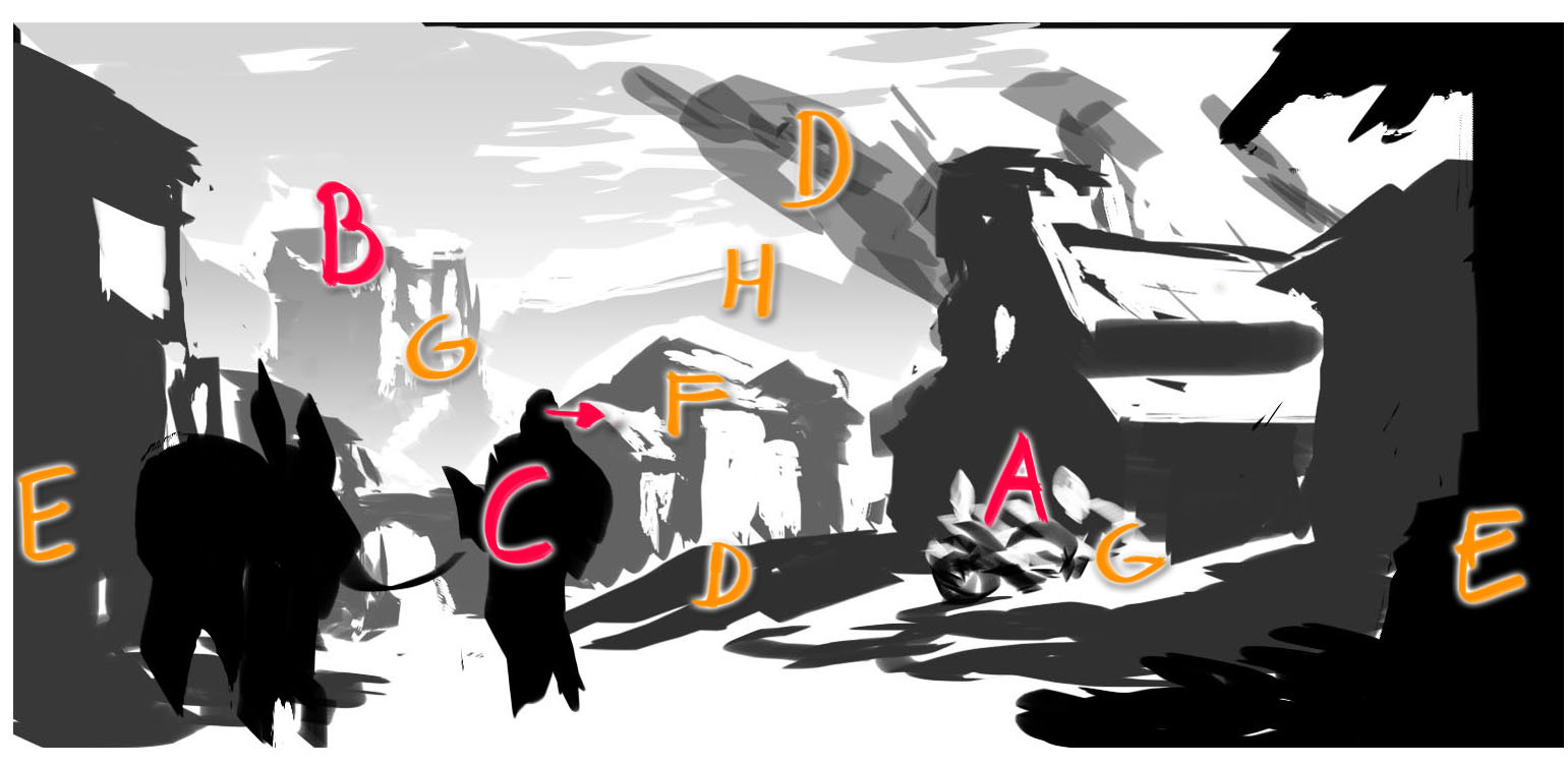
The compositional elements in this sketch are:A Villagers fighting the plague. This is the major focus point of the image, since it sets the tone for the whole setting. The villagers are set against the looming silhouette of the church, which creates a nice dark backdrop for the bright shrouds of the plague victims in the morning sun and also is a good metaphorical element for the grim and oppressive authority of the catholic church in medieval times.B The castle as second focus point, a bit removed from the despair in the village but still close enough to signify the nobility’s firm grasp to power. With the eye of the beholder coming in from the top left, moving to the bottom right, it is a natural movement form secondary to primary focus point.C The doctor. Since the project would call for a separate detailed concept for this character, I decided to make him not too dominant in the image and place him and his pack mule, as a kind of tertiary focus point, more in the foreground / near mid ground. His gaze direction also leads the eye of the viewer towards the main focus point A.
- D Smoke and Hill
- E Foreground buildings
- F Background buildings
- G Lighting
- H Mountains

Click here for higher resolution!
Side note: At this point I also did a drawing of the fictitious village with the nearest surroundings to get a better understanding and visual grasp on the spatial correlation. This was not utterly crucial for this piece, but was a good exercise anyway:

Click for higher resolution!
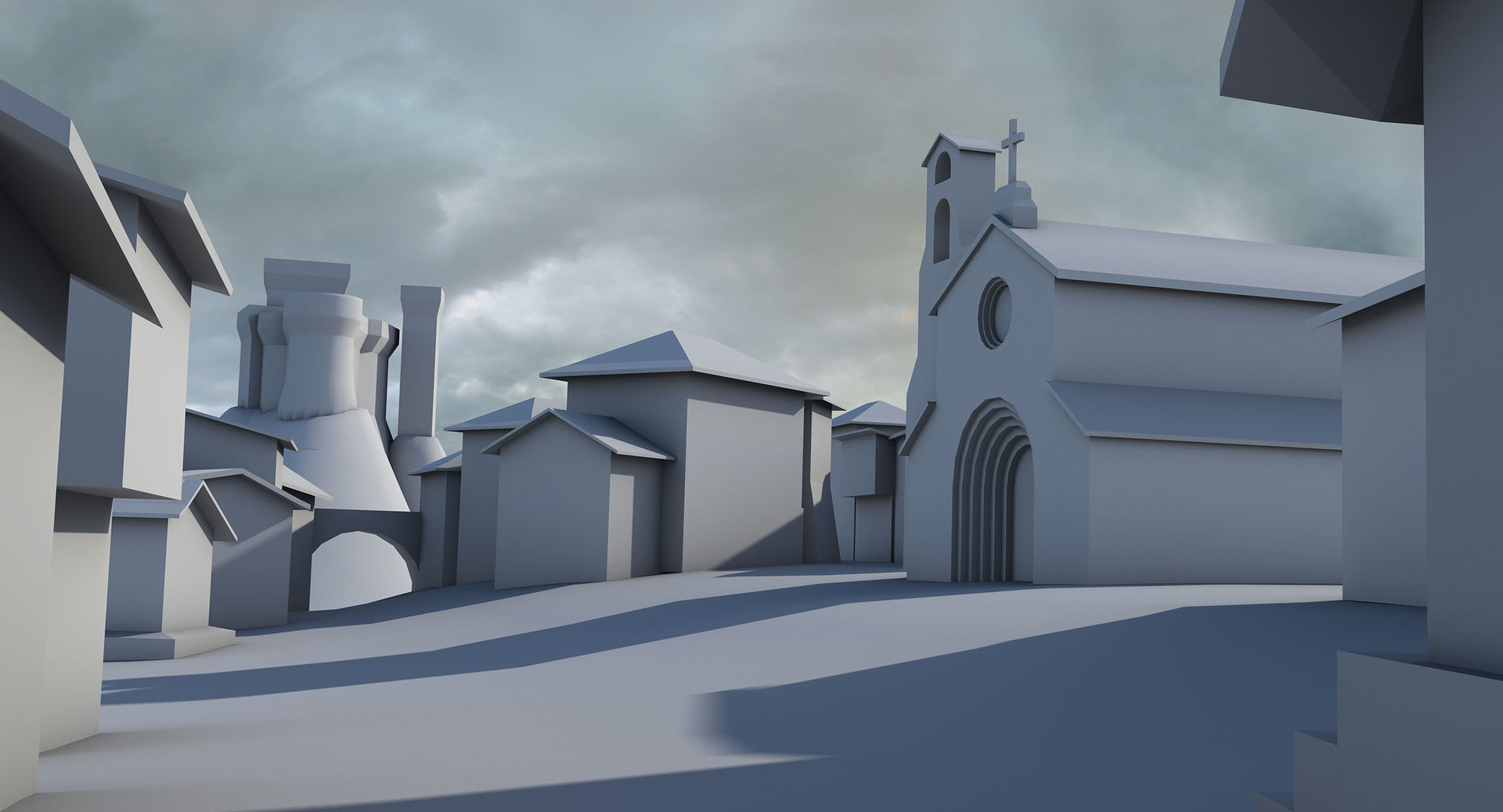
4. Basic 3D! - Will it Blend(er)?
Village01_WIP01.jpg

Click here for higher resolution!
The next step is of course mostly a matter of personal preference. If you don’t know 3D or you don’t like it, then you can surely dive straight into painting at this point, especially since the scene at hand is not too outlandish crazy, but doing a 3D block-out first has it’s advantages:
- You have the perspective correct and all objects in it.
- You have sizes and proportions correct over distances.
- You can test lighting setups and determine basic values
- You can easily check different camera angles, tweak the arrangement of objects and therefore the composition as a whole
- You can use flat color coded render passes - which are, depending on the program you are using, called something like object/material id pass or clown pass etc. - for easy selections in Photoshop - at least in the beginning
- If you want to / need to take the subject matter further, you probably have already basic assets for more pieces
- If you work in a team i.e. for game development etc. you could refine and hand off the assets to modellers etc. for detailed modelling.
Furthermore it is a pretty common requirement these days in concept art, to know your way around 3D to utilize already created assets or feed the modeling pipeline with starter assets as mentioned above.To get back on the task at hand: For the village block-out I used Blender. This is - like any tool choice - a personal decision and you can do the same in 3D Studio Max, Maya, Modo etc.Given the level of sophistication, at which Blender has arrived these days though, I tend to prefer this program. Not only because it is freeware (www.blender.org/download), but also feature wise it is pretty much on level with the big (expensive) dogs and in addition has a very lively community, so a mother load of online resources ranging from YouTube videos, over add-ons, to forums and discussion boards.
# 5. Initial Texturing! - Get to cover!

Click here for higher resolution!
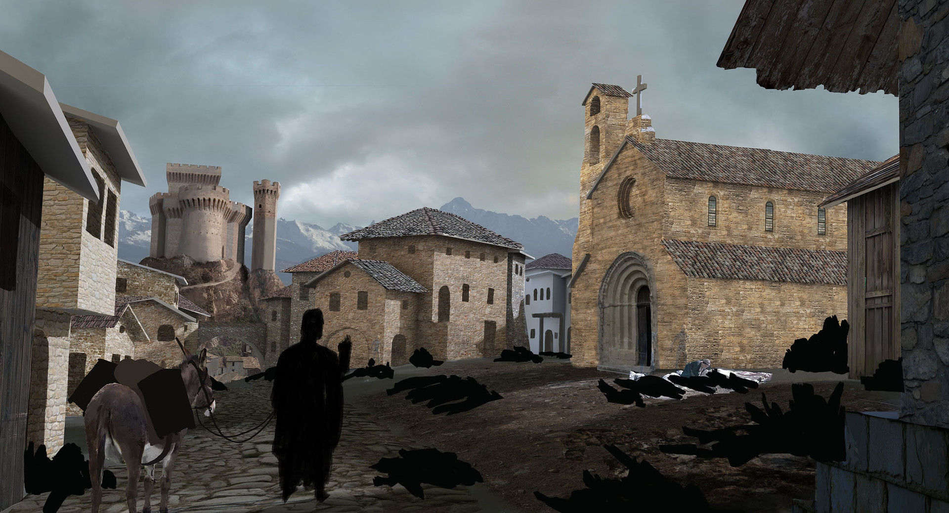
After creating the basic render in blender, I roughly blocked in additional shapes in Photoshop (the doctor and his mule in the foreground, basic enhancements to the buildings, as well as the corpses and villagers). Then I started the texturing pass.This includes the sky and mountains in the background, as some additional far details of the village through the arch on the left. Besides that most buildings were covered in some nice texture for the kind of masonry and roof tiles which are typical for the region. Also the ground gained a cover of cobble stones for the town‘s road and more stony packed dirt for the rest of the square. The textures are set to different blending modes (mostly soft light or overlay, sometimes even normal with adjusted opacity) and edited with the several great adjustment tools of Photoshop. I want to get the textures’ values, color and contrast as fitting as possible for the chosen lighting scenario, mostly determined in outdoor scenes by the sky and the far background.I also like to keep a copy of the arranged textures, so I could whip them out again later, should I get the feeling, that I need to recreate the texture or structure due to too much over painting etc. Besides these copies though, I usually merge down the textures and adjustments once I’m roughly happy, so I can paint more straightforward on the layers. ‘Merging’ down for me means, that I keep a normal mode layer for each compositional element (the foreground houses, the doctor, the corpses, the church etc.), rather than merging all layers down to just one canvas. While you surely can do that and keep the parts accessible with invisible mask layers, I prefer to have the actually separated subject layers, because the layer order structures the image already and also each layer can be used as it’s own mask, so you don't have to keep mask layers up to date if the painting process changes the silhouette of an object.Painting is what I comes next to do next, to iron out small inconsistencies, cracks, mismatches or missing parts etc. between the textures. An example for this is the castle, where I had to paint-fix a couple of issues with the texture to avoid hour long fiddling with wall photographs.As always with texturing it is a balancing task between spending too much time and too little.You could obsess too much about covering every visible surface with the right texture for the right material or wing it and paint more of the details yourself.As well as finding the right contrast and tone, this boils down to experience and also to taking a good look at your target style level. If your goal is realism, you might end up with more texture and photo manipulation in a matte painting style, or if you aim more for a painterly result you can play a little more loosely with the textures, merely taking some hints of color or noise from it and rely more on your painting skills to get the details in.In this case I wanted a more painterly look and I ended up painting over most of the canvas at one point or another.
6. Painting Image Elements! - Dressing the set further

Click here for higher resolution!
Now I brought in additional elements for the image, like the copses on the ground, scattered rubble, the smoke, the smoldering heaps of burnt stuff and the remaining villagers (deliberately few to make the scene seem more disturbingly deserted).For some of these I used photos or screenshots from movies to start painting and save some time, but unless you already happen to have the fitting images (which was the case here) it is rarely a time saver because you end up looking for the images too long. Also one can always use the practice in drawing/painting things by yourself ;). This only requires some references, which are usually found faster, since you don’t need to look for correct angles, lighting and resolution.
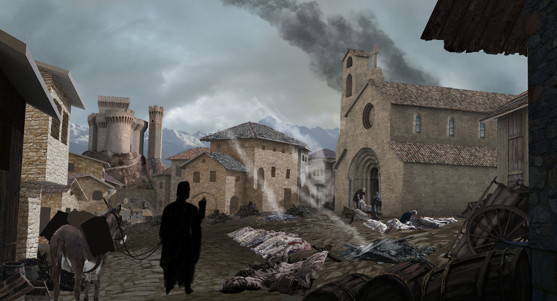
7. Integration! - The big one

Click here for higher resolution!
The next step is probably the most important one. After shoveling in all this rough detail and information, now is the time to really hammer out your painting’s structure. This means adjusting values (by painting and/or simple manipulation of existing image parts) to generate light and shadow areas, paint out areas of too much detail and also of course, painting in details, that are still missing at this point. As you can see in the image above, I tried to arrange light and shadow values so the most contrast would fall on the central points of the image, namely the castle and the villagers. (Oh yes at this point probably the doctor would have been good, too, but it seems I took the work-in-progress image a little too soon ;) )I also put in the lots and lots of smoke in the area from all the things that were burnt in the village to battle the spreading of the infections. In this case these smoke columns and their angle in the wind also provided a good help in guiding the eye on the image from the top left to the bottom right.You can also see, if you zoom in, that I ended up painting over many areas of previous photo detail, since they ended up looking just too non-painterly in some places. It is always good in this business to not get too attached to some work you have put in already, if it turns out later to not work so well. After all if you are working on a client’s directions, it can always happen, that some things you have done don’t pass the muster and you have to redo.
8. Final Details and Finishing Touches! - Pixel Massaging, Filters and Stepping Back
Click here for higher resolution!
Finally the doctor joined the scene for good :)! Also as you can see, still a lot of adjustments were made to boost the lighting to what I wanted it to be, namely a little more warm in the sun, but not too bright and cheery. The smoke got a little warm light touch higher up, and the overall light was boosted to get that slightly glary look on bright things in the morning sun, especially looking out of the shadow into the light.Some of the previously painted out textures also had a little comeback i.e. on the house in the center. The reason for that being that this house was kind of the main reference point for the common folk architecture in the image (besides the castle and the church as references for the upper crust architecture) and the attempt to purely paint the structure were not as nice as the second, re-textured and painted over attempt you see in the final image.Again, as frustrating as it may be sometimes to redo things, if you do it with the right attitude, then you feel good doing it: Everything in the image serves the purpose of you telling a story or conveying an idea or solving some kind of visualization problem. If along the way you see, that parts of what you did are not up to the task, then fix them! Nothing worse than spending so much time in a piece of concept art and getting the feedback by your client later on, that you did not hit the target, because you were to protective of your work.For me these small reworks also give provide the opportunity to practice my eye and overall sense for a piece so I hopefully would not make the same mistake in later work again.After all, the little sting you feel, when you discard a piece of your image to re-do it, fades with the good feeling of ‘This time it will be better!’When I was overall satisfied, I also dropped in smaller details like the carrion birds in the sky, plague markers on the houses and banners on the castle.When no more problems jump my eye, I whip out some minor post processing steps (again depending on the piece). Besides playing with overall color balance, level adjustment and saturation control, I like to put an overlay layer above everything and use contrasting colors to merge the image more together while reinforcing the focus areas. In this case the layer had bluish colors in the shadow areas and and areas of little interest, while the more relevant spots and the bright sunlit areas received an orange/yellow color. Then the opacity is lowered to a point where the layer cannot be noticed consciously any more (usually around 10% opacity).If you want to take it further, you can also make flat copies of your image and play around with overlaying different filtered versions. The classics in this would be a layer with a slight Gaussian blur, one with smart sharpen and one with chromatic aberration. Give all of these layers a mask and invert it to hide them completely and then you can paint the mask back in places you see fit. Typically you would get in some selective sharpness in areas of interest and slap some blur on in too busy areas or areas of low interest. You can also use the same technique to increase the spatial separation of objects to another, so the one in the background would be more blurry than the one in front. But as always these techniques have to be administered carefully to not spoil the whole image and also they are never a fix for a basic compositional or value problem in the image. These are just the sprinkles on the frosting of a cake. If the cake is not so great, no-one will eat it just for the sprinkles ;)
Finally, I compiled a little process GIF, that packs all the steps into one place.Thank you for sticking to this process break-down up to this point. I hope you enjoyed reading it and hopefully you will also enjoy any future posts of mine here on Steemit.

Click here for higher resolution!
This is a massive!
What an incredible post you have come up with and the quality is out of this world. Thank you so very much for the clarity of your descriptions, it is in itself a great tutorial. Awesome!!!
Upvoted & resteemed! All for one and one for all! Namaste :)
What a great first post ever! Thank you so much for sharing your creative process. I am a curator for the OCD project here on steemit and I would love to share your post with our followers. Let me know if you are ok with that by replying to my message below.
This gem of a post was discovered by the OCD Team!
Reply to this comment if you accept, and are willing to let us share your gem of a post! By accepting this, you have a chance to receive extra rewards and one of your photos in this article may be used in our compilation post!
You can follow @ocd – learn more about the project and see other Gems! We strive for transparency.
Let me know if you have and questions regarding the project or nomination. Hope to hear from you soon!
Hi Max,
Thank you for your kind words! Great that you like the post :) Sure, I think sharing on your project sounds like a good thing, so go ahead.
Congratulations @conceptmonk! You have completed some achievement on Steemit and have been rewarded with new badge(s) :
Click on any badge to view your own Board of Honor on SteemitBoard.
For more information about SteemitBoard, click here
If you no longer want to receive notifications, reply to this comment with the word
STOPCongratulations @conceptmonk! You have completed some achievement on Steemit and have been rewarded with new badge(s) :
Click on any badge to view your own Board of Honor on SteemitBoard.
For more information about SteemitBoard, click here
If you no longer want to receive notifications, reply to this comment with the word
STOPHere are some related posts:
I'm the AskSteem Bot [BETA] - I try to be helpful but if you don't want me click my username and hit "mute". You can also leave feedback.
Wow this article really is a gem! I love how thoroughly you've broken everything down as you step through your process. Thank you for sharing this.
Congratulations @conceptmonk! You have completed some achievement on Steemit and have been rewarded with new badge(s) :
Click on any badge to view your own Board of Honor on SteemitBoard.
For more information about SteemitBoard, click here
If you no longer want to receive notifications, reply to this comment with the word
STOPwow, i can't say any think for this work, just wow
That is a mountain of work you put into that piece.
Congratulations @conceptmonk! You received a personal award!
You can view your badges on your Steem Board and compare to others on the Steem Ranking
Vote for @Steemitboard as a witness to get one more award and increased upvotes!