Steemit Welcome Page Design Concept 3 - Final Entry
Some of you may have already seen my first two attempts at developing a landing page for new Steemit users.
In the first I attempted to express the decentralized nature of Steemit through the abstract use of tree branches.

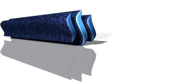
In the second I used binary code to indicate the advanced technology behind the platform.
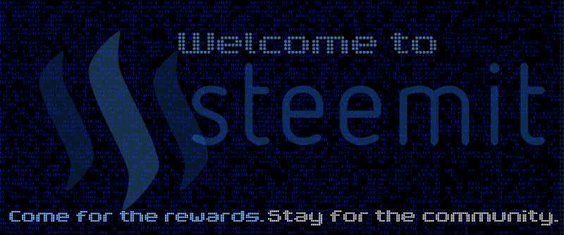
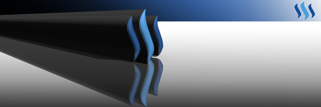
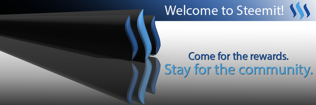
I found both the first designs to be a little overwhelming with visual stimuli, so I wanted to create a more minimalist version for my final effort. Below is a gif which charts the progression of the design process.

At first I had a very small extrusion on the 3D Steemit logo. In the end however, I decided I preferred it to be elongated and stretched off-screen. For me, this is symbolic of the dynamic nature of Steemit and its continual evolution during this beta period. I also thought it could be interpreted by some viewers as a sign of progress, indicating how far Steemit has come and how far it is likely to go.
Here are the final products.
Without Text
With Text
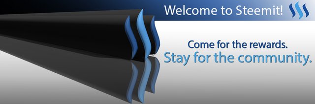
EDIT: Based on the feedback received in the comments, I redid the design with the suggested changes.
Without text.

With text.

supreme steemthemes
I actually like the first two. Those look fantastic. I don't think they're overwhelming at all. Either of those two would be a great landing page for the site.
Really great work!
I still prefer the first design though.
That's the second comment of a similar nature.. Perhaps I wasted my time with this one. lol. Thanks for the comment-
Never! It's good to explore different designs, even if you go for the first one, you know that it's the right one.
Otherwise it was just the only option available.
Great work. The first one is my absolute favourite though. It also feels suitably wintry even if it wasn't your intention.
It wasn't my intention. I just wanted to use the blue as that is associated with Steemit. And I had to use leafless branches to portray the decentralized-ness.
Now that you mention it, it does look awfully seasonal. That does means it would have to be changed come spring though...
I love it though. Maybe not I think because winter and Christmas is in our minds we maybe automatically project that onto it. In spring we might see it as more spring like. I think for summer and autumn you could give it warmer colours though because those cool tones may fit less.
Well, if I'm lucky enough to win the competition and have my work used as the sites landing page, I wouldn't want to be greedy and hold on to that honour indefinitely. Come spring or summer there could be another competition for a fresh homepage. By then I may even have enough SBD and followers to host it myself..
Cool or maybe you could re-enter it.
I personally love the binary code design but for the general public I would go for as Wal Mart friendly as possible and go simple simple simple. I think even the large shadow the logos cast is too much, though a neat design, the offset of the shading to the rest of the white makes that portion of the logos stand out to much for me.
I hadn't noticed it until you messaged me. Now I cannot avert my eyes from it. lol
The shadow is part of the rendered extrusion so it will take a while to amend but, I shall make a version with the opacity of the shadow greatly reduced.
Nice work ;-)
As always, I preface my comments with the fact that I am not a designer, and I have no idea what I'm talking about.
I'd like to see -
I hope that's helpful :-)
Funnily enough out of everything you said, making a reflection for the letters is the easiest thing. I actually already did it, but ended up hiding the layer as it looked unnatural. The texture on the extrusion is an excellent idea, I hadn't considered that. As for the reflection of the logo, it is portrayed exactly how a reflection would be, I fear that If I made a gap between the two it would no longer look like a reflection..
Those changes may take a little while but, I quickly made a version taking your advice about moving the shadow effect.
Better?
one other thing I should have mentioned, that is quite relevant - I did not take into account that amount of work involved in implementing any of the changes.
As someone who is constantly on the receiving end of suggestions to just put that there I know how frustrating some of the suggestions can be.
So please take anything i say with a grain of salt, and if it will take a bunch of effort, or you disagree with it, feel free to ignore my suggestions.
I won't be offended, honest.
As for this change - I think it works better. there is greater contrast now so the words stand out more. Otherwise the background tends to look a little 'dirty'.
I can't think of a better way to describe it.
As for the reflection - keep in mind this is a logo, not a photograph. It does not have to mimic real life. It's art, so place the components in such a way that the convey the message most effectively and / or are most pleasing to the eye.
Again, just my 2 cents worth. ;-)
No.. They are very good suggestions. Sometimes you need some fresh eyes to point out things you have overlooked when you have been working on something for a while. I thank you for the suggestions.
I made attempted to make a version with the suggestions you made, but my computer crashed every time I tried to render the 3D object. I think the binary code on the extrusion was a little too much detail and overworked the program. It's a shame because it looked as though it would look very good!
The competition is closed now, but regardless I will still see if I can get it to render at another time.
Oh bugger!
Sorry about that.
But on the plus side, i too think it looks better with the texture on it.
Maybe try something else with not quite so much derail in it?
I got it to work by reducing the size of the image before rendering to lighten the workload. I updated the post a few moments ago with the new version.
I like it!
Well done. It think this is clearer and cleaner.
Sorry for the extra effort I put you through though.