SLC21/WK6: Summary on Lessons so far [Hands-on Practical]
Summary on Lessons so far
It's been an amazing week of contest, with well Crafted lessons from our tutor @lhorgic. A big hand of appreciation to him who has been there To guide us and correct us while shaping us to become better Graphics designers in tomorrow's world.
Equally, I want to use this opportunity to thank all those who participated in this week's Learning challenge no, I was able to read, read and observe what are interesting books and Graphics from your entries. I was moved and enthusiast by some people's work. It shows great display of creativity and intensive understanding of Graphics design.
Before I proceed, I want to say once more, Again welcome to this last week of the steeemit Learning challenge. Going to have you all participating this week and I hope you run of the week in a grand style. Good luck in the contest guys!.
SUMMARY OF LESSONS |
|---|
| Lesson 1 |
|---|
SLC21/WK1: Introduction to Gradients and Application
Talking of gradients, it is a practical transition between one, two or more colors, creating a visual a appealing look.
In lesson one we were discussing on Gradients and how they can be made and applied using canva app. Before getting to practical demonstration, we equally discussed on the various types of gradients apply in graphics design such as:
Background Gradients
Linear gradient
Radial Gradient
Angular gradients.
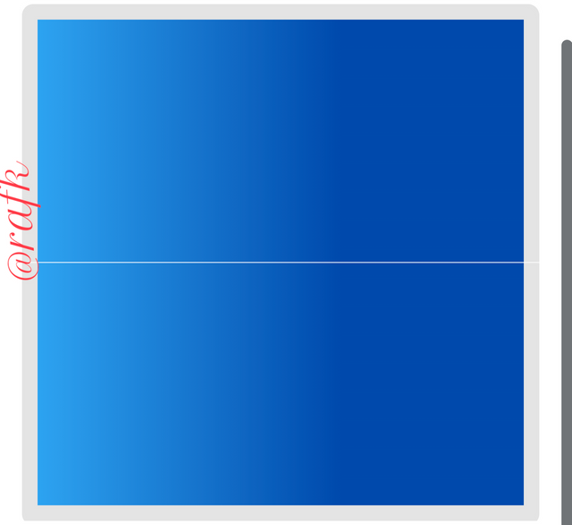 | 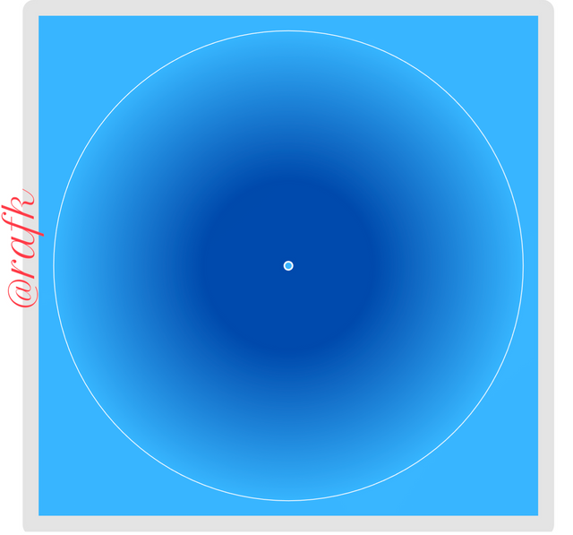 | 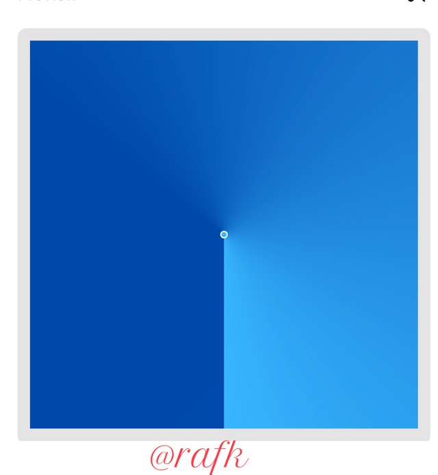 |
|---|---|---|
| Linear | Radial | Angular |
These are the 3 most applicable background Gradients use. Although other types of gradients such as diamond gradient, noise gradient e.t.c were discussed a drop link will be available for the full content of week 1.
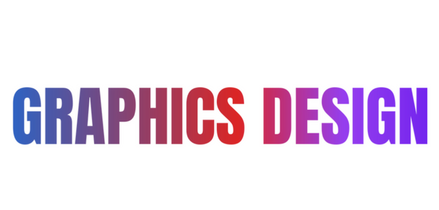
Moving from background Gradients, we equally discussed on typeface gradient and a few examples were giving as follows.
 |  |
|---|---|
| 2 colors | multi color. |
Creating gradients, we use the apps in our canva app, and proceed to Gradients where we can choose from any of the 3 options available. Added to this is a section as well for type face. Whatever you wish to produce, click on your choice and adjust the colors to your taste.
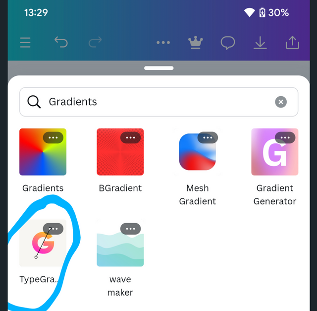
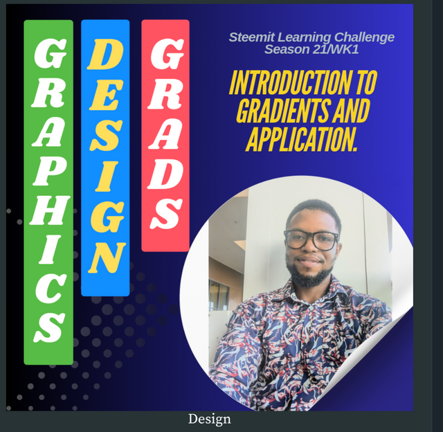
After learning about gradients, we went into application and I was task to produce 3 gradient With this specification. 1 color, 2 colors and 3 colors. At the end of this stage, I was task to pick one of the Gradients and do a flyer. .
 |  |
|---|
I did understood the lesson at my level. But equally I
After evaluation, I was corrected on the areas I need to improve on and that was complete for me.
For full content of lesson 1, follow This Link 🔗
| Lesson 2 |
|---|
###SLC21/WK2: Introduction to Logo Design
Logo design being one of the fundamental demands in time was introduced in lesson two of this week. As an introductory lesson we began by defining a logo as a company fingerprint or symbol or typeface the represents a brand or company.
Moving on from here, we go on to talk on characteristics of a good logo.
Simplicity, meaning it should be less crowded and easy to memorize .
Relevance, which talks on how the logo should be directed related to the brands key message
Timeless. A good logo should bear time variance
Memorable, a good logo should be easily memorized by it audience.
Moving on from here, we fast forward to the rule and impact of logo on a Brand. Under here it talked on the
How a good logo should be able to :
Create brand recognition
Build a brand loyalty
Promote brand value
Differentiate brand from competitors and
Displays brand's key message.
Mostly importantly, before moving on, we talk on the key dos and don'ts when designing a logo such as
| Dos |
|---|
Keeping it simple
Making it memorable
Ensuring versatility and
Applying readable type face.
| Don'ts |
|---|
- Your logo shouldn't be over complicated
- Follow a trend or
- Ignore it target audience.
Rounding up with this lesson after learning a few tips about logo design, I was task to come up with a simple logo to demonstrate my understanding. Below is the result.

After my lessons a few corrections were made after resolution which I took serious note of.
For full content of lesson 2, follow This Link 🔗
| Lesson 3 |
|---|
SLC21/WK3: Logo Design - Part 2
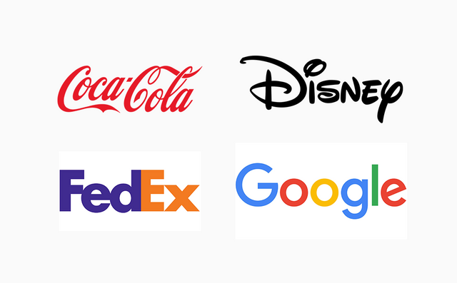
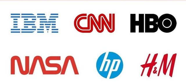
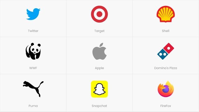
This was a more intense season, as we had to discuss one day different type of logos. If you examples of logos which already exist where I mentioned as I now highlight.
 |  |  |
|---|---|---|
| Wordmark logo | Lettermark logo | pictorial mark logo |
On a summary, decide if you could pick out from the variety of logos. For a more comprehensive understanding a link will be dropped for full details under the various type of logos.
Moving on from here, we had to learn on the different application of the different type of logos, starting with when and when not to use a particular logo. Based on the Three above, here is when to apply and when not to apply them.
Wordmark logo
Used cases when the brand name is easy to memorize. Also you want something which is clean, timeless and recognizable.
Do not apply this type of logo when your Brand's name is complicated or long.
Lettermark logo
This is most applicable for brands with long names. And they want it simple and reducible.
Do not apply this type of logo, when you are still forming a new brand.
Pictorial mark logo
This goes for companies looking for striking logos which are easily recognized.
Do Not apply pictorial mark logo if your brand is complex or abstract.
Living this section, my next ass was to pick and all the available logos I have choose and clearly demonstrate the various steps to producing this logo. Looking at what I had in contacts, I went for the what Mark logo and combination logo. A practical demonstration was exhibited and this can be found in the main post.
 |  |
|---|---|
| Wordmark logo | combination logo. |
Not mentioning combination logo in the primary logo types, I would do a quick demo of it. This is a type of logo which is in a combination of letters and symbols as you see in my logo above. Get this brought about by the use of typeface and elements.
After submitting my post for evaluation, if you corrections were made and I made sure I took load of it before moving to the next week of the learning challenge.
For full content of lesson 3, follow This Link 🔗
| Lesson 4 |
|---|
SLC21/WK4: Mockups in Design and Application
Of course, we talk of Graphics design but how do our designs look when they are applied in a real life. That is when we talk off mock-ups. Mockups are enhanced practical application of a virtual reality of our designs.
Proceeding, we equally discussed and the different type of mockups that exists.
Wireframe mockups
This mockup points on the structure and layout of a design prioritizing its functionality over other forms.
It is used in early stage designs and testing face.
High Fidelity mockup
A special type of mockup, design to be more detail and making the design looks much more like the final product.
It is most used in presentations and internal design reviews.
Product mockup
Purpose is to demonstrate how a design will look on a product when printed. We can have an example in the image below

It's most use case is in printing design, packaging and marketing.
Midway in the lesson, we have to discuss on importance of mockups in the promoting brand or product. A few points where I like it and explained as we do if summary of them. A full body of the context can be checked in the post link.
Visual communication
Mockups provides a clear and precise visual representation of a product or design concept which help the consumers to understand the products benefits, features and desire.
Enhance User Experience
Mockups greatly help in the interaction of consumers with a particular product. Once validate, this could go a long way increase customer validation.
Marketing-promotional materials
Vacation of mockups could greatly help in design of marketing products such as flyers, brochures and website banners. These tools promote brand awareness and Skyrock sales.
A few points listed, a majority will be I'll give you in the main post.
After carefully studying the different type of markups and their importance, we were asked to pick or design a flyer and apply our mockup on it.
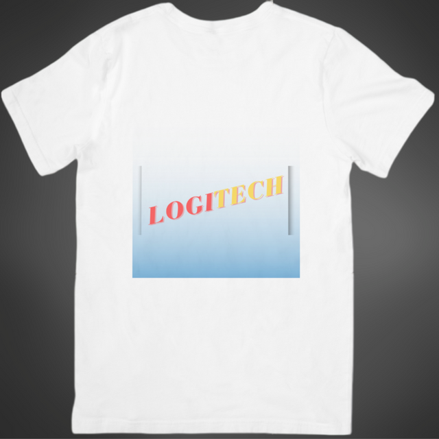
I already had a prepaid logo for lesson three, so I just picked it and applied on a t-shirt mockup. Below is presentation.
Equally I decided to do a new design for the week and apply it on a mockup.
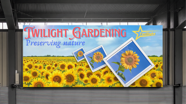
As always, during evaluations, a few points or point it and I go ahead to work on them not to make the same mistakes in the next lesson.
For full content of lesson 4, follow This Link 🔗
| Lesson 5 |
|---|
SLC21/WK5: Hands-On Practical.
In this week's lesson, it was a practical lesson which was carried out with reference to the previous lesson.
The task was so carry on practicals by using a logo wishes already been pre-designed or design a new logo for those who did not attend the last session, and equally design a flyer and which the logo will be applied on, and finally applying this design on a mockup.
In my task, I thought of something interesting and I decided so come up with a new logo and flyer. Designing my logo and make sure I implement the principles of logo design as instructed in my previous lessons. Below is what I was able to design in week 5.
Full details of design procedure have been mentioned and demonstrated in the original lesson.
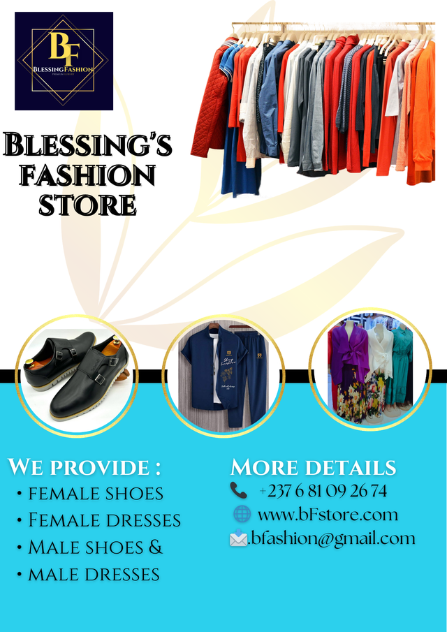
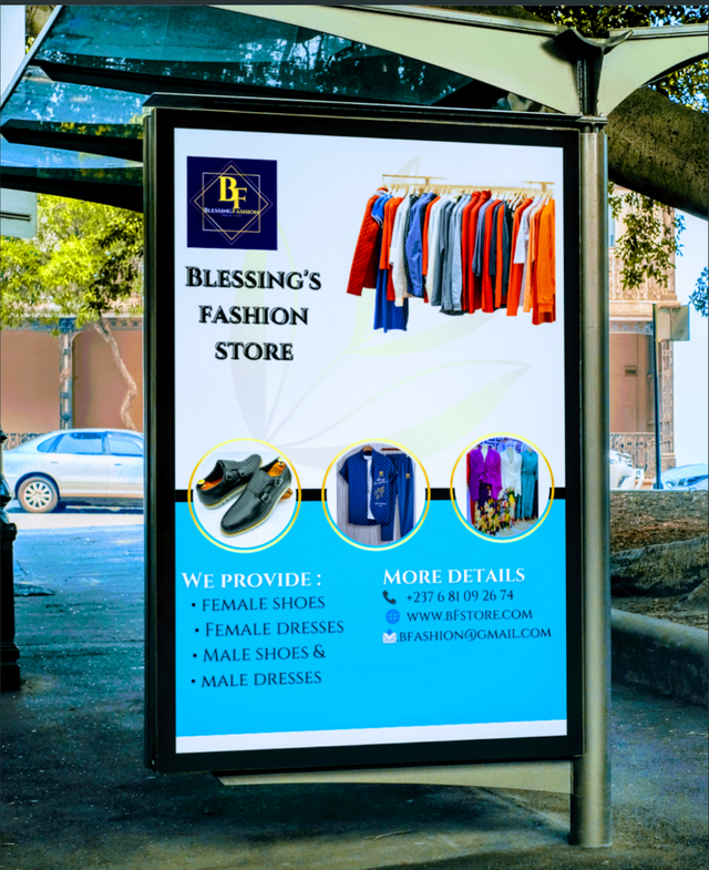
After designing my logo I proceed it to design a flyer. I was inspired by my sisters business WhatsApp group. There, she does online shopping and disposal of various fashion. Both male and female. Glancing through the chats I discovered her profile was too empty. Nothing signifies her brand or anything. So I decided to make it surprised for her coming up with this flyer
 |  |
|---|
This was a more symbolic lesson, and in the end I met sure I list a few principles which I applied in the design such as.
Balance
Alignment
Contrast
Hierarchy
Repetition:
A more detailed explanation of this point it's found in the main post. It was a great way to round up the lesson and I did enjoy it so much. Equally my sister was so happy to receive a new flyer and brand name.
In the end a few points were also pointed and I made corrections of them right away before moving on to this week's lessons.
For full content of lesson 5, follow This Link 🔗
Summarizing, it's been an amazing week of contest a lot to learn from and applied to. Now I am able to design logos, create professional flyers and apply them on mockups. Equally I have learned the principles of Graphics design the dos and don'ts in graphics design which have been a long way to check me in becoming a better graphics designer.
Big thank you the steeemit team for creating a learning opportunity on the platform for its users. Moreso, thank you so my tutor and mentor @lhorgic for taking out his time to teach us Graphics design for free.
I am inviting 3 students who have actively participated and the previous lessons to join me participate in this Grand summary.
@artist1111
@josepha
@impersonal
Credit to: @rafk
Hello @rafk thank you for participating in this week's lesson. We have assessed your entry and we present the result of our assessment below.
Feedback:
Welcome back to class dear student.
Let me start by commending you for a job weldone, the effort put into this work is quite commendable.
Thanks for the warm compliment made in your intro, It's been a great while teaching and learning at the same time. You won't believe I also pick one or two lessons from the entries that comes in weekly. Am glad you learnt a whole lot of stuff during this period.
Your summary is quite comprehensive and nice, you have captured so many important points in your entry and I commend you for a job well done. Thanks for staying through.
Regards
@lhorgic❤️
Upvoted! Thank you for supporting witness @jswit.
Hi, @rafk,
Your post has been manually curated!
@tipu curate
;) Holisss...
--
This is a manual curation from the @tipU Curation Project.
Upvoted 👌 (Mana: 0/7) Get profit votes with @tipU :)
Your whole content is very organized and informative. Each stage of education has been beautifully illustrated. Did a great job. Good luck for the contest.