SLC21/WK2: Introduction to Logo Design

My Logo design
Hi everyone !
Welcome to this week's learning challenge. I believe we are all fired up and ready to put up some good entries. Thanks to Everyone who has shown me support in my previous lessons and I pray you continue the same. It's another week of engagement and I am ready to bring in more good entries which are eye-catching and readable.
LOGO DESIGN |
|---|
A logo is like a brand's fingerprint. In other words , it is a simple symbol or image that represents a company or product. This is the first thing the audience see, and it can create a big impression about the brand or company or product. A good logo is memorable, meaningful, and versatile. It should be easy to recognize and activate the right feelings.
Discuss Logo design based on your understanding about the topic.
As previously mentioned, A logo is more than just a nice picture we see; it's the visual imperative of a brand's identity or representation. This is the first impression, the silent ambassador that speaks volumes about a company's values, objective, and personality.
The Essence of a Great Logo
A good and effective logo should embody the following qualities:
Simplicity: A good logo is supposed to be clean, uncluttered, and easy to memorize. It's the kind of design that sticks in the mind, not one that confuses or distort you thoughts.
Relevance: The logo should directly relate to the brand's key message and values in aspect. It should be instantly recognizable and activate the right feelings or emotions.
Timelessness: this means your logo can withstand the test of time. Over time, the design should not look dated or trendy, ensuring longevity and consistent brand recognition progressively.
Versatility: A good logo should fit well or adaptable on various applications. That is, it should look equally good on a business card, a billboard, or a digital screen e t.c.
Memorability: The most important goal of a logo is to be memorized. It should leave a long lasting impression and be easily remembered.
The Design Process
Creating a strong logo involves a meticulous process:
Brand Research: Understanding the brand's identity, target audience, and unique selling points is crucial.
Concept Development: Generating creative ideas, brainstorming, and sketching potential logo concepts.
Visual Exploration: Experimenting with different typographies, color palettes, and design styles.
Refinement: Iterative process of refining the logo, making adjustments, and fine-tuning details.
Testing and Feedback: Gathering feedback from clients, colleagues, and target audiences to ensure the logo resonates.
Finalization: Creating the final logo in various formats and sizes, ready for implementation.
Discuss extensively the role and impact of logo to a brand.
The Power of First Impressions
To be sincere, we judge books by their covers. In the same way, we judge brands by their logos. A careful designated logo can:
Create Brand Recognition: A strong logo is captured in people's minds, thereby making it easier for them to remember and recognize your brand.
Build Brand Loyalty: A memorable logo can foster emotional connections with your audience, leading to improve brand loyalty.
Enhance Brand Value: A strong brand identity, supported by a powerful logo, can significantly increase our brand's value.
Differentiate from Competitors: A unique logo helps your brand stand out in a from the rest of the marketplace.
Communicate Brand Messaging: A logo can convey your brand's message and values in one glance.
The Psychology Behind Logos
Color psychology, for instance, plays a an important role. Different colors insinuate different emotions. Red, for instance, is often related with passion and energy, while blue is often associated to trust and reliability.
The shape of a logo can also convey specific messages. Circles, for instance, often symbolize unity and completeness. Triangles can represent stability and strength.
The Evolution of Logo Design
Logo design has evolved significantly over the years. From simple, text-based logos to complex, symbolic designs, logos have adapted to changing times and technologies. Today, with the rise of digital marketing, logos need to be versatile, adaptable to various platforms and devices.
In Conclusion, A well-designed logo is a powerful tool that can help your brand succeed. It's an investment in your future, a visual representation of your brand's aspirations and potential. So, the next time you're designing a logo, remember: it's not just a picture; it's a promise.
Explain and demonstrate visually the do's and don't when it comes to Logo design. You can do more research to be outstanding and kindly ensure not to use my specimen logo.
The Do's
1. Keep It Simple
Minimalist Design: A simple, clean design is easier to remember and recognize.
Example: Nike's iconic logo is a prime example of simplicity.
2. Make It Memorable
- Unique Identity: Your logo should stand out from the crowd.
- Example: The Twitter bird is instantly recognizable, even without the wordmark.
3. Ensure Versatility
Scalability: Your logo should look good in various sizes, from tiny favicons to large billboards.
Color Variations: Consider creating black and white versions for different applications.
4. Choose the Right Colors
Brand Personality: Colors evoke emotions, so choose colors that align with your brand's personality.
Example: Red is often associated with passion and energy, while blue is often linked to trust and reliability.
5. Use Readable Typography
Clear Fonts: choice of fonts should be easy to read and visually appealing.
Avoid Excessive Fonts: Stick to one or two fonts to maintain consistency.
The Don'ts.
1. Overcomplicate
Cluttered Design: Too many elements can confuse and overwhelm viewers.
Example: A logo with excessive details and multiple colors can be difficult to remember.
2. Follow Trend
Timeless Design: A timeless logo will still look relevant years later.
Example: Avoid using trendy design elements that may quickly become outdated.
3. Be Too Literal
Symbolic Representation: A symbolic logo can be more impactful than a literal one.
Example: Instead of a literal image of a camera for a photography business, consider a more abstract symbol.
4. Use Clipart
Original Design: A custom-designed logo will make your brand stand out.
Example: Avoid using generic clip art that looks unprofessional.
5. Ignore the Target Audience
Audience-Centric Design: Your logo should resonate with your target audience.
Example: A playful logo may not be suitable for a corporate brand.
Design a simple logo with the knowledge you have gotten from this lesson by assuming that a client gave you a job to design for his brand (business).
Let's take. For instance, as a graduate student in graphics design, I have complete my lessons and I am out there For the job market. A client contacted me based on my resume requesting a design for his newly opened fashion shop.
Based on my knowledge of Graphics designed and the various principles that will make the local work best for this business, I am going to be designing a simple logo which is going to portray business model for this client.
Design procedure
The name I was constructed to walk with his New breed fashion as Brandon name and slogan classic wear.. Let's see how we can put this to work.
To Begin with, I open my canva app. And choose the right scale for my background. After which I proceed by selecting the various elements which will be needed for my design.
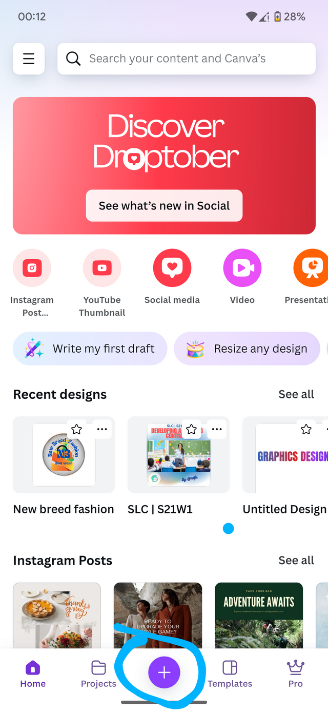 | 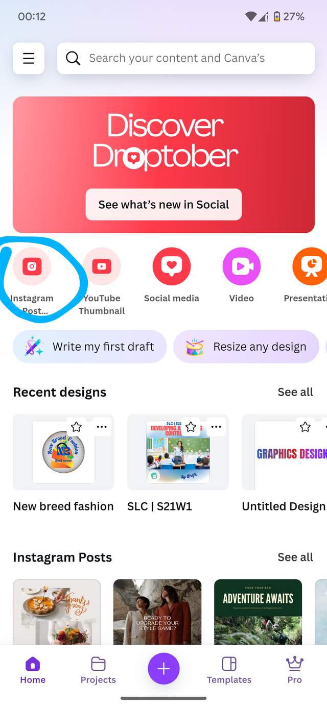 | 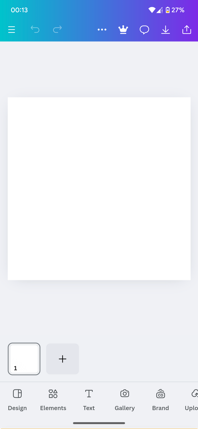 |
|---|
From yeah I go in search of the best elements and typeface which will go well with my design. Under elements. I type the desire Logo specification I want such as circles, cloths and shapes or my choice.
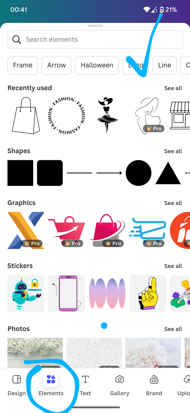 | 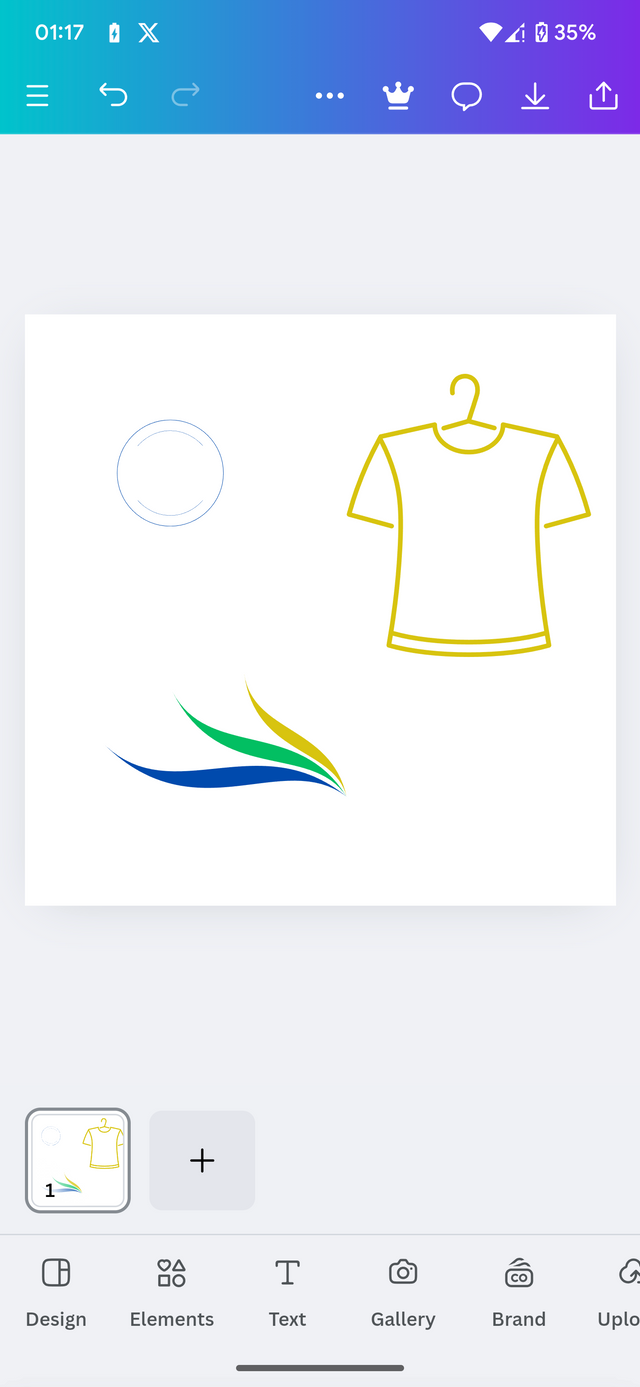 |
|---|
After importing they require element, I arrange them and input my Typeface To complete my lover design. After adding my typeface, I was able to obtain the following results.
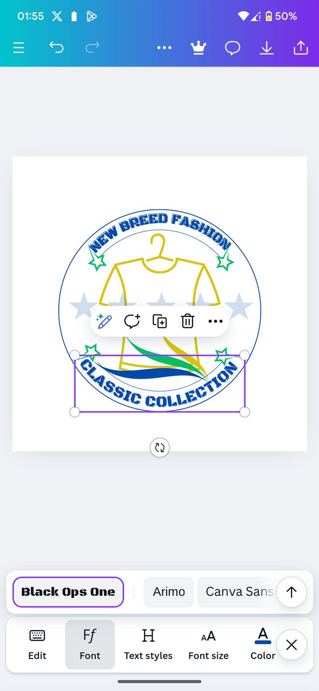 | 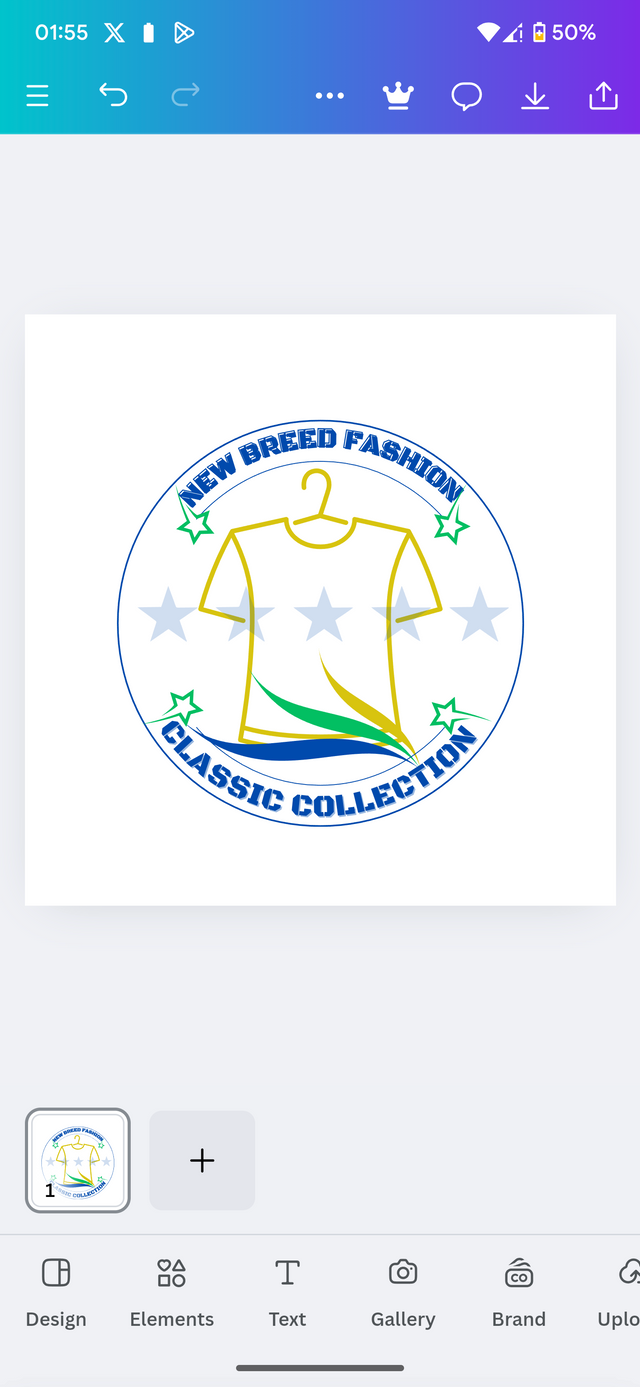 |
|---|
Here's how my final design looks like.
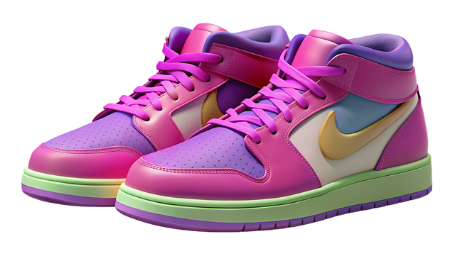
By applying a 3D element we could also have results like this.
In Conclusion, a well-designed logo serve as a powerful tool that can uplift your brand to new higher levels. It's the first impression speaks volumes about your business. By applying the principles of simplicity, relevance, timelessness, and versatility, one can create a logo that resonates with their target audience and leaves a long lasting impression.
Note that, your logo is more than just a any visual element; it's a strategic asset that which can significantly improve your brand's success. In this aspect, invest time and effort in designing a logo that truly represents your brand and drives your business forward.
At this point, I would like to invite a following persons. Join me participate in this amazing contest. @simonnwigwe, @chant, @wirngo.
Cc : @lhorgic
Credit to: @rafk




Upvoted! Thank you for supporting witness @jswit.
Logo design is the first glimpse of brand recognition. It represents the company or product and should be memorable and meaningful. A simple, flexible and memorable logo plays an important role in the success of a brand. Correct color selection, appropriate understanding and design ability to last over time, are the characteristics of a good logo. It not only attracts viewers but also strengthens brand identity and fosters long-term relationships. Always stay safe and good luck for the competition