My WhaleTank Promo Art
Here's my submissions for the WhaleTank Promo Art. I've decided to go with a ultra-plain postmodern-y look. I love keepin' it simple! I had such a great time designing these. Thanks again for this opportunity, and I'm looking forward to more engaging community design projects!
NOTE: I've done all these in vector format, happy to provide them upon request. I've also designed them with the font Karpow that I created :)
BITSHARES: maximus3 #97555
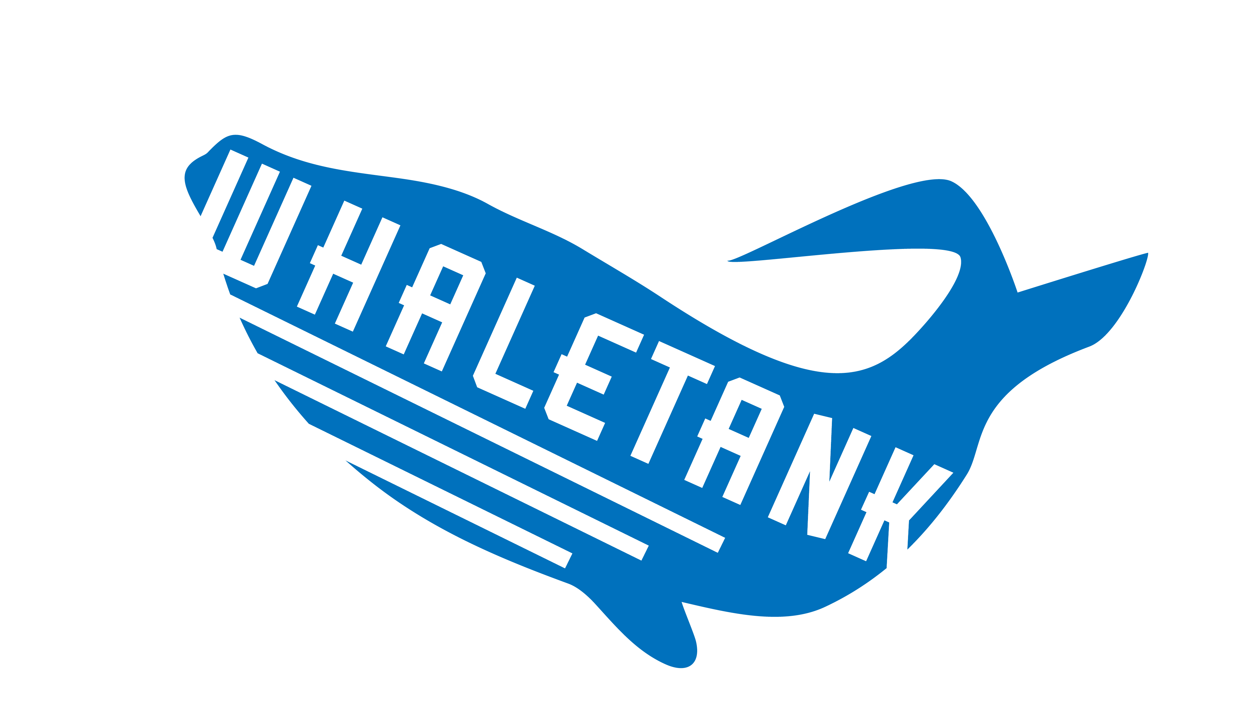
#1
This is the simplest idea I had. This idea originates from "deconstruction in graphic design" where the designer uses the negative space for the message or elements. It's slightly tilted upward to represent the whales be movin' on up. The diagonal lines (gills) reinforce this directional movement. This whale is going to the moon.
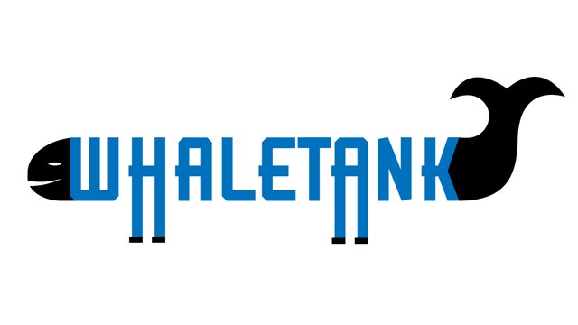
#2
This submission is just plain silly. Isn't it hilarious to wonder what it would be like if whales could walk? This particular whale is smiling because he rapidly evolved, got feet and escaped his whaletank...hmmm...LOL
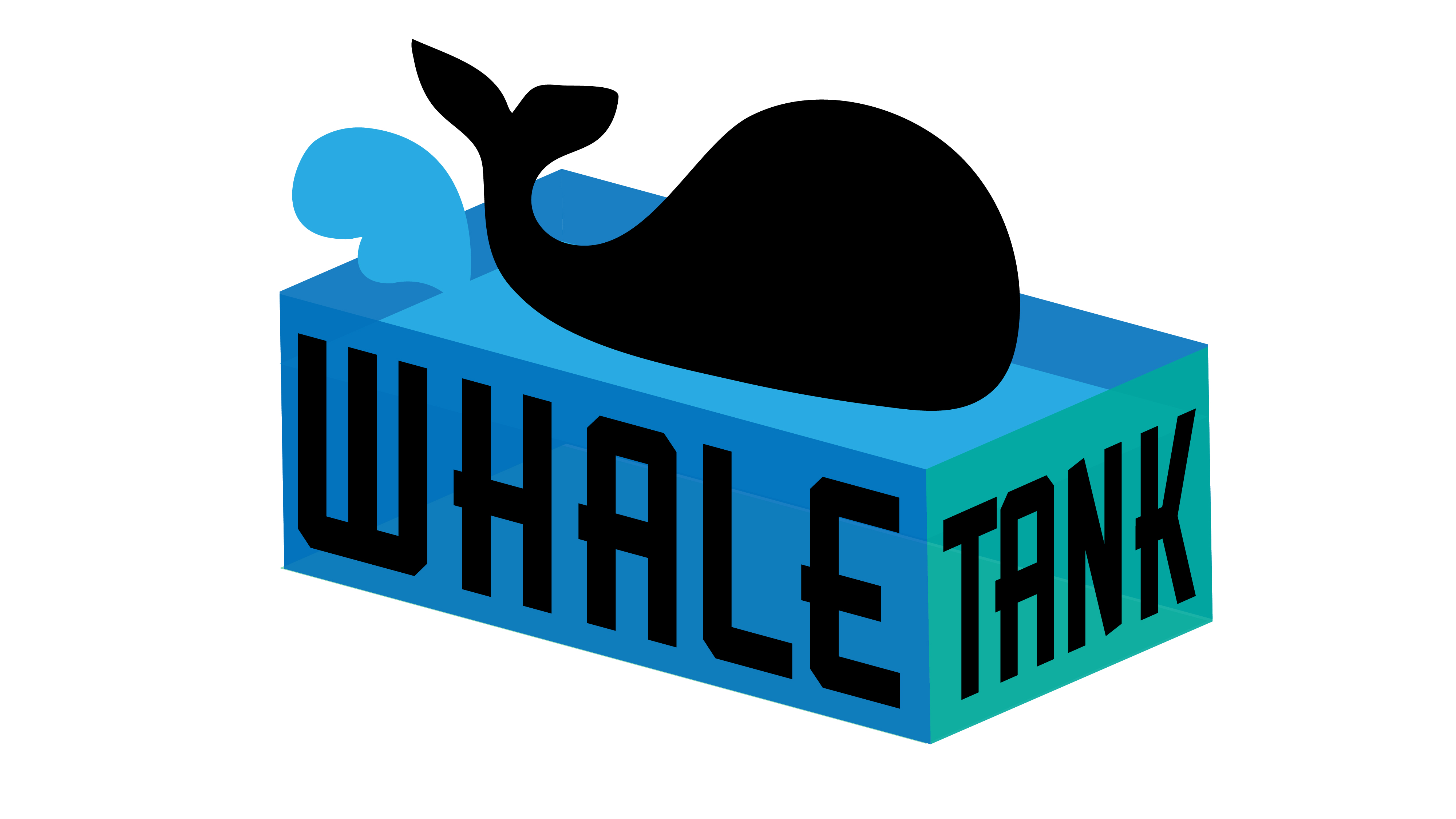
#3
This is totally my favorite! Here's a whale too big for his tank. It's lookin' like he's splashing around.... or going to jump out of his tank soon? This composition will look great if used as a logo on any background and still be legible when shrunken down i.e. thumbnail or business cards.