Whaleshares Website Redesign: First Screenshots
Design is still something of a mystery for most people. It’s especially true when it comes to website design. Non-designers usually have no idea of what amount of work is needed to get this job done. This post’s goal is to show an example of a website redesign process using my recent front dev work on Whaleshares website.
First things first, here’s how the redesign will look like:
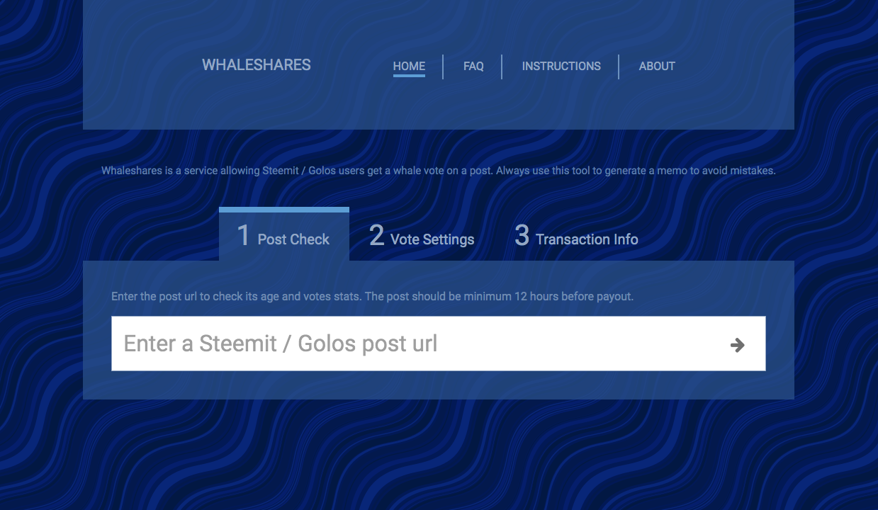
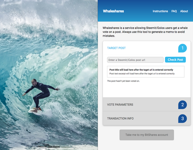
After the target post's url is entered, post stats will append to the same tab. They will tell whether the post is fresh enough to vote on it (it should be minimum 12 hours before payout) and what Whaleshares whales have already voted on it. The second tab will take you to vote parameters where, after choosing a whale, you’d see his vote stats. After setting up the vote parameters you will go to the final tab with the transaction info. The final button will take you to your Bitshares account where you could transfer the tokens and voila, the vote magically happens!
For comparison, here’s how the website currently looks like:
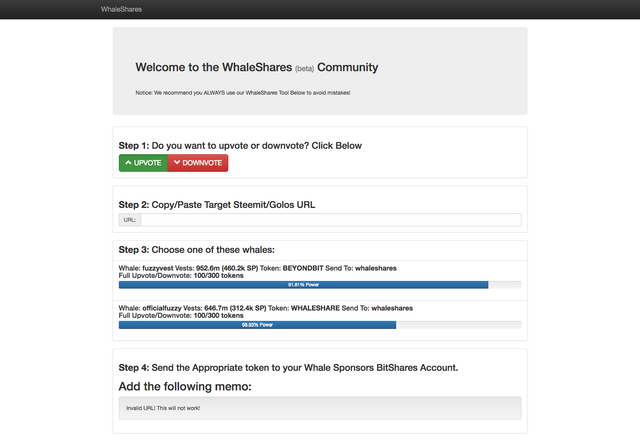
What is Whaleshares?
For those who are not familiar with Whaleshares, it’s a project by @officialfuzzy which makes getting a whale vote easy. All you need is some tokens which you can get for free by winning a contest or even being around in the Whaleshares community chat. Currently there are two tokens issued, WHALESHARE and BEYONDBIT. Here’s my post explaining in great detail how to get and use these tokens.
The design process
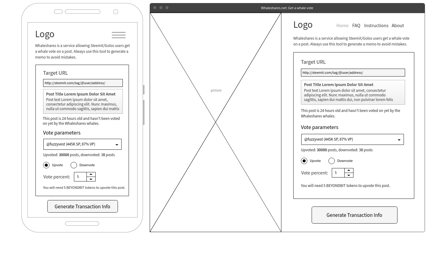
Now let's turn to the design process. I’ve started with the current front page structure and my first goal was to reduce the height to fit a mobile device’s screen. I did some quick sketches and came with an idea of using a vertical page background to reduce website width on desktop screens plus make an accordion to save vertical screen estate. So I’ve made some wireframes:
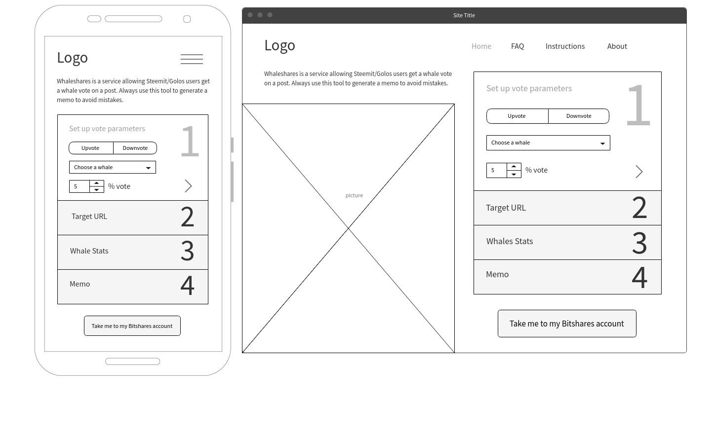
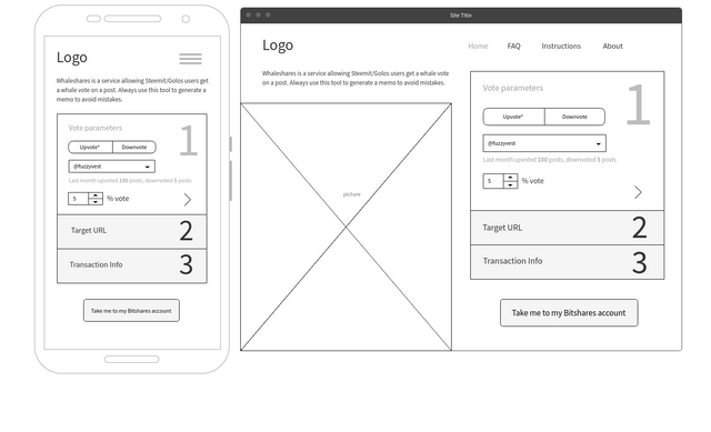
finally resulting in these mockup: 3-step version
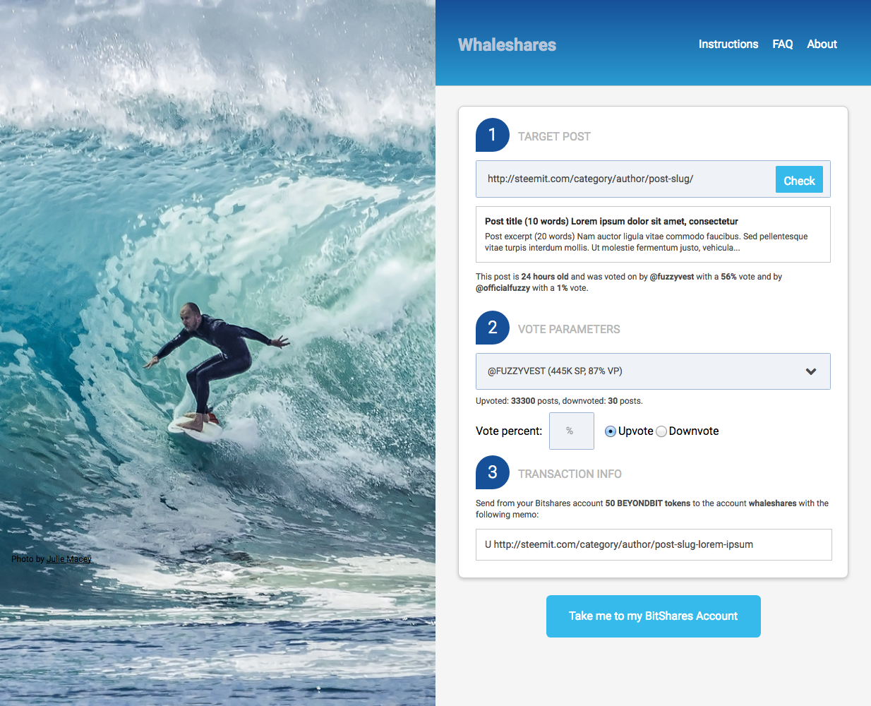
or 1-step version:
That design was nice and functional but I’ve run into a dilemma. Left side height was somewhat stable while right side height could vary greatly. Some info could be appended only after the target post url was entered, so either an empty space appears at the right side initially (which looks way ugly) or that space is cluttered with unnecessary info (which is bad from the usability point of view):
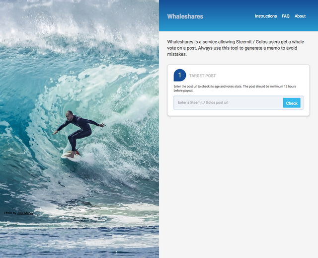
That screenshot led to a totally different layout: I decided to try a minimalist approach with horizontal tabs instead of vertical ones. That idea was lurking in my head since the beginning but somehow I didn’t give it much weight until then. What I’ve came up with was this quick mockup:
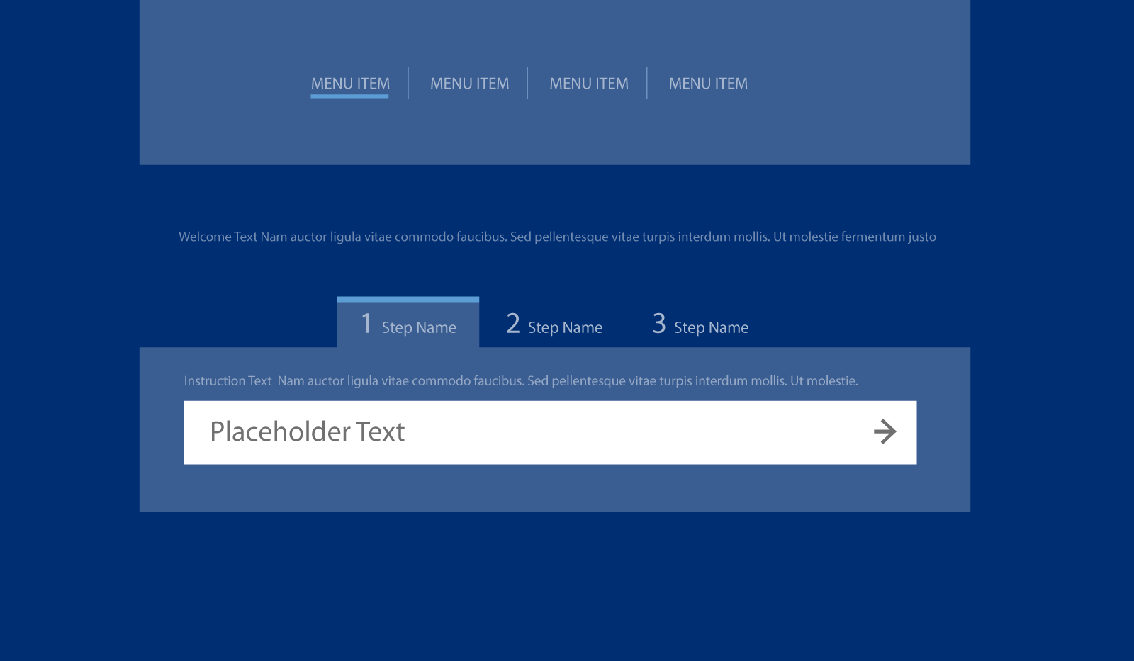
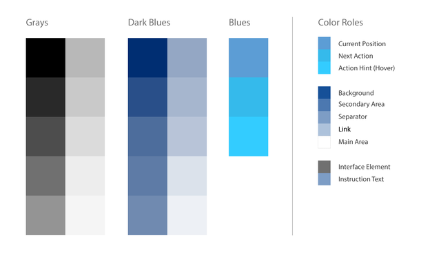
This layout has resolved the screen height problem altogether and removed an unnecessary clutter plus added a more modern look. So I was happy with it and moved on to defining a color palette:
Then I’ve polished the layout a bit and added the wave background.
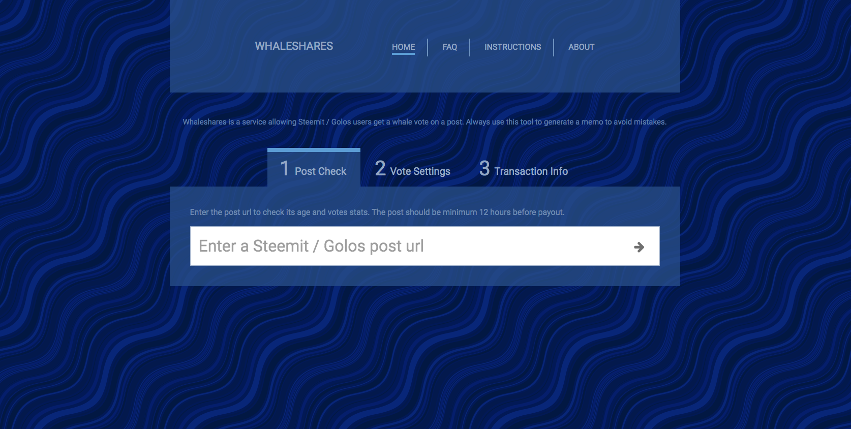
The next step will be creating a template out of this mockup, getting right the elements’ widths for all screen widths and testing it in different browsers.
What I’ve learned in the process
- I highly recommend to make as much wireframes as possible before moving on to design. You can see that what I’ve initially done was not enough as I would come to the idea of horizontal tabs earlier if I had explored more layout possibilities.
- Essentially this website is one big form and despite all CSS3 advancements form elements are still hard to style.
- There is no way yet for such a kind of a website to get rid of auxiliary javascript. I am a big fan of CSS only design, but even making tabs without JS isn’t feasible if you don’t want going into workarounds.
- Having said that, CSS3 (the current version of the language used to describe how a website looks) has a lot of improvements making design cleaner, faster and more beautiful. The price is the steep learning curve. To be a good designer now means to read, learn and experiment a lot as new tricks and technologies appear with an ever increasing pace.
I will be glad to hear your feedback on the redesigned version as well as your ideas on how to make the website better. I am especially interested in these questions (you can open the screenshot is a separate browser tab for a full width version):
- Where does your attention go first when you first see the redesigned website?
- Is it clear to you what to do first when you've just came to the website? If so, what would you do first?
- Are you fine with the minimalistic color gamma or you would prefer lighter / brighter colors?

What's the fastest method to convert sbd into whaleshares/beyondbit?
SBD->Bitshares via blocktrades.us and then you can buy those tokens at bitshares exchange.
Whaleshares Website Redesign: First Screenshots
Just a tip... you will save a little if you do SBD>BTS via blocktrades then BTS>HAIRSHARE>WHALESHARE
Love it and love using WhaleShares one of the most powerful systems on here!
I will totally give you some constructive criticism when you are done with it. :) Lets make it amazing!
Great, I'm looking forward to it! :)
Hey @vitkolesnik, I think you were more on the right track with the brighter responsive design. The open cleaner tablet look is more of where the web is going in terms of design.
This is not totally to scale, I just sliced up your examples from above to mock this up real quick to give you my thoughts.
For the background image, I would do a background cover css and randomly rotate the image that displays on load, so it's kinda fresh every time you visit the page.
Keep everything in bootstrap or other responsive layout and throw the logos to the bottom on tablet/mobile views.
If you use bootstrap, you can use the modals to open the faqs, about, etc over the page for a clean look.
Thanks a lot for taking time to read and experiment with the mockups. I greatly appreciate it. This is what I like on Steemit, a creative environment where ideas flow.
I will work on the horizontal tabs version as I like the cleanness of just one input at start. Also this version is capable to hold more info as the website will grow. I will make a variation with bright colors and ask the community for feedback. The idea of logo "exhibition" is great and I'll try it on the footer, thanks for the hint! I've had the idea of a rotating background image and will experiment with it too.
As for bootstrap, I like their functional approach but not the visual style, it seems to me to be overused and I'd like Whaleshares design to be unique (yet of course functional). I was looking into alternatives to bootstrap but didn't yet decide if I want to go with any of them. At any rate, I always work with the responsive design in mind.
Thanks again for your comment and let's stay in touch!
No problem. I'm happy to give feedback along the way, even if it just helps get other ideas flowing. Like you said the shared creative process is really great here.
Always keep in mind us "web guys" assume everyday people know what we intended things to do, but sometimes the elements need that extra-obvious hand-holding explanation. :-) Like the titles of the tabs themselves. "Check Your Post". In last night's discord chat, I got to listen to new-comers to Whaleshares go through that process of using them to upvote for the first time with Akrid trying to guide them. It was rough, but understandable that not everyone will understand the process at face value.
I will follow along. You can reach me in discord too.
Thanks! will connect to you on discord)
You got my vote and a resteem :)
Thank you!)
Wow 😱
Many people indeed love the aesthetics but have no idea how much work is put into it. Like people love the feel and fluid usage of the Iphone, but it took a great visioner like Steve Jobs to get to such a product.
Thanks for putting in much effort, it is such a lovely design.
Exactly. Thanks!
Wow !
Great tool !!👌👌👌
I can easily relate with you, because I'm a website designer
Then you know what I'm talking about)
Great project man keep it up :)