You are viewing a single comment's thread from:
RE: Whaleshares Website Redesign: First Screenshots
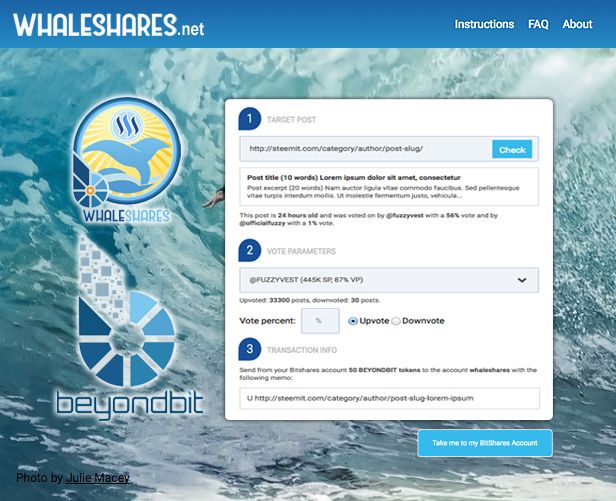
Hey @vitkolesnik, I think you were more on the right track with the brighter responsive design. The open cleaner tablet look is more of where the web is going in terms of design.

This is not totally to scale, I just sliced up your examples from above to mock this up real quick to give you my thoughts.
For the background image, I would do a background cover css and randomly rotate the image that displays on load, so it's kinda fresh every time you visit the page.
Keep everything in bootstrap or other responsive layout and throw the logos to the bottom on tablet/mobile views.
If you use bootstrap, you can use the modals to open the faqs, about, etc over the page for a clean look.
Thanks a lot for taking time to read and experiment with the mockups. I greatly appreciate it. This is what I like on Steemit, a creative environment where ideas flow.
I will work on the horizontal tabs version as I like the cleanness of just one input at start. Also this version is capable to hold more info as the website will grow. I will make a variation with bright colors and ask the community for feedback. The idea of logo "exhibition" is great and I'll try it on the footer, thanks for the hint! I've had the idea of a rotating background image and will experiment with it too.
As for bootstrap, I like their functional approach but not the visual style, it seems to me to be overused and I'd like Whaleshares design to be unique (yet of course functional). I was looking into alternatives to bootstrap but didn't yet decide if I want to go with any of them. At any rate, I always work with the responsive design in mind.
Thanks again for your comment and let's stay in touch!
No problem. I'm happy to give feedback along the way, even if it just helps get other ideas flowing. Like you said the shared creative process is really great here.
Always keep in mind us "web guys" assume everyday people know what we intended things to do, but sometimes the elements need that extra-obvious hand-holding explanation. :-) Like the titles of the tabs themselves. "Check Your Post". In last night's discord chat, I got to listen to new-comers to Whaleshares go through that process of using them to upvote for the first time with Akrid trying to guide them. It was rough, but understandable that not everyone will understand the process at face value.
I will follow along. You can reach me in discord too.
Thanks! will connect to you on discord)