Smart Things I Learn From IKEA Introduction
The first months I move to Berlin, I spend all my spare time with IKEA furniture. I have to not only because they are cheap, but also that IKEA furniture is the only system not named by the functions, but marked with a strange name and a unique number. That means I don’t need to know the word Chair in German, which I do not know, but just write a serial number of my favorite chair from IKEA Chinese website, then follow the number find the same Chair in IKEA Berlin Local Store.
For more accuracy, actually, they are my wife’s favorite, all of them. She just sends me a lot of serial numbers like code and I just follow the order from China, Global Business.
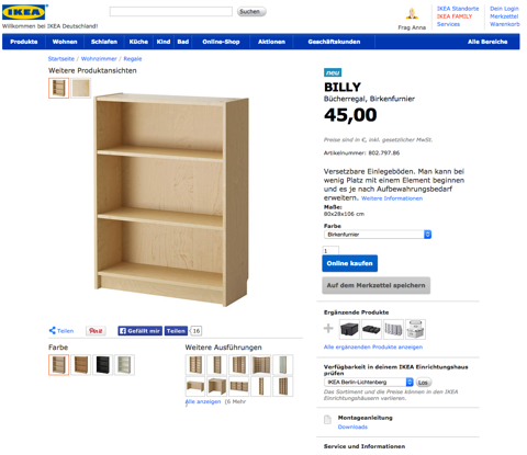
in German
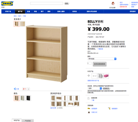
in Chinese
This is the first good thing I learn from IKEA design: a Standard and Universal Tracing System.
Standard and Universal Tracing System
It will be very useful and helpful for users, especially when you deliver global content in different languages like IKEA, you should have a catalog with a standard system for the user.
Maybe cross languages are not that common, but thinking about this, when you have massive content in different dimensions, digital and real, books and films, basketball and football competitions, include leagues and cups and so on, you can of course just sort of the way bring you most profit or you think the best for users, but don’t forget give them a page to browse all content by alphabet or number or year or some other global standard universal systems.
When I got lots of IKEA furniture back home (which is totally nightmare
I don’t want to go through again so just skip that part. ), after I installed some, and make a very little tiny mistake by just put the wrong side to repeat all the work, I realize some points of an IKEA designer should think when they design a furniture. At least these three steps:
- Design a furniture, a beautiful and useful one. (of course, but this is the first and only a step most designers should do.)
- Put this furniture into a flat box, max long to 2m and wide less 1m.
- Design an Introduction, to let all the people in every corner of the world in different education and background know how to install it, in most common tools, without one letter.

Things in real world
The first two steps should not be very hard for you as a professional furniture designer. But the third one, thinking about this,
Users are all different, most of them are first install a furniture. You have to using pictures to break barriers of various cognitive, education, culture, and not in a art way, but guide them follow more than 30 steps to finish the whole complex processes.
I keep all the introductions and read (watch) them while thinking how they help me in the whole install processes.
Connection to Real World — Skeuomorph design
Skeuomorph is not only a design style but also bring the experience from the real world to the virtual, by linking the unknown to known, help users building acknowledge of a new system.
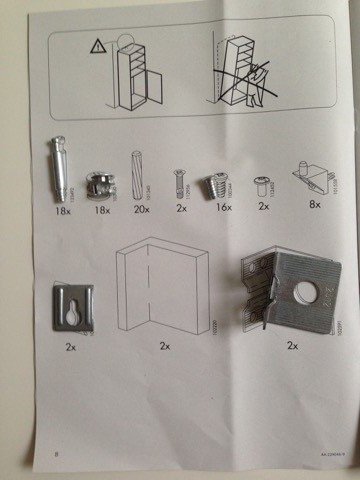
the first page of every introduction
I found this point when I confuse two kinds of very similar screws. They are different length but I just don’t know which one should be installed here by watching the picture.
I can’t link which real screw is the one marked in the picture. Then I drop it onto the first page of this book, suddenly everything is clear because I found the screw in picture is excitedly the same size of the real one! And the similar one is actually shorter than this, by following the number of screws (not word), I install the right one to the right place.
Clearly mark the confusing parts
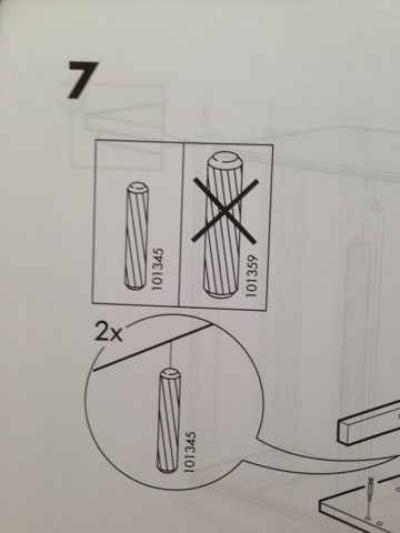
easy confused sticks
This point seems like very junior. But here is story when I found this.
You know there are lots of sticks for join parts. But sometimes there is two type of sticks, long and short. Just at the same time I was confusing which one is right one, I saw a big highlight notion with a wrong mark on short stick.
I don’t even need to flip the book to the first page to check which the serial number of different sticks, but just compare the sticks in my hand and find out the longer one, and install it.
So you got it? the essence is timing. Clearly mark parts, just when users start to confusing.
Knowing which part is easy to confuse is a basic skill of product manager. If you can’t avoid it, know when and where the users start to confuse is much harder, because you have to see and go through it as a new user.
- Are you confirm you want to cancel it ?
- Confirm
- Cancel
- Are you confirm you want to cancel it ?
- Cancel
- No
Which button you should click? For a product manager, it is of course a cancel process with a confirm alert. But for user, just remember “I want to cancel, where is cancel, I want to cancel it!”With a highlight on button is good way, what about changing the text
- Are you confirm you want to cancel it?
- Confirm
- No
The more you think you know the product, the easier to happen this kind of confusing parts, avoid it or mark it right at user start confusing.
The Only One Right Way
I thought I’m smart enough to skip some steps or just one “stupid” step to save more time, but turn out I have to uninstall everything until I follow one by one. That small step looks like very superfluous is actually very important way to help you separate front and back of a bed and so on.
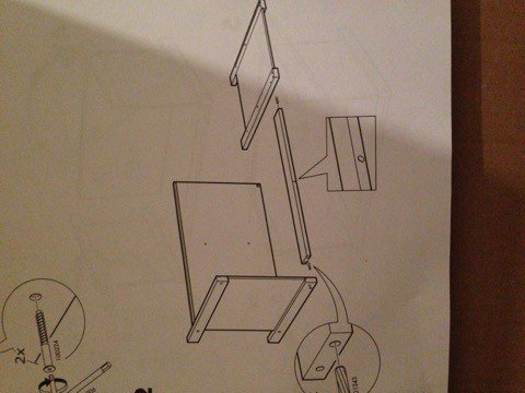
*the hole at middle of this stick
Like this, the stick can be install by both directions, but if you looks very carefully, the hole at middle of this stick shows there is only one right direction to install this stick.
If you miss this detail, you will not be able to join other parts onto it after a long way. (Don’t ask me how I find out.)
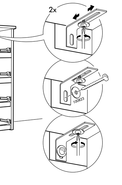
Install the Drawer slides
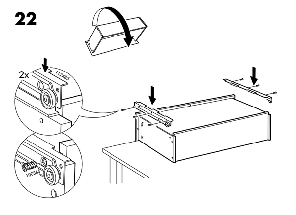
Flip the drawer
This is very typical step when you installing the slides of drawer. You have to Flip the drawer. I didn’t do it at the first time, I thought I’m smart and good enough to work it like usual (just lazy), then I can’t make any more process **because the flip action can not only tell the side of slides but also tell the side of contact plane, that make two pairs slides show exactly the same as pictures and show you which slides are pair and forward to which direction, and help you find from the all four similar slides. **And only in the view, you can easily see where to install the strews. It is just a Flip, the only one right way to install this drawer.
I remember there is a theory in a design book, the only one right way is a protection to user and force user to do it right, in the only one way.
Think more
A Flippable Table Legs
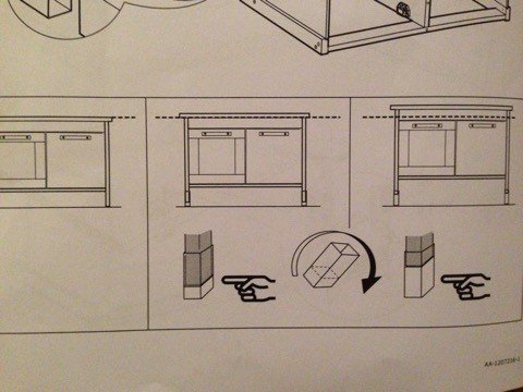
grow up with children
A small detail really touches me when I install the little kitchen for my girls. I found out this part of table legs can flip, and I don’t know why it should be.
Then I tried, it changed the hight of this kitchen. That means when you children grow up and higher, you can just easily make the kitchen grow with them by just flipping the legs, if they haven’t destroyed it at that time.
Hold the Shelf for Children

normal panel in shelf
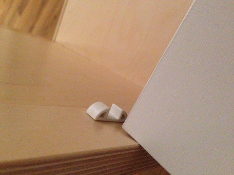
children panel in shelf
There is a little detail of shelf. Normally all the IKEA inner panels of bookshelf are one side fix from bottom. It’s easy to take it away for install and adjust. But this children kitchen’s panels are all two side fix, that means not easily move but better safety.
So there is not really correct way, just more suitable solution.
Nothing is something
Once I design a sports mobile app, we have a problem, If these two teams have never meet before, do we still need to show the panel of “History”or just skip it. Nothing is something, these two teams have never meet before that nothing is information itself. We have to keep the History panel and leave it blank or say “No history before”.
IKEA deal this blank information by using the dotted line. The image braw by dotted line means this thing is not include in the package.
this thing is not include in the package
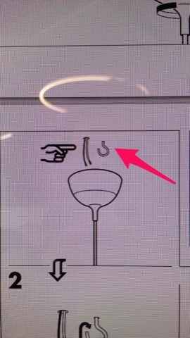
But it confuses me because they didn’t use dotted line for this hook, I have to buy one at last minute I install the light, and I brought the wrong size.
The Darkside
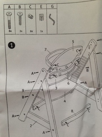
That are some smart things I learn from IKEA and actually just because they design these too easy for user, I didn’t realize how smart they are until I install a children chair, not from IKEA.
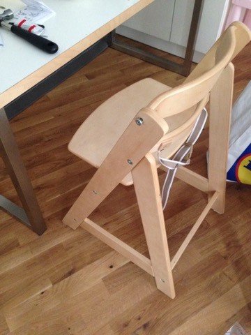
After I installed this stupid chair for four times, I have this idea of writing a article to sing a song for IKEA designer.
stupid chair
The chair is the same style like IKEA. It really can tell that steel idea or style are easy but steel the whole concept is hard.
the introduction is copied from IKEA too, without one word, but only one picture shows one step seems this chair are like Transformers and put itself together automatically.
And without a word but with lots of AABBCC which hard to recognize.
 T
T
And notice this, there are two type screws! The difference of these two are really hard to separate in real world, actually, they are almost the same, not only visually but also functional, they can both install another’s hole!
The only way you can think you may install the wrong screw is when you can’t install it into the hole anymore! Because one is a little shorter than another. And how you find which one is right in this hole you deal with? Noway, you have to uninstall all screws and put them together carefully find out the longer ones and shorter ones.
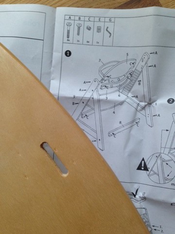
Can you see the gap in panel? It’s a very important information that mark which side should be in front and using that gap to install the safety bell which is the very last step of the whole process. But why can’t I make the safety bell right through the gap at the third time reinstallation? because you can NOT see the gap on the introduction! This key information is blocked!
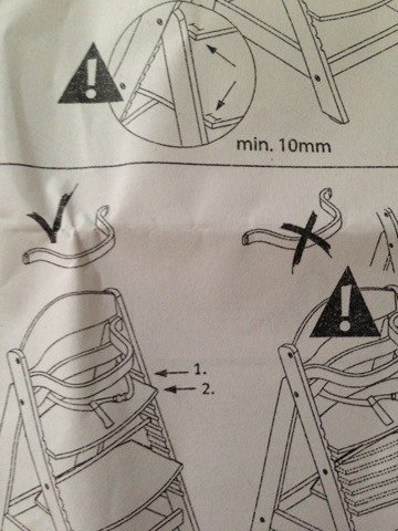
Can you tell the difference between right and wrong? Even today I still can’t find the difference!
Summary
After lots of weekends on these, I finally finished everything, and I found out compare the time IKEA smart designer save for me, this thing I found on the last day of installation, is more helpful, Screwdriver…
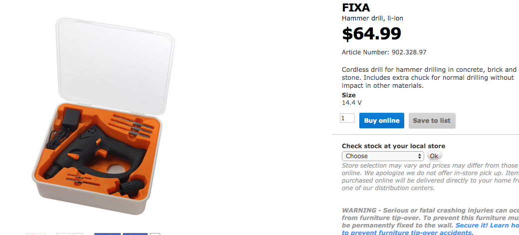
make you life easy
Good article
Following you! I give you a vote!
Congratulations @zhichao! You have received a personal award!
Click on the badge to view your own Board of Honor on SteemitBoard.
Congratulations @zhichao! You received a personal award!
Click here to view your Board
Vote for @Steemitboard as a witness and get one more award and increased upvotes!
Congratulations @zhichao! You received a personal award!
You can view your badges on your Steem Board and compare to others on the Steem Ranking
Do not miss the last post from @steemitboard:
Vote for @Steemitboard as a witness to get one more award and increased upvotes!