You are viewing a single comment's thread from:
RE: Open Source Radio Logo contribution
And here we go again. On what basis do you say the quality aint good enough? It is a logo, it should be clean and simple.
They specificly asked to take the utopian logo as a basis.
Okay, i'll explain
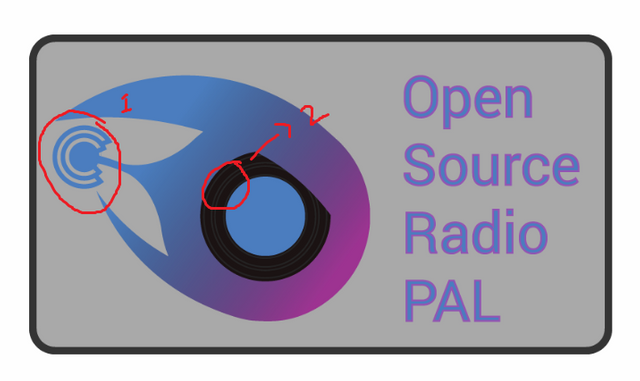
Since when is a radio antenna always straight?
First radio i found on google
Yes those lines might be small. But that is easyly editable. So i don't feel as that should be a reason.
The proof of work is in the original image. You can see that i first added the vinel record. Then i started to play with the antenna. And as the final thing i made it flow out of the logo.
The font is roboto (a free google font).
This is just silly. The hole logo is curved and you are telling me i should straighten the antenna? This is what i call artistic freedom.
If i need to look at others i need to say there are worse things approved.
The font can be downloaded from google itself. It is a free font. And i don't believe i have the right to redistribute it without written consent from google. But everyone can freely download it.