To Adjust the Menu Bar and Tags Bar to the Sides to Enable Full View of Page.
Components
Steemgigs is a new platform that was launched by surpassinggogle for steemians to share their various services, and also make posts relating to it via the steemgigs.org platform
Proposal
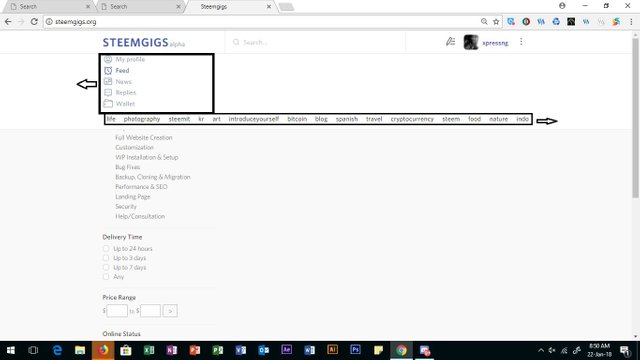
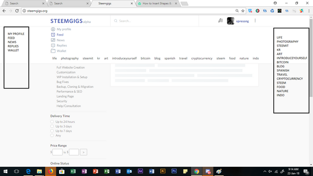
My suggestion is, steemgigs.org should adopt the idea of moving the menu bar and the tags bar to the left and right corner of the page to enable a better view, since these features tend to cover other features on the page.
Mockups / Examples
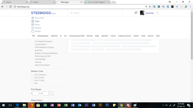
The images below explain the proposal as seen on the platform and how i suggest it should be;
The initial form

What should be done:

The suggested view however;

Benefits
If this is adopted,
- Users of this platform would be able to access a full page view.
- the interface would be easier to navigate through.
- feeds display would be accessed with ease.
Posted on Utopian.io - Rewarding Open Source Contributors
Excellent observation!
Thanks boss
Hello @Xpressng, your contribution cannot be approved because it is a duplicate. Similar suggestion was found here
You can contact us on Discord.
[utopian-moderator]
Hahaha, thank you very much for loving steemgigs and loving contributing. It is overwhelming me touching. Even though, steemgigs is only still a preview and not launched yet. But i will have all these contributions for keeps in the build-up. Read this post:
https://steemit.com/steemgigs/@surpassinggoogle/steemgigs-a-core-aspect-of-our-model-is-steemit-steem-growth
Yea. I could see it's not in its full phase yet and there's the reason for those little error and i trust it would be fixed in no time. Thanks for this development Sir, you have done "surpassingly" well. Thanks for stopping by too.
i sure would read the post too. Have a nice time.