Logo proposed for Steeditor [Task Request]
Repository
https://github.com/jakipatryk/steeditor
Details
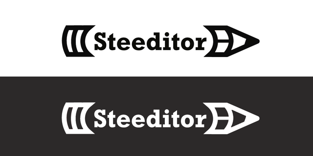
Steeditor is characterized by its simple design and use, so its logo must express the same.
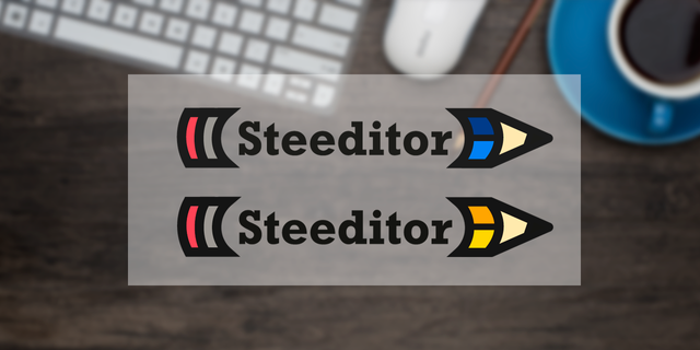
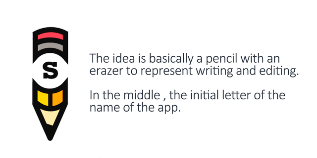
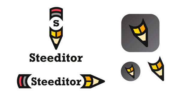
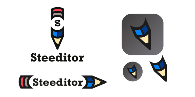
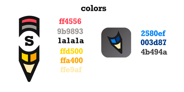
This pencil-shaped logo symbolizes the tool of every writer, which together with the eraser on the other side represents the text edition.
I made 2 versions with different colors.
Presence

Benefits / Improvements
This type of logo, gives a very user-friendly feeling, in addition to giving a fun and professional touch to the app.
Thanks to its flexibility, it can be used in all instances for which it is required always expressing the main idea.
Proof of authorship
Tools
Photoshop CS 5
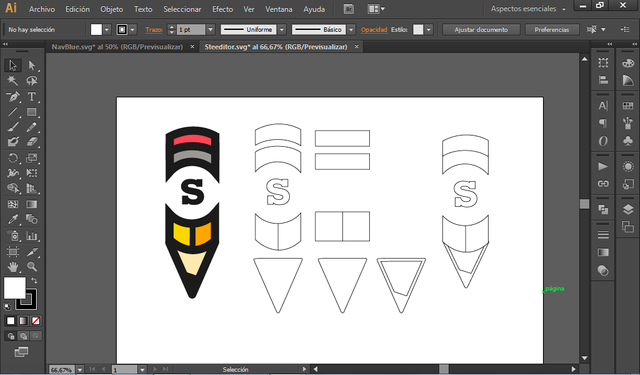
Illustrator CS 6
Original files
Proof of Work Done

This work is licensed under a Creative Commons Attribution 4.0 International License



both of his logos are very interesting to me
Hey @rvilov ,
Thank you for the contribution, I liked your logo designs but only I am not sure about "S" letter. Is it necessary or is it really provide a differentiate.
Your contribution has been evaluated according to Utopian policies and guidelines, as well as a predefined set of questions pertaining to the category.
To view those questions and the relevant answers related to your post, click here.
Need help? Write a ticket on https://support.utopian.io/.
Chat with us on Discord.
[utopian-moderator]
Thanks mod! I thought about placing the logo of steem where the "S" is but I feel that it did not fit the style.
Hey @rvilov
Thanks for contributing on Utopian.
We’re already looking forward to your next contribution!
Contributing on Utopian
Learn how to contribute on our website or by watching this tutorial on Youtube.
Want to chat? Join us on Discord https://discord.gg/h52nFrV.
Vote for Utopian Witness!
my foto
