Hey dee-y,
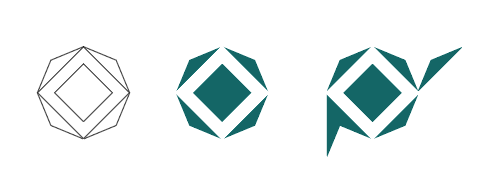
I like the initial version more than the version with "Y". However this is what project owner wanted.
So there are a few things caught my eye, like why did you use a bigger "Y" letter.

And I don't think myriad pro is a preferable font for logo design. And it looks like distorted vertically.

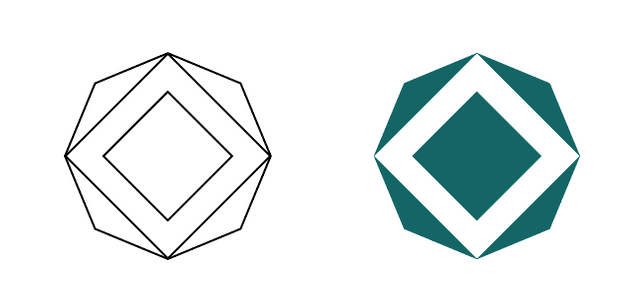
You could create the same shape without all those grids and extra effort with just "4 points star" and "2 rectangles"


Your contribution has been evaluated according to Utopian policies and guidelines, as well as a predefined set of questions pertaining to the category.
To view those questions and the relevant answers related to your post, click here.
Need help? Write a ticket on https://support.utopian.io/.
Chat with us on Discord.
[utopian-moderator]
Thank you for your review, @oups!
So far this week you've reviewed 2 contributions. Keep up the good work!
Hi @oups, i like the first logo too but sadly... lolz. I made the letter "Y" slightly bigger so it is more identifiable as what it is. Thanks for the easy show for quicker work flow 😊 really appreciate that one.