Image Dimensions and 3D 360deg rotate effect with Sass Scss

Repository
What Will I Learn?
- You will learn how to use
translateZ()function and creating distance between the elements. - You will learn why we use
transform-style: preserve-3dcode. - You will learn how to radius at top-right and to bottom-left corners.
- You will learn how to use rotate 360deg. with
rotateY()function.
Requirements
- Any text editor. (Brackets, Atom, Notepad++)
- Basic HTML knowledge
- Basic SCSS code knowledge
- SASS installed.
- Local server (Wampserver)
- Any browser
- Any image to rotate
Resources
- https://en.wikipedia.org/wiki/Sass_(stylesheet_language)
- https://sass-lang.com/
- https://github.com/sass/sass
- https://www.w3schools.com
- http://thesassway.com/
- http://sass-lang.com/documentation/file.SASS_REFERENCE.html
- https://sass-lang.com/install
- https://rubyinstaller.org/
Difficulty
- Intermediate
Description
In this tutorial we will create with sass scss a 3D animated image and it will flip whith mouse. This effect can be used on intro pages or somewhere in your website. If you follow this tutorial download all files from my github page and change your image or size etc. Try to play with numbers that are already defined so that you can learn better. You can use comment mark(/*between this marks*/) to deactivate and test it. With this way it will be more useful for you and understand the codes better.
1- Before you start be sure that you run our sass code in the directory of site files. Our command is sass --watch sass:css. It will translate all codes that you write in scss file to css file. After that, write a basic html file on root directory as index.html and define there a division and also 2 more divisions into first division. Don't forget to give css file path as stylesheet.


2- First as always I define a body style and i use also an image as background. Ofcourse your body will be different but try to use 3D backgrounds also. It will make our work better on visibility.

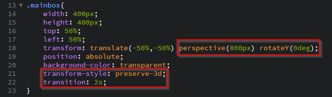
3- Now we can start to style our mainbox (first division). My background color is for now white, When i finish with my work it will be transparent. As width and height i choose to use 400px because my image size is also 400x400. As you know from previous lessons with giving 50% spaces from top and left, and cambination with transform: translate(-50%, -50%) we center our element. Here is also up to you where you want to use your effect. So play with it on your projects to position it.

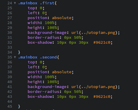
4- Here inside our mainbox division we have two more division and We define here for first one and for second one, positions and their size. After all these I insert my Utopian png to both of them. We need this to give 3D effect and we need more layers, thats why we code same thing twice on different divisions. We are defining border-radius to top-right and to bottom-left corner as 50% its because of our image how it looks. By box-shadow we define only horizontal shadow with 10px and we give as 30px blur effect.
5- Now its time to rotate our work as 360 degrees. Therefor we must be on mainbox class (main division). To do that first we define our transform-style as preverse-3d. After that first we add some more functions on transform code. What we want here is later defining hover effect on mainbox. And this hover will be 360 degree flipping effect. So here as rotateY 0degree will be our starting position. And our distance will be defined with perspective function as 800px. And our delay is 2 seconds.
6- Now we are defining our hover on mainbox and this code is same code as on mainbox class only thing that we need to change is 0deg to 360deg to let it turn. After this step you can change the background-color to transparent and check the work. You will se that it turns but not 3D yet.

7- To give the 3D effect we need to move position of one division back (inside) and other to front. As you know we move object positions with transform code but this time our function will be translateZ() function. It will take the element closer or farther away from the viewer. So 50px distance between two images will be enough to make it 3D. I define 25px -25px for first and second divisions.

8- And finnaly our end work...
Video Tutorial
Curriculum
-Rounded Image With Rainbow Color Shadow Animation with Sass-Scss
Creating a Personal Card with Animation with Sass Scss codes and meaning of the codes
Creating a Contact Form from a simple version to a stylish animated one with Sass Scss
Animated effect and styles for navigation bar with Sass scss
Proof of Work Done
https://github.com/omersurer/Sass-Scss-Tutorials/tree/master/Image_Dimensions_and_3D_360deg
Güzel bir çalışma olmuş...
You have a minor misspelling in the following sentence:
It should be therefore instead of therefor.Thank you for your contribution @omersurer.
Your contribution has been evaluated according to Utopian rules and guidelines, as well as a predefined set of questions pertaining to the category.
To view those questions and the relevant answers related to your post,Click here
Need help? Write a ticket on https://support.utopian.io/.
Chat with us on Discord.
[utopian-moderator]
Hey @omersurer
Thanks for contributing on Utopian.
We’re already looking forward to your next contribution!
Contributing on Utopian
Learn how to contribute on our website or by watching this tutorial on Youtube.
Want to chat? Join us on Discord https://discord.gg/h52nFrV.
Vote for Utopian Witness!