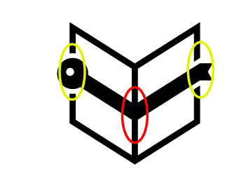
Hi @realinfo, thank you for your contribution. it is really nice that you always try to combine the literal aspects in your design and make it as simple as possible. in this case, since the name of the project is bookworm, you make a logo that is a combination of book and worm. however, you got to remember to make the elements simple yet recognizeable.
The worm part actually doesn't really looks like a worm, in my opinion it looks more like a bended key and i am not really sure 'worm' is the first thing people would guess when they see the logomark. the point is the elements is not easiy to recognize.
Another thing is i don't understand why you made cut outs on the left and right side of the book and left the middle one with none.
Talking about your presentation, overall i really like it. one thing though, mock up means a model or replica used for instructional or experimental purposes.
above image is not a mockup, it's not a model that can show how the design looks in real life when being use.
Your contribution has been evaluated according to Utopian policies and guidelines, as well as a predefined set of questions pertaining to the category.
To view those questions and the relevant answers related to your post, click here.
Need help? Write a ticket on https://support.utopian.io/.
Chat with us on Discord.
[utopian-moderator]
Thank you for your review, @nilfanif! Keep up the good work!