Thank you for your contribution.
First of all, i personally wouldn't call it a logo, the final concept looks more like just an icon than a logo. and the logotype that you provided seems unpolished, it looks like you just put a word kumo next to a basic cloud icon.
The shape is soo basic, as you can see if you put the logomark alone, it look more like an illustration of a cloud than a logo
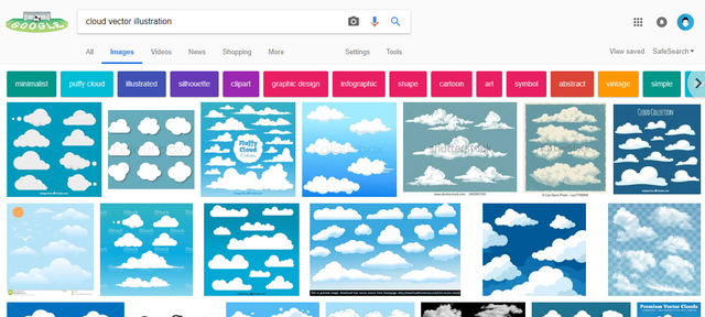
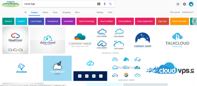
see the different when i search for keywords "cloud vector illustration" and "cloud logo".
in "cloud logo" result you can see a lot of clever design with some unique elements that can make that logo unique to that particular product and make it more memorable.
Your contribution has been evaluated according to Utopian policies and guidelines, as well as a predefined set of questions pertaining to the category.
To view those questions and the relevant answers related to your post, click here.
Need help? Write a ticket on https://support.utopian.io/.
Chat with us on Discord.
[utopian-moderator]