You are viewing a single comment's thread from:
RE: Logo Design Proposal for Wifi-Wand
Thank you for your contribution.
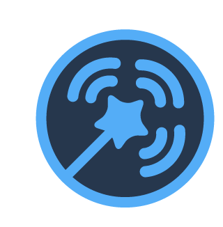
The gap between some elements are not consistent.
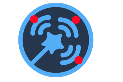
Bellow i try to fix it, the gap is not perfectly tha same but the difference is more subtle.
Your contribution has been evaluated according to Utopian policies and guidelines, as well as a predefined set of questions pertaining to the category.
To view those questions and the relevant answers related to your post, click here.
Need help? Write a ticket on https://support.utopian.io/.
Chat with us on Discord.
[utopian-moderator]
Thank you for your review, @nilfanif!
So far this week you've reviewed 12 contributions. Keep up the good work!
Thanks for your moderation @nilfanif.