STEEMPUNK-NET - MMORPG on STEEM - User Interface Suggestions For Housing Concept
In my previous posts I talked about inventory screen, character screen and attributes screen suggestions for the @steempunknet game. If you are not familiar with the game yet, here are some useful links.
Quick overview of the game and how it works
Components
In this post I will be showing some suggestions for the user interface of the housing screens and how it could work. Keep in mind these are only my suggestions as a beta tester for this game so there are no guarantees that any of this will be implemented into the game. So this is my DISCLAIMER to the readers of this post, that there is no guarantee that any of these ideas will end up in the game.
Proposal
Everything suggested is based on the housing concept introduced by @jedigeiss here https://steemit.com/steem/@steempunknet/steempunk-net-housing-concept-draft-finished-test-steems-mmorpg-today
Below are diagrams and explanations of how the housing users interface could be designed.
For reference these are the items I used in my mock up screenshots that were needed as presented in the housing concept. Some of these I created because they are not yet used in the game.
Mockups / Examples
Housing Screens Menus
So lets look at the main housing screen menu.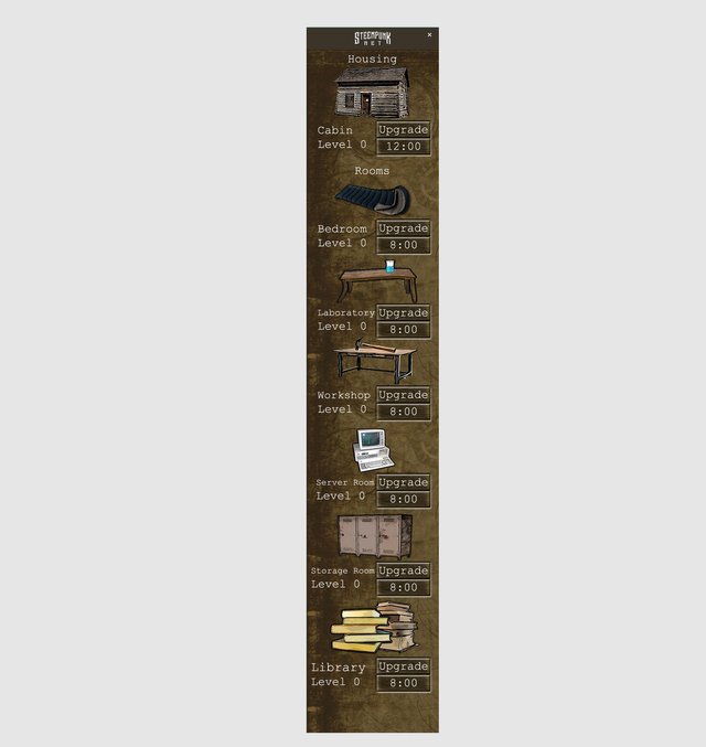
As you can see it is a simple menu as described in the housing concept, below is a diagram explaining each component.
As you click on the icons the window expands and reveals the user interface for each section. Below you can see the menu that opens when you click on the house/cabin icon.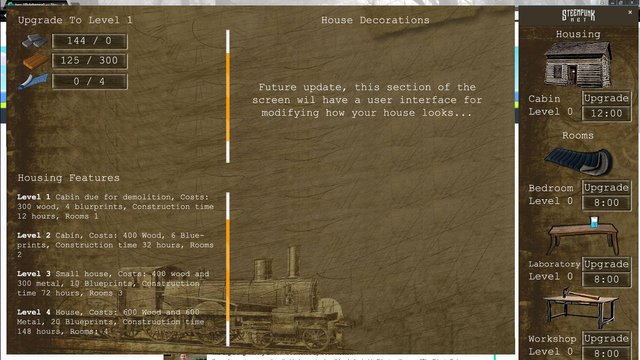
Below is a diagram that explains the user interface.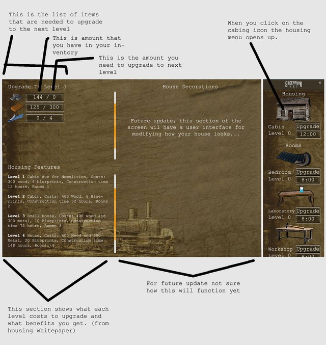
Basically all the menus are very similar to each other, below is a screenshot of the Bedroom menu.
Now lets look at the Laboratory, the rest of the menus will be slightly different because the rest of the rooms allow crafting abilities of in game items. So the laboratory menu screen is divided into 4 sections as can be seen below.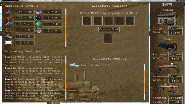
Now lets look below at the diagram of the above screenshot which explains what each section is (you may need to open this image in a new window to see it full size).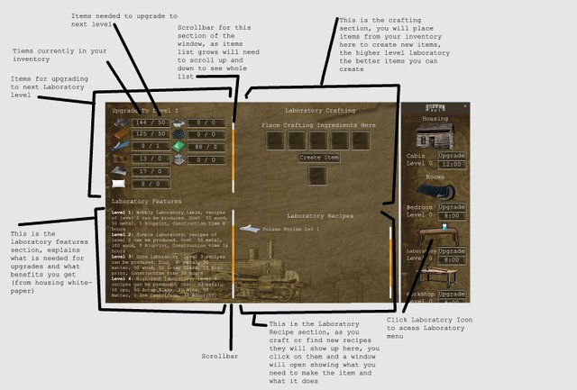
That is basically it, I do not have screenshots of the rest of the rooms because the user interface of those will function the same way as the Laboratory screen. The only thing that will change is the items used and descriptions as written in the Housing Concept.
Benefits
The crafting system is not yet fully explained in the housing concept but this user interface should work well once the rules for crafting of items are decided. As in my last post, these are just more of my suggestions I think would be fun to add to this game. This is a pretty easy to understand user interface that will add lots of items and variety to this game. Once again keep in mind that these are simply my suggestions and ideas as a beta tester of this game and there is NO GUARANTEE any of this will be implemented in the game.
Here is the latest update of the game by @jedigeiss
https://steemit.com/steempunknet/@steempunknet/steempunk-net-update-no-12-new-steem-api-art-contest-started-dev-housing-english-german
Posted on Utopian.io - Rewarding Open Source Contributors

Your contribution cannot be approved because it does not follow the Utopian Rules.
You can contact us on Discord.
[utopian-moderator]
but i am Aristocrat, I want to live in a skyscraper. coks coks
Amazing work
@jillfeint we have our own cities in the sky!
hehe, maybe you can build a skyscraper in the House Decoration menu in a future update ;)
i am poor to build
nice man, I think it looks great! I can't wait for the housing to be rolled out!
Fantastic!
I want to buy a library...right now!!! :D
Thanks :)
I was visiting the @steempunknet page for the first time and I got wood! Guess I'll have to wait to use this for housing? Nice work @dksart! Excited to join the steempunknet community.
haha, yep :)
i think this is a good idea