Visualizing US gun violence data using Cartograms
link to the github repository with the jupyter notebook and other files
https://github.com/chandrashekarka/GV_Cartograms
What are Cartograms ?
Conventional maps are 2D projections of our 3D planet which tries to preserve both the area and the angles to best of their abilities. Conventional maps don't care about the population density of the region or any other quantity. For example if we were to mark incidences of a particular disease on the map by marking points where the cases were reported it might show a large density of points in urban areas. This can mislead people into thinking particular disease is more prevalent in cities when the large density might be entirely due to higer population densities in cities.
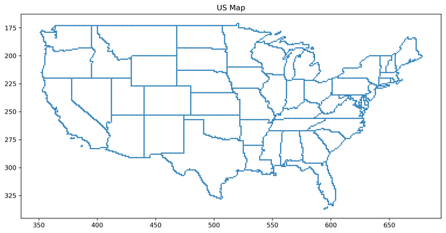
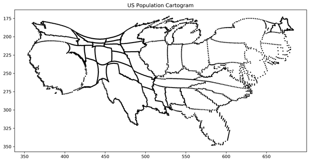
Fig-1 : The above figure is a normal 2D map of USA and the bottom image is obtained by plotting the transformed coordinates of the state boundaries. (Source: Created by me using matplotlib using the data from Mark Newman's website)
Cartograms also known as value-by-area maps, density equalizing maps aims to achive this by creating 2D Maps that can stretch and squeeze regions of the conventional map in order to make sure the density of a particular quantity of interest (example : population) is uniform all over the map. There are many methods to create cartograms and some work better than others but all of them have some limitations. In 2004 Michael T. Gastner and M. E. J. Newman of University of Michigan in their PNAS paper titled "Diffusion-based method for producing density-equalizing maps" proposed a method which is quite simple in terms of underlying mechanism yet overcame lot of the problems previous methods suffered from.
Let us consider what this method does with the specific example of population cartogram (Fig-1). We represent US landmass on a square grid, in this case 512 * 1024 array where any point belonging to a particular state is assigned the population value corresponding to the state it belongs to. We need to embed the US landmass inside an "ocean" (see Fig-2), where all the values corresponding to the ocean are assigned average population value. The method lets the population diffuse out from regions of higher concentration to regions of lower concentration and finally obtain the cartogram by obtaining the transformed positions of all the state boundaries. All the code required to do this and US population data in the program compatible format can all be found here on Mark Newman's website.
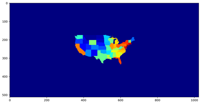
Fig-2 : 512 x 1024 array where the US map is embedded. One can see the "ocean" surrounding the landmass, which is critical for the method to work. (Source: Created by me using matplotlib using the data from Mark Newman's website)
US Gun Violence Data
I came across a data set on US gun violence incidents between 1/1/2013 - 3/31/2018 on kaggle. The data contains 239677 events and 29 attributes corresponding to each one of them.
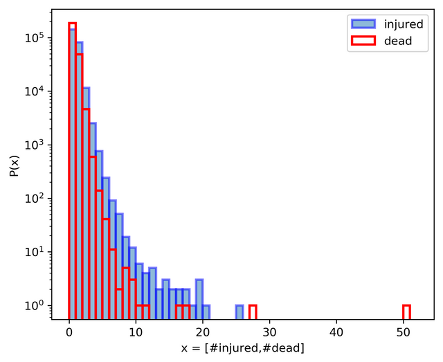
Fig-3 : Histogram reprsenting the number of people injured and number of people killed for all the 239677 events (Source: Created by me using matplotlib)
The data set is interesting enough to analyze it in detail but my intention here was just to create cartograms using three different measures, total number of events in each state, total number of injured in each state and total number of deaths in each state. Here are the three cartograms corresponding to each of the 3 measures,
Number of events in each state

Fig-4 : Cartogram based on total number of events for each US state.(Source: Created by me using Matplotlib)
Number of people injured in each state

Fig-5 : Cartogram based on total number of people injured for each US state.(Source: Created by me using Matplotlib)
Number of people killed in each state
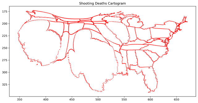
Fig-6 : Cartogram based on total number of people killed for each US state.(Source: Created by me using Matplotlib)
Conclusion
One can see that Cartograms can be very effective tool in visually conveying some information where pie-charts and other simple tools might not do enough justice. I urge you all to download the codes from Mark Newman's page and use it to visualize interesting data. Thank you for reading.
References
- Gastner, Michael T., and Mark EJ Newman. "Diffusion-based method for producing density-equalizing maps." Proceedings of the National Academy of Sciences of the United States of America 101.20 (2004): 7499-7504.
- https://www.kaggle.com/jameslko/gun-violence-data
- http://www-personal.umich.edu/~mejn/cart/
Hi, and welcome to Utopian.
Your post is very informative and interesting, but, to be considered to receive Utopian rewards, you must have some things in mind:
All in Utopian is about open source projects. For this reason, is very important to create well structured and clear repositories in Github. You have linked this repository, but, to be honest, is very difficult try to understand what is the project about and how to use it. Information in your repository must be clear. Please, consider to add a README file with information about the project, how to use it and with some instructions to allow other users to use it. It's important to add a valid license too.
This is your first post about this project. So, it's very important to create a very complete introductory post. Your post is very interesting, but there is only some information about cartograms usage and concepts. There is no information about your open source project. Focus on your project, explain how it works, used technologies, roadmap.
We will always be ready to support your contributions to the open source community. Take a look to the guidelines, and welcome to Utopian.
Need help? Write a ticket on https://support.utopian.io/.
Chat with us on Discord.
[utopian-moderator]
Thanks a lot. Will follow the guidelines better next time.
All-In-One BidBot with 20% ROI!
You just got a boost courtesy of @bidbot.wallet, via @bid.bot and @boomerang. I am the All-In-One, Upvoting and Anonymous Flagging BidBot.
I can calculate the most profitable bids for the best bidbots out there, so you don't have to! Place your bids via https://bidbot.me.
This post has received a 9.77 % upvote from @boomerang.
Upvote this: https://steemit.com/free/@bible.com/4qcr2i