I think there's too much information from the picture and the background overlapping with the Steemit logo looks chaotic for my taste.
I'm not sure if borrowing the hero logos would be a good idea since it powers down originality. Perhaps a drawing /logo with unfamiliar heroes?
My two cents.
Here is second idea, more simple :)
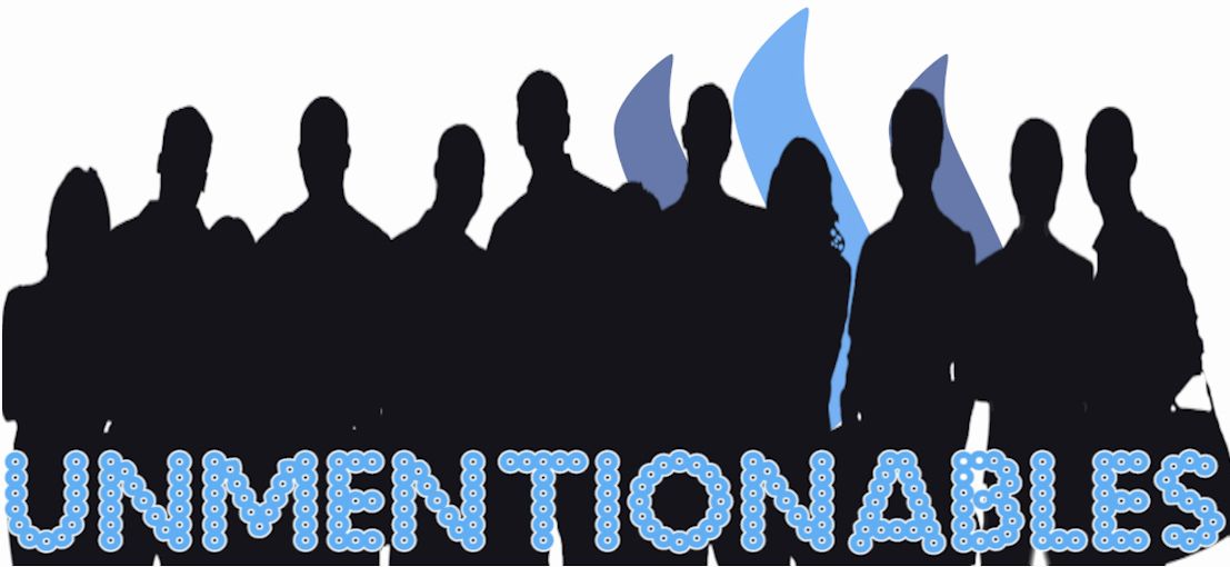
This one's better , but really not there yet. Pure black also's too dark.
Something about the "Unmentionables" I can't put my finger on. can you try some other fonts for the Unmentionables not using the bubbly font?