Small changes lead on to big
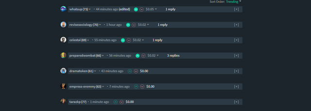
I am not sure if I have missed this earlier somehow, but tonight the Steemit.com UI has put a bar in the comments section and allows the collapsing of comments.
So then it looks like this if all are collapsed.
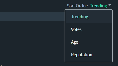
I went to PAL and they have it too, minus the more obvious bar. I am not sure how both platforms got it so fast, but it could be that both have always had it and I am blind :D I like the bar itself but I think it would be better if there was an additional couple of features I will mention. But first, I rarely have used this sorter on comments, but I also noticed this:
Are there more options? I remember Trending and Age, but don't remember Votes and Reputation. I haven't used it for ages though and forget that it is there but it is a handy feature if getting lots of comments.
What should be added in my opinion is a "collapse/reveal all" option to make scrolling easier on the posts that get a lot of comments and, a "memory" that remembers what has been collapsed, at least while the browser is open. I am not sure how possible the second option is, but the first with a collapse/reveal button shouldn't be too stressful to integrate.
I was commenting on @juliakponsford's post asking what people want to see on the PAL trending and mentioned how many little tweaks and experiments are going on all over the Steem platform. In my opinion, it all adds a lot of value to the ecosystem, even if some of the tweaks don't work.
One of the benefits of having decentralized experiences that can have variants of tweaks to UI, UX and economy through native tokens is that a great deal of testing and learning can be done that distills and distributes through the community and acrocc platforms. This adds a change dynamic as well as competition but, still ties everything together for collaborative open-sourced growth.
What I am hoping is that in time there will be more customizable view options to tweak interfaces in ways that best suit the user for not just filtering, but layout of content. I would like to be able to have plugins for something like @steemworld so that I can get vital statistics shown live and a quick link to the full experience. Feeds for alternate fronts, a comment feed plugin perhaps that allows for answers straight from it like @arcange has created and the like.
This way, there could be bundles to set up a range of layouts and then a user can customize further. Not only this, various experiences could be integrated into the one page and if they each are tokenized on something like @steem-engine, be used from a central interface. Some of the apps could charge a fee for their use or, a fee for their premium app, others could aid in integrating to make user experience more seamless.
at some point, the design component of the UI has to start developing clean and functional designs so that people can use intuitively without having to learn much. Most of the design has already had experts create it on other platforms - go steal it and open source it all.
Anyway, this has been longer than I intended, but while some people scoff at these tweaks, I am glad that these small changes are happening as it keeps things ticking over and people exploring and finding aspects they might not have utilized earlier.
Taraz
[ a Steem original ]
Edit: it seems the collapse has been there for a long time, I just haven't used it :) a little tweak in UI makes a difference.


Are you thinking about something that would act as a dashboard and you can add the "extensions" you wanted based on need?
something like that. Would be nice to have a drag and drop dashboard with apps that can fit into various space sizes, like setting up a phone.
I had a Mazda 626 when I was teenager. Drove it around for quite awhile before I noticed the button. It didn't really look like a button. It wasn't around any other buttons on the dash. Just there, all by itself, not looking like a button. One day, I was reaching across, for something. Accidentally hit the button. All the vents blowing out that cool crisp AC started moving side to side.
I am not one of those people who go and press every button before using something, I get to where I can do what I need to do with a tool fast and then slow down and lets things arrive as they do.
One thing that I think should get some tweaking is how comments and replies are presented. on the longer chains I find it difficult to read.
The Mazda 626 was not bad. I had a 2005 Nissan Bluebird - but fancier was my first car - a plum Nissan Micra.
The art program I use has hundred of features I've yet to try, and some of those buttons I use incorrectly because I get cool, personalized effects. That helps when you want your stuff to be different.
I bought four new tires and a car with them, for my first car, which was an 85 Pontiac Parisienne. That was like driving a living room. I miss those big comfy seats. Then I got the Mazda, which was also an 85. That thing was fast for a 4 cylinder. Then my first new car was a 98 Chevy Cavalier. I liked that one the most, worked on it, made it fast, but not loud.
@tarazkp I feel that I absolutely have to take part to this conversation with you two to mention a thing that either of you probably have no opinion or interest in. But I do it anyway because I'm self-centered and like to talk about myself.
My first car was Ford Fiesta that I inherited from my bigger sister. It was an old car when I got it and it did not have lots of buttons in it which is a good thing because I'm the type of person who absolutely has to press and click every button, open all doors, hoods and compartments and search every place before I can start driving a car / using a website / using the device. And buttons in gadgets, those are simply irresistible to me. I press them several times just to make sure what it does if it does anything. And if it says: "Do not press this button!", I demand an explanation or I will press it to see why it shouldn't be pressed.
This is the number one reason why people have thought of killing me.
– WHAT DID YOU DO?!
– I broke it.
– WHY!?
– I pressed the button that said do not touch because it didn't say why. But I broke it so I'll fix it.
For you:

ngnh..
hngh...
I...
has..
to...
.
.
.
NOTHING!
No, it's working. I can tell because it's a Nothing Button.
looks like the logo on the underwear my wife wears.
I uh... I wouldn't know anything about that.
I don't know much about it either....
you are home.
My daughter has done this since about 1 yr. She presses things then looks around for what has happened and then keeps pressing until she has it figured out. Doesn't get it from me - maybe her real father.
We are emotionally the same age. Me and her. Oh, and I think your daughter is going to be an engineer when she grows up.
Always when talking about real fathers there's only one thing that can be done:

I wonder when this gets old. In my head.
Yes! No fear of old jokes getting too old any time soon then.
And one more thing: you better contact ESA soon. That they are going to get an awesome pilot in a few years. There's only a small step from being an engineer to a space pilot. Considering who her father is.
I'm living the dream.
I say it to my daughter all the time, mostly to reassure myself.
@fredrikaa, can you get my daughter a foot in the door at ESA? :D
Direct-messaging. Partiko introduced it on their Android app (but not on iOS unfortunately).... so I haven't had the chance to try it and see how well it works.
That would be bloody awesome.
I think you have hit the nail on the head by simplifying it this place will be less scary for someone new. There is so much to take in and with the addition of all the various apps a simpler smarter way to work should be on everyone's thoughts.
While there are plenty of tech people here, there aren't many UI or design exports it seems. They will arrive too.
And the best part: it was a community initiated change to the UI :-) More are coming!
Good to hear. Long reply chains need a UI tweak - not that there are many of those here :D
I felt compelled to add add least one more comment here so we formed a proper comment chain.
me too.
:’)
Posted using Partiko iOS
Been there a long time bud ;) The hide of comments longer than the 2 additional sort options I think ;)
That is what I was asking @abh12345 and he was unsure also.
The bar has definitely not been though... right? :D
So they coloured it in and now I see it? :D
The hyphen to collapse has been there for around or at least a year I'm pretty sure.
Goes to show what a UI tweak can do though :D
i have no idea, i feel it was not there, i did not use it for ages. and for sort order i feel there was reward and date (2 options for sure, not sure for the names of them)
yeah, I only remember two option in that list. Newest was one of them - perhaps :)
or maybe created :D
Lol
Posted using Partiko Android
Hello @tarazkp, thank you for sharing this creative work! We just stopped by to say that you've been upvoted by the @creativecrypto magazine. The Creative Crypto is all about art on the blockchain and learning from creatives like you. Looking forward to crossing paths again soon. Steem on!