Typography – Part 4: Internalize the essence of fonts – stroke by stroke.
Hey steemers!
When I went to school we had to draw fonts – as strange as it may sound today. We had to draw them and get to know them in every single detail before we were allowed to hit the power button of our Mac for the very first time. It was literally the dry run before we were allowed to swim.
I’ve spent months learning about the history of fonts. Sketching and drawing them was our daily bread. We did complete layouts incl. headlines and paragraphs only with the use of a pencil. I’m not sure if it is still taught today at school, it would be a pity if not.
An example of 2 headlines, hand made incl. the font name.

I think this is a very essential part of your education on your way to become a designer. You have to internalize the basics and the principles before you start to actually work or start to make designs. Everything else makes no sense to me. You need to develop a relationship with the fonts.
-/ Typography is the staging of the language.
And therefore very emotional.
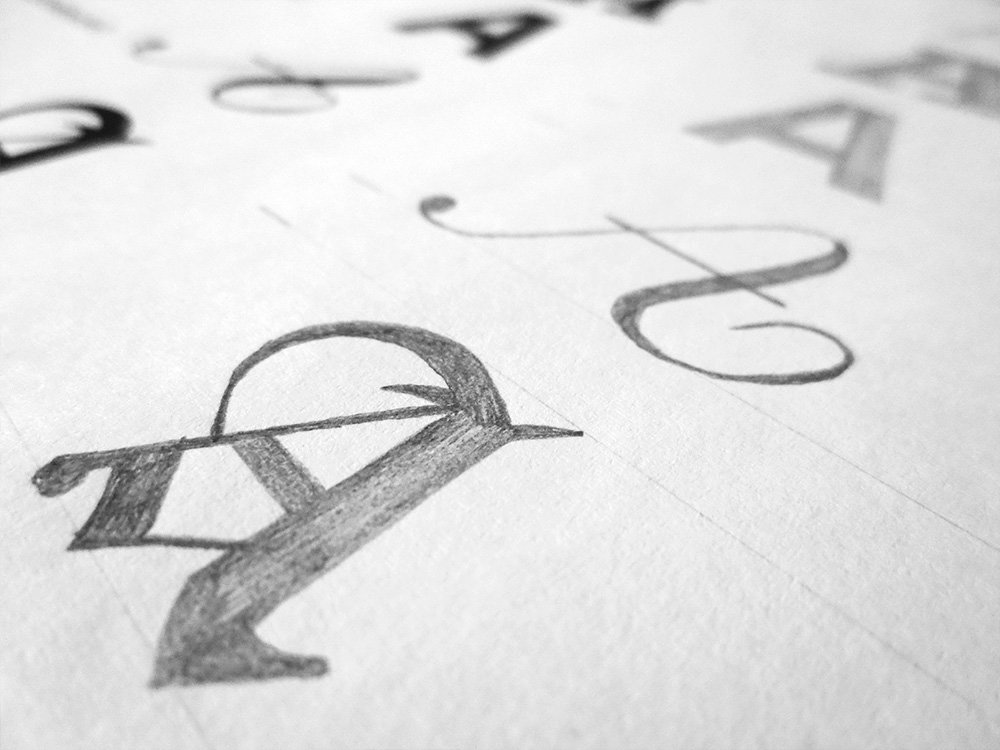
If you come to learn more about fonts and how they are made you’ll probably stumble upon a very cool technique, it’s called the „Stroke-by-Stroke technique“. In doing so every single stroke is gently set next to each other until you reach the right size and the shape of the letter is formed. Permanently compare your sketch with the original. When you’re finished you use a sharpened pencil to retrace the outlines and intensify the edges and acute angles.
A model (on the left) and the technique to develop the letter, stroke by stroke.

In the following I’ll show you some examples. All created with the stroke-by-stroke technique.
Believe me: You’ll get a very deep understanding for fonts in general and build the so much needed relationship with them. You’ll look at them in a different way by the day you had to draw them by hand. Needless to say you’re not allowed to use a ruler, only for the aid lines.
It's not only about creating a flawless copy though. Even if you're not Leonardo da Vinci (I'm bad at drawing myself) it helps to develop an understanding for this subject. Please forgive me any variations, these are some of my very first drawings, I did my best:). We all have to start somewhere. The key is to start.
1. Capitals
you can see and learn the basic differences, even better when you draw them!:)


2. An entire alphabet
sorry I can’t remember the font; that was a huge task!:)
Left original / right drawing


3. Different font groups/classes


4. Different fonts


Language can be very emotional and a good designer should be able to bring that onto paper as well, with the use of fonts. Before you are able to do that you need to develop a certain understanding about fonts, how they are made, what makes a single font-face special and so on. I’m happy that I learned so much about fonts before we started to do designs and layouts, you have a totally different starting-point and you judge designs in a different way. I believe you’re not able to do proper layouts and designs without a deeper understanding for fonts. Period. As soon as you know about the details and characteristics of a font you chose them very carefully – and that makes a good design.
If you are into handwriting this could be a very good point to start from. It's definitely good to know the basics before you can start being creative. Maybe it helps.:)
Thank you very much for your attention.
To be continued...
If you missed the previous parts, they can be found here:
https://steemit.com/typography/@sascha/typography-part-1-the-evolution-and-origin-of-typefaces
https://steemit.com/typography/@sascha/typography-part-3-the-anatomy-of-typograp
Excellent post bro.... I'm in the construction field and when I free hand my designs my chicken scratch is worse that hand written doctors note!
Thank God for AutoCad :)
Thank you @masterline! When I'm in a hurry and make some quick notes, no one could ever decrypt them :) Seems everyone has his/her own secret hand writing, especially doctors :)
@sascha always gives a great impression of the depth and intricacies of calligraphy
Thank you very much @thebeachedwhale!
I'm loving this series. Keep up the great work!
Thank you!! I'll do my best :)
Thanks for this and your other related posts. I really find them fascinating. I'm aging myself by saying that I worked in a "type shop" when I first entered the workforce and fell in love with fonts and typography. Then along came the Mac, which I bought shortly after it's release, and told my co workers that this was going to change our industry (pre-press and printing). They laughed at me but I had the last laugh because I embraced desktop publishing and enjoyed many promotions while those who clung to the old methods of pre-press soon found themselves either being trained in the new technology (by me) or showed the door. It was an exciting time to be in that business! Well, anyway... That's a very long way of saying I appreciate your posts. You provided many insighst into the world and art of typography that I never stopped to learn while I was in the thick of meeting deadlines.
Hi @tamiji! Wow, thank you very much! I'm very happy to see my posts are appreciated and it is fascinating for me to meet and talk to people who worked in the pre-DTP era, that's really awesome! I bet it was an exciting time! Thank you very much for this little insight in your life and experience!
Hey! Great series! I'm really excited to see type fans on steemit. Check out our fonts, I'd love to see what you think. We might hold the record for number of fonts made! Www.tiny.cc/xerographer
Great series, as a graphic designer im very happy to see that art community is growing little by little in steemit :) keep the good work!
Hi @martaxrodriguez! Thank you very much, great to see the number of designers here on steemit is growing!
I'm not a designer by any means, but as a "consumer," I adore typography. It's my design-of-choice when it comes to home decor, invitations (my wedding invitations' design was simply typography, no other illustrations), and even jewelry. This was a cool post - thanks for sharing!
And that was very cool comment @cehuneke! Than you very much!:)