Typography – Part 3: The Anatomy of Typography
Hey steemers!

Today we’ll take a look at the details of a font, the single components of the letters.
There is no all-embracing book which includes all available types, there are simply too many fonts in existence. You won‘t find a single typographer to know all of them and if you come to know at least 20 to 30 by name you are already considered an insider. Different font styles and warping of fonts create additional difficulties. That’s the reason why it is advised to look at specific characteristics and get to know the fonts better with the help of these.
Actually it’s surprising how a few fonts came to stay for years, decades or even centuries. The ‘classics‘ shine with timeless elegance and shapes brought to perfection. Recreations often don’t put the same power to paper or fall against fashion trends – and there are plenty of them.
The term ‘classics’ is understood to mean these type of fonts which already filled the set-boxes in times of lead typesetting, not quite a few as well. ‘Classics‘ are of course fonts like Garamond, Bodoni and Times and many more mentioned in the last post, Part 2.
A first rough differentiation
It’s possible to make a first rough group of categories:
- Serif fonts (Antiqua)
- Sans serif fonts (Grotesque); ‘sans’ means ‘No serifs‘ (latin: sine = without)
- All other fonts
To differentiate Antiqua fonts and Grotesque fonts within their own category can be really hard sometimes as they have partially close resemblances. The other fonts are very unconventional creations and are not used for paragraphs and body text. That’s why it’s very easy to differentiate these hundreds of ornamental- , title- , script-, fraktur- and correspondence fonts.
A finer differentiation
Knowledge about fonts is only acquired through an intensive and dedicated study and view on fonts. A magnifier is very useful to identify the necessary characteristics because the devil is in the details. You practice with the use of printed products or laser prints by comparing them with font pattern books. Beginners will need a collection of writing samples which they can organize and extend. A conscious grahpical view of the environment sharpens the view for fonts as well. Ask yourself what fonts were used as soon as you see a poster, a sign, a mailing, whatever it may be! You’ll feel greater security step by step.
To be able to differentiate single fonts we have to deal with the details. The aesthetics of the fonts is hidden in the shape of the letters. A beautiful grace, sweetness and richness of forms is revealed to the viewer.
Examples of different types of serifs:
Normal (e.g. Garamond)

Thin (e.g. Bodoni)

Accentuated (e.g Rockwell)

Sans (e.g. Helvetica)

That alone already helps to categorize a font, in this example: Antiqua or Grotesque, serif or sans-serif. Not only the form itself but also the interrelation between forms and interspaces, the play of single forms and shapes, irregular ups and downs of ascenders, everything counts up and makes up the font, makes something special and shows the true nature of what we have here – a piece of art. A very skilled eye is able to call the font by name without looking at all the details.
Detailed typological nominations
they help to classify and differentiate fonts (doesn’t matter if serif or sans-serif)
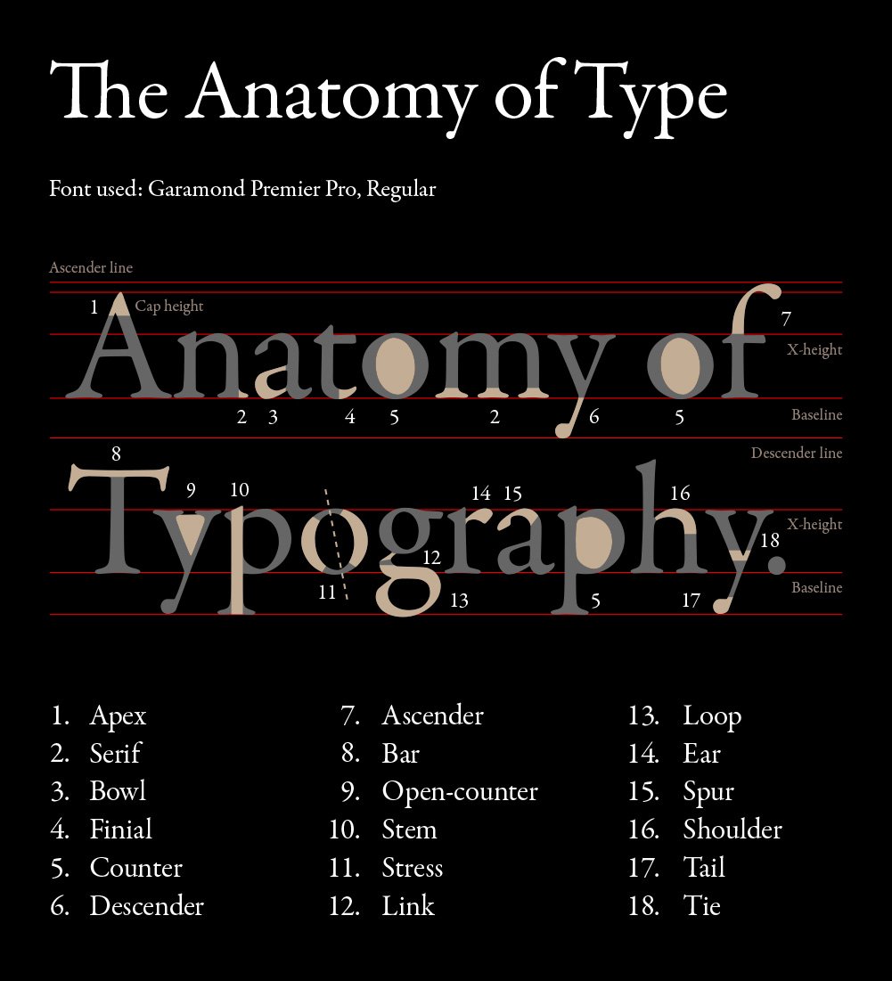
With the help of these you’ll be able to determine not only a group or category but even the font itself. Whether serif or sans serif doesn’t matter, the nominations are identical.
If you work with fonts and study them you’ll get a good eye for it and it’ll be easy for you (if you practive long enough) to determine a font. Golden rule: Learning by doing. As always :)
Different impressions arise depending on how the details of a font are designed. The creation of a font requires highly artistic skills as you can see and was reserved for only a few individuals back in times. Computer aided digitization (not drawing) is no longer a big deal from a technical perspective. However that’s the reason why fonts are made that are not entirely finished. That happens when the designer does not have this specific ‘ingenious idea‘ and makes copy no. 25 of a font. That’s again the reason why computer technology brought us dozens of similar and ordinary fonts what makes the differentiation itself nearly impossible. In the 60’s a grown typesetter was able to differentiate most of all fonts – an impossible thing to do today.
Thank you for your attention!:)
To be continued …
Interesting stuff
Thanx for the great post..look forward to the next
Thank you @merlinscat! Happy to hear!
Have you seen the movie Helvetica?
@ericbotticelli Not yet! On my to-do list :)
WOW it is like learning a sub language to use language haha interesting stuff indeed. While I was reading this I couldn't help but think that when writing first came out one had to be very rich to afford to do it so it was like artistry. The artisan would take great care to craft each letter eloquently and perfectly as it took so much effort back then to learn to read and write and then be lucky enough to afford materials to write with. It makes me feel lucky to just have it all basically for free and at the mere touch of a button, minus some serious artistic flair. But I suppose we can make up for that in being able to express ourselves more flexibly and quickly.
Hi @onesunbeingnow! Absolutely. It's common nowadays to share fonts for free. e.g. Google fonts and AdobeTypeKit make them easily accessible and available. But the good ones are expensive. Not even Helvetica is for free: The family pack which includes all available font faces is about $1300.
WOW that is a lot for fonts... 0_o For that price I could pay for lessons to write them for real hahaha XD
Awesome, I had always wondered how fonts were created. Now this confirms that only a skilled artist can do it. Thank you!
You're very welcome @efrageek! Happy to help.
Please do a post about wingdings :)
Thanks for this very useful series on typography. By the way, will you be reviewing Arabic (Persian) script fonts, too? Being a Persian, I am very interested in typography and its history.
Hi @ghasemkiani! Nothing planned so far, it is a very interesting topic though, we'll see, no promises :)
This is really interesting and informative. I'm trying to get into hand lettering, and need to learn more about this stuff!
Thank you @theblondepoptart! All the best! Can't wait to see some of your work :)