Basite indirgenmiş Teknik Analiz dersleri-3: MA(Hareketli Ortalamalar)--Baseline reduced Technical Analysis lessons-3:MA (Moving Average)
Hareketli Ortalama (MA):
Hareketli Ortalamalar (MA), geçmişe verilere dayanarak belirli sayıdaki fiyat verisinin ortalamasını hesaplayarak şu an ki fiyatı göstermeye çalışır. Grafiğin ana çalışma mantığı aritmetik ortalamalar alarak hesaplamalar yapar. Bu hesaplamalarda hangi zaman dilimi için ya da ne kadar geriye dönük veriler için hesaplama yapılacağına yatırımcı karar verir. Bu sayede fiyatın geçmişe fiyat ortalamasına bakarak nasıl bir trende doğru ilerlediğine karar vermemize yardımcı olur. Yani yatırım yapmak istediğimiz yatırım aracı şu an eski ortalamanın altında mı yoksa üstünde mi hareket ediyor. “Artış içerisinde mi yoksa düşüş içerisinde mi?” sorusuna MA grafikleri ile cevap bulabiliriz. Hareketli ortalamaların birkaç çeşidi mevcuttur. Biz en çok kullanılan 2 tanesini biraz daha açmaya çalışalım.
1. Basit Hareketli Ortalama (SMA):
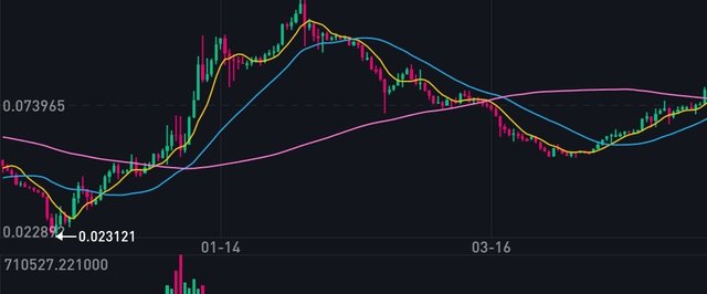
Hareketli ortalamaların en basit ve hesaplaması en kolay halidir. Bu ortalamada verilerin tamamının hesaplamaya etkisi eşittir. Yani ilk seçilen verinin ağırlığı ile son seçilen verinin ağırlığı eşittir. Seçmiş olduğunuz zaman dilimindeki tüm verilerin toplanarak veri sayısına bölünmesi ile elde edilir. Daha önce dediğimiz gibi kaç verinin ortalamaya katılacağını siz belirlersiniz. Örneğin, Binance kullanıcıları seçtikleri para üzerinde SMA indikatörünü seçtiklerinde 7,25, ve 99 adet veriyi hesaplayarak grafikler çizilmektedir ve her grafik farklı renkte olacak şekilde aynı sayfada görünmektedir. Burada küçük bir tüyoda verelim: 7 verinin grafiğinin 25 verinin grafiğinin üstünde olması ve 25 verilik grafiğinde 99 verilik grafiğin üstünde bulunması son fiyat ortalamasındaki yukarı yönlü trendin habercisidir.
2. Üstsel Hareketli Ortalama (EMA):
Basit Hareketli Ortalamanın(SMA) biraz geliştirilmiş hali gibi düşünebilirsiniz. SMA da tüm veriler aynı ağırlığa sahipken, EMA da son veriler trendin belirlenmesinde daha önemli olduğu için son verilerin ağırlığı ilk verilerin ağırlığından daha fazladır. Bu yüzden hesaplanması biraz karışıktır. Fakat hesaplamayı zaten bilgisayarlar bizim için yaparak otomatik olarak grafiğini çıkarmaktadır. EMA için ise yukarı doğru giden EMA yükseliş trendini, aşağı doğru giden EMA ise düşüş trendini gösterir. Bir küçük tüyo: Yukarı yönde giden EMA çizgisinin mum grafikleri kestiği ve tepe oluşturduğu nokta düşüş trendinin başlayacağının habercisidir. Bunun tersi de geçerlidir. Yani aşağı doğru giden EMA çizgisinin mum grafikleri kestiği ve çukur oluşturduğu noktada yükseliş trendinin habercisidir.
EMA grafikleri son verilere daha fazla ağırlık verdikleri için trend dönüşlerine SMA grafiklerine göre daha çabuk tepki verebilirler. Bu sebepten EMA grafiğini daha çok tercih edebilirsiniz.
Beğendiyseniz oy vermeyi, yorum yapmayi ve resteemlemyi çok görmeyiniz lütfen
Follow @cryptosman
Moving Averaga (MA):
Moving Averages (MA) tries to show the current price by calculating the average of a certain number of price data based on past experience. The main working process of your graph calculates arithmetic averages. In these calculations, the investor decides which time period to calculate, or how far backwards to calculate. It helps me to decide how the price is going towards the past by looking at the price averages. In other words, the investment tool we want to invest is now under the average or moving on. We can find the answer with MA graphics in the question "Is it in the increase or in the fall?" There are several types of moving averages. Let's try to open the 2 most used ones a bit more.
1. Simple Moving Average (SMA):
This is the simplest and easiest to calculate of MA. In this average, all of the data is equal to the computation effect. That is, the weight of the first selected value equals the weight of the last selected value. It is obtained by dividing all the data in the time frame of your choice into the number of data. As you said before, you determine how many of them will join the average. For example, when Binance users select the SMA indicator on the money they have chosen, the graphs are drawn by calculating 7,25, and 99 data, and each graphic appears on the same page as it will be in different colors. Here is a small tip: 7 charts are over 25 charts and 25 charts are over 99 charts.
2. Exponential Moving Average (EMA):
You can think of Simple Moving Average (SMA) as a slightly improved version. The final weight is greater than the weight of the first data because all data in SMA have the same weight, and EMA is more important in determining the final trend. So this calculation is a little complicated. But the calculations are already done automatically by the computers for us. For EMA, the upward trending EMA shows the upward trend and the downward trend shows the downward trend. A small tip: The EMA line going upwards marks the point at which the candlestick charts are hitting and the peak is the news that the downward trend will begin. The reverse is also true. That is to say, the EMA line going down is the habercis of the rising trend at the point where the candlestick graph is cut and pit.
EMA graphs can react more quickly to trend returns than SMA graphs because they give more weight to the end. For this reason, you can prefer EMA chart more.
If My Post will helpful for you, then please Upvote, comment, resteem Me
Follow @cryptosman
This post has received a 3.13 % upvote from @drotto thanks to: @cryptosman.
Proje kapsamında daha detaylı bilgi almak için buraya tıklayabilirsiniz.
Cointurk Discord Kanalı