Tauchain and Agoras Logo Design
Introduction
I’d like to introduce Tauchain and Agoras in brief before we start to look at the logo designs to give us some background knowledge.
Tauchain is a decentralized platform which has the ability of self-amending, knowledge building and any collaborative work generalization.
Agoras is a market building on Tau and also the smart payment currency used in the market.
Regarding logo design, there are several types: lettermarks or wordmarks (IBM, Google), Symbols (Apple, Twitter), Abstract logo marks (BP, Addidas) and others like Starbucks and BurgerKing.
The original logos of Tauchain and Agoras were designed in lettermarks type. So I will try to design new logos in symbol and abstract types.
I started Agoras logo design first since it is part of the whole ecosystem (design starts from part to whole here).
Agoras
If we want to find an item representing “market” (Agoras), the first item came to my mind is “scale” because we use scale to weigh items before exchange.
T +  = currency?
Beside the meaning of market, Agoras is also the primary currency on Tau. So I used “T” (looks similar to a scale) as another design source for logo design.
Another reason I chose scale is that scale always has two items on each side which is a symbol representing the preference of different people. People’s preference lead to different value of each item. For example, some prefer shoes over hat while some prefer hat over shoes. However, no matter how much you like it, when you exchange it with another item, these two items have the same value. For this reason, symmetry is necessary for the logo design. My proposal for Agoras logo is shown in figure 1:
![]()
Figure 1: Agoras logo design
The whole body looks like a “T” while I made the top of “T” bigger and the bottom shorter with smooth curves to make it concise, pretty and easy to remember. The top curve with the vertical line symbolized a scale weighing everything in agoras (market). Two sides of the body are in different colours representing different preference of people which make the logo like a 3D logo. However, these two different colours looks the “same” to us and are in the same plane (not 3D) representing the same value.
One interesting thing about the logo is that it also looks like the Chinese word of “market” (市) and the ancient Chinese currency since Agoras represents the market and currency at the same time.
Figure 2 and figure 3 illustrate some Agoras logo preview.
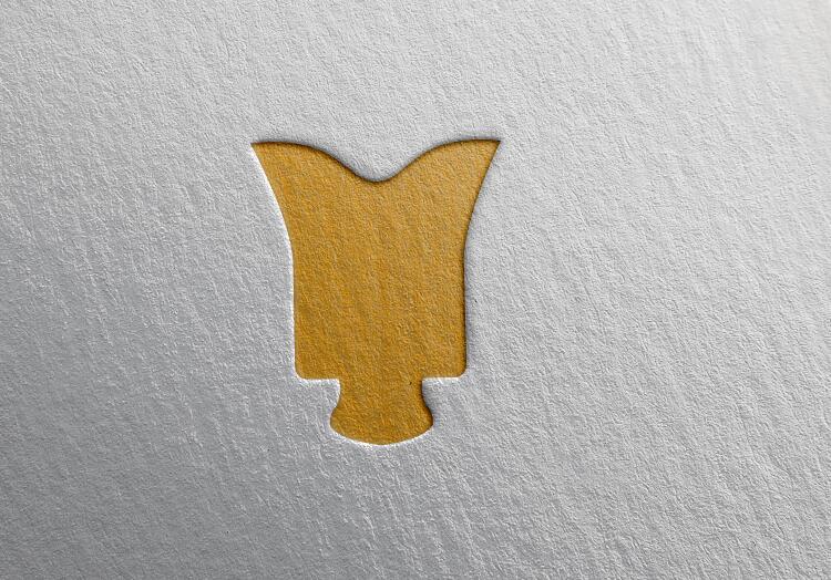
Figure 2: Agoras logo preview in card
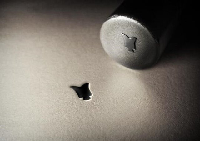
Figure 3: Agoras logo preview in stamp
This is my logo design for Agoras. Hope you enjoy it.
Tauchain
As I mentioned before, Agoras is the primary payment currency on Tauchain platform. I like that Agoras has a bridge over Tau. So Agoras and Tau logos can link together in some way. So Tauchain logo became a little bit easier after the Agoras logo design. My Tauchain design came like this (see figure 4):
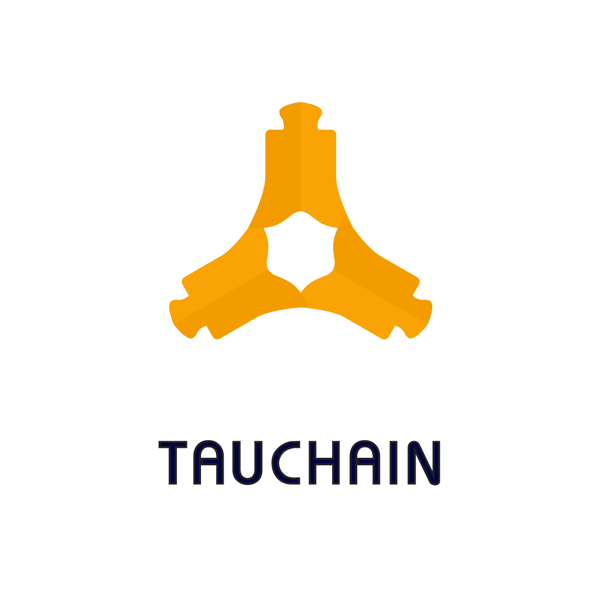
Figure 4: Tauchain logo design
Three hand in hand “agoras” (here “agora” represents one node in tauchain) form a chain (platform) which has the unlimited scaling ability by connect more “agoras”. The three parts of Tauchain logo represent different members in discussion platform (Tau itself can be one member sometime). The chain itself comes from a connection of each node in a logical way representing Tau’s ability of logical consensus detection and knowledge deducing.
With the development of Tau, I believe, these three parts can symbolize human, Tau, Machine in the future. Tauchain will connect human world with the machine world.
Some Tauchain logo preview are shown from figure 5 to figure 8.
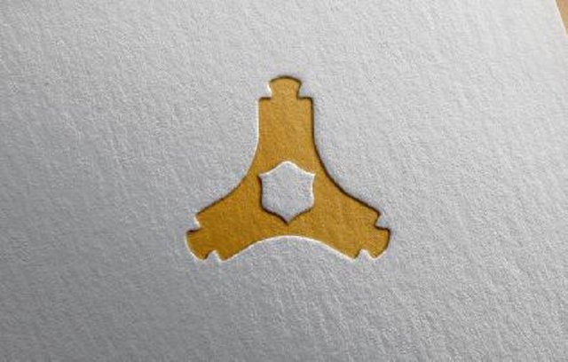
Figure 5: Tauchain logo preview
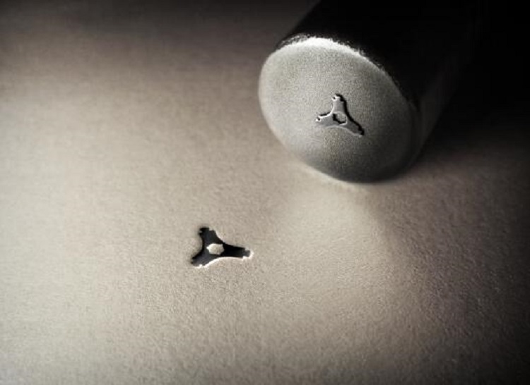
Figure 6: Tauchain logo stamp preview
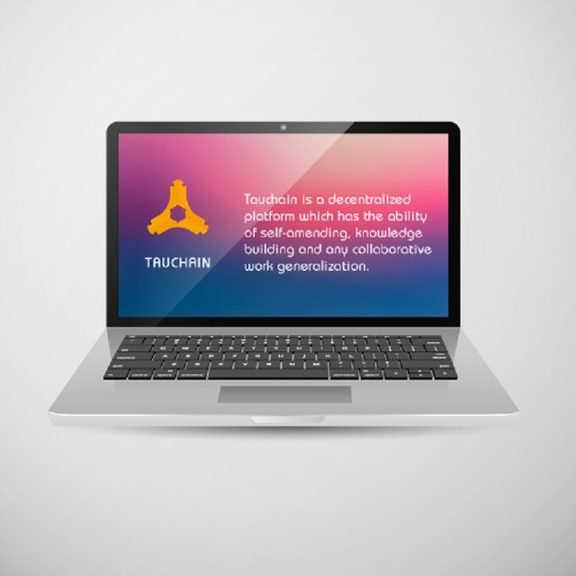
Figure 7: Tauchain logo preview on Macbook Pro
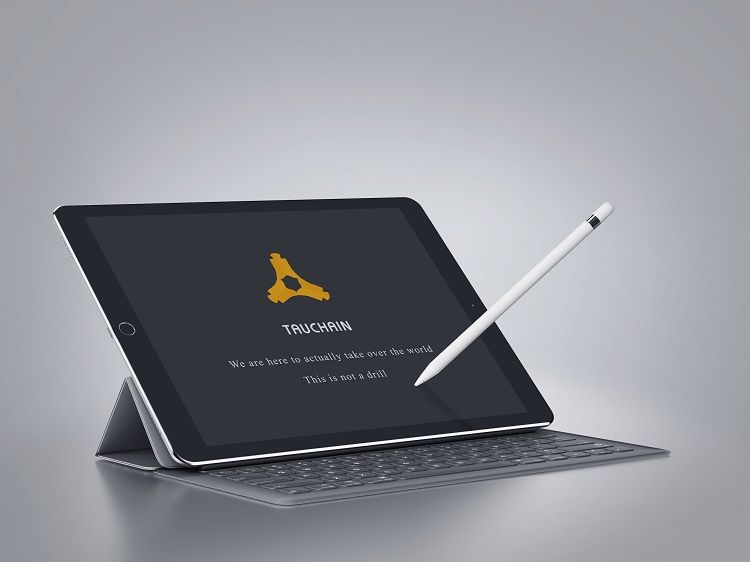
Figure 8: Tauchain logo preview on iPad Pro
So that’s my logo design for Tauchain. Enjoy.
Colour: the colour can be changed as required depending on the project’s colour palette and preference.
Fonts: Bauhaus. It can be changed or redesigned as required.
Any feedback is welcome.
pretty cool stuff, good luck in the competition :)
Thanks for your support, Miao. Another designer and I designed them together with the knowledge of this project. Hope they can help Tau go much further.
Congratulations @yibest! You have completed some achievement on Steemit and have been rewarded with new badge(s) :
Click on any badge to view your own Board of Honor on SteemitBoard.
For more information about SteemitBoard, click here
If you no longer want to receive notifications, reply to this comment with the word
STOPDo not miss the last announcement from @steemitboard!
STOP
Congratulations @yibest! You received a personal award!
Click here to view your Board
Congratulations @yibest! You received a personal award!
You can view your badges on your Steem Board and compare to others on the Steem Ranking
Vote for @Steemitboard as a witness to get one more award and increased upvotes!