Let's design a logo for Tauchain and Agoras
Did you see this post? The Tauchain/Agoras project is looking for new logos. So, let's do it:
Research
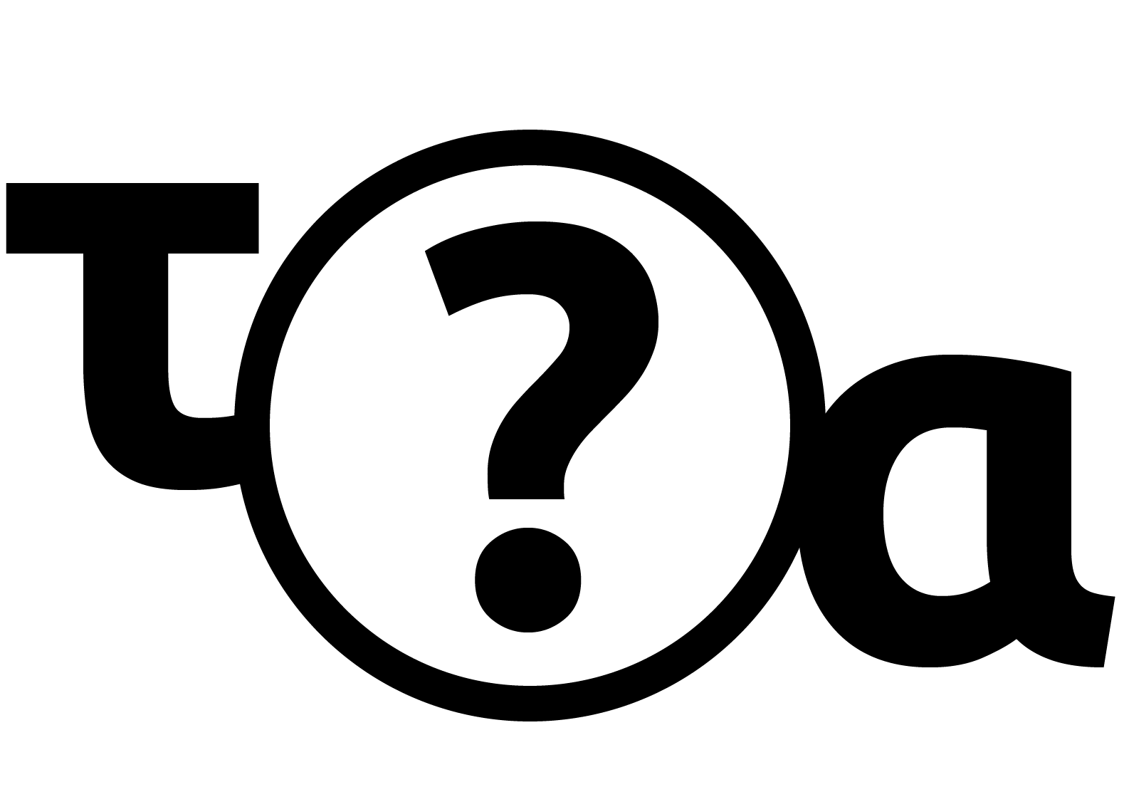
What is Tauchain? What are Agoras tokens? Sure, we know what a blockchain is and we also know the difference between coins and tokens. But that's not enough. If we want to design a logo, we first have to understand what distinguishes Tauchain and Agoras from other projects. So, we have to do some research. This means reading blogs, watching videos...
...We should also take a look at the “About τ -Chain”-paper:
Abstract. τ-chain (pronounced tau-chain) is a decentralized peer-to-peer
network having three unified faces: Rules, Proofs, and Computer Programs,
allowing a generalization of virtually any centralized or decentralized P2P network,
together with many new abilities, as we present on this note.
Let's take a look at the old logos
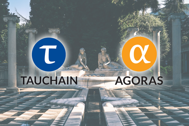
What aspects of the logo do we want to transfer to our new logo?
We want to keep the letters tau and alpha, but instead of just using the glyphs from a certain font, we want to create them from scratch, maybe with a twist.The colors work quite well – they seem to have been chosen wisely – but maybe we want to change them just a little bit.
We definitley want to create lockups like the old ones, additionaly a horizontal arrangement and a version without the wordmark, which can be used for favicons etc.
What else do we have to consider?
The logos should be distinguishable. There are quite a few cryptocurrencies and we don't want to confuse them. So, the logos shouldn't look like any preexisting logos.Also, they should be as simple as possible, but not simpler. It has to be, because it will be seen in very low resolutions like 16 by 16 pixels. We want to show that the logos belong together. We should use similar shapes, colors etc.
The logos will be used on dark and light backgrounds, we should avoid using pure black or pure white.
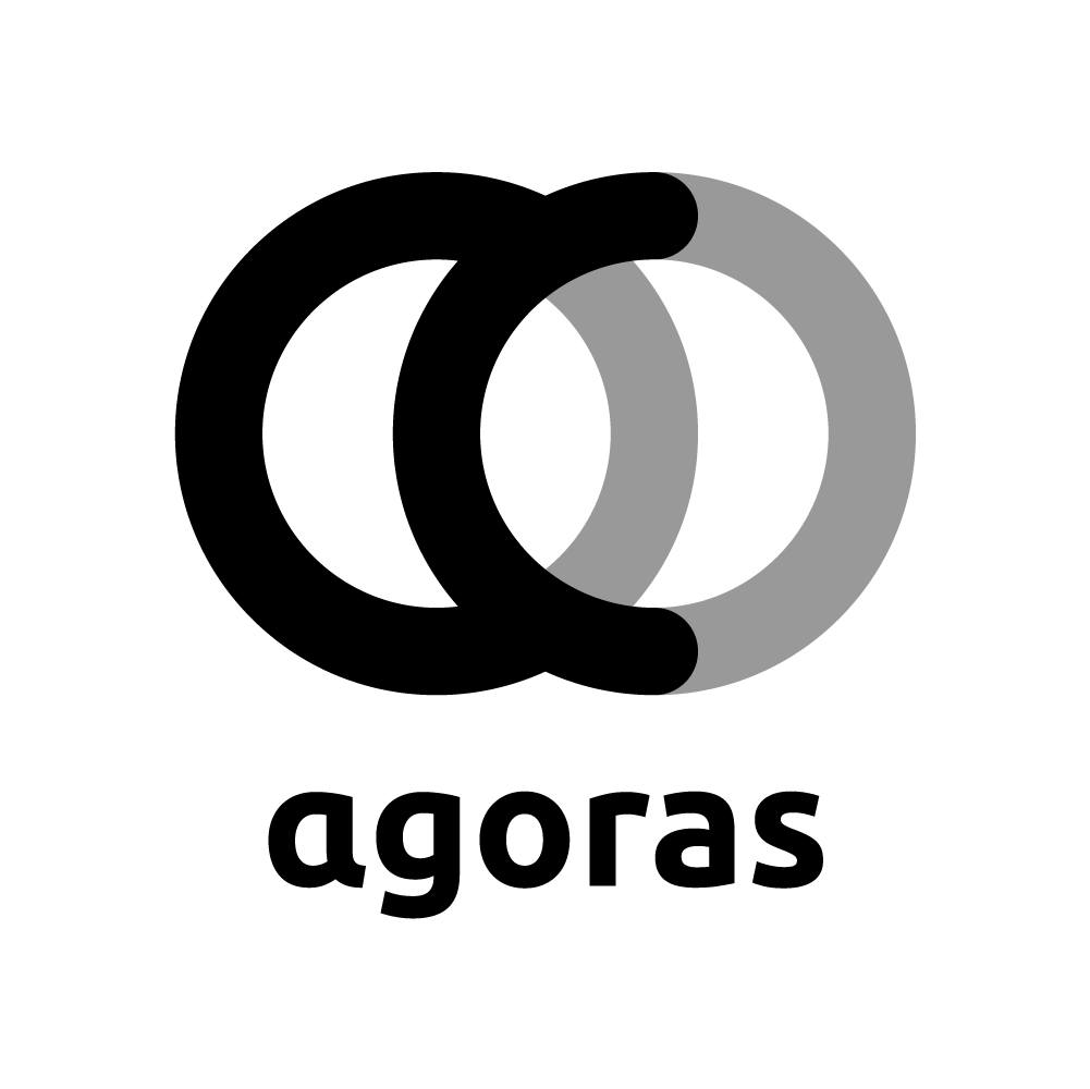
Let's start with Agoras
How can we represent a token? Maybe like this: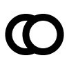


Great! We did the first logo.
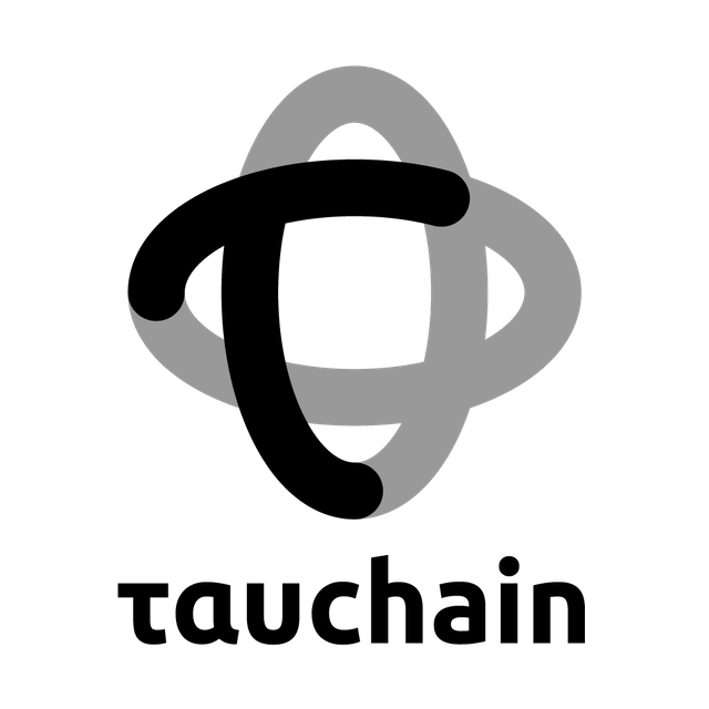
Let's get to the Tauchain logo
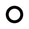
We want to show that the logos belong together. So, let's start with our old friend, the circle: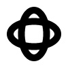

Ta-dah! This is our second logo. But we're not done yet.
Our logos need wordmarks
Before we can choose a font, we have to answer some questions: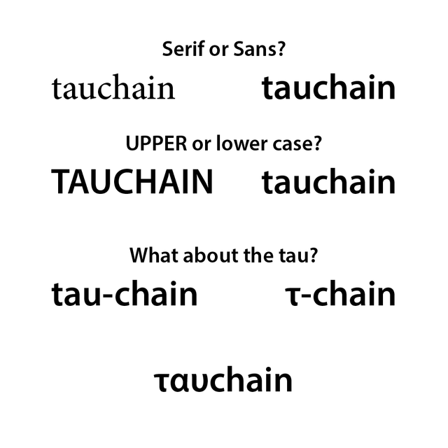
Serif or Sans?
Sans serif fonts work better for displays. Also, they look more modern. We definitely want to choose a “sans”.Free or licensed?
A free font would be great, because it could also be used for infographics etc. without having to deal with licenses. We will have to be careful, because many free fonts lack important features, for example the Greek alphabet.Upper or lower case?
TAUCHAIN! or tauchain? The upper case version looks like it's screaming at us. The lower case version looks friendlier, it's more readable and it also looks very modern und understated. Facebook, amazon and ebay don't care about upper case, neither should we.Tauchain, Tau-chain or τ-Chain? ταυchain!
We want to emphasise the tau, but neither the hyphen nor the greek letter are visually pleasing. However, we could use the Greek alphabet for the “tau” and the Latin alphabet for the “chain”. That's much more subtle than the other solutions.Let's find a font
Now we know what we're looking for. But where can we find it? Let's use Google Fonts. We can set some filters: Sans Serif, Greek, 6+ styles. So, what do we got here?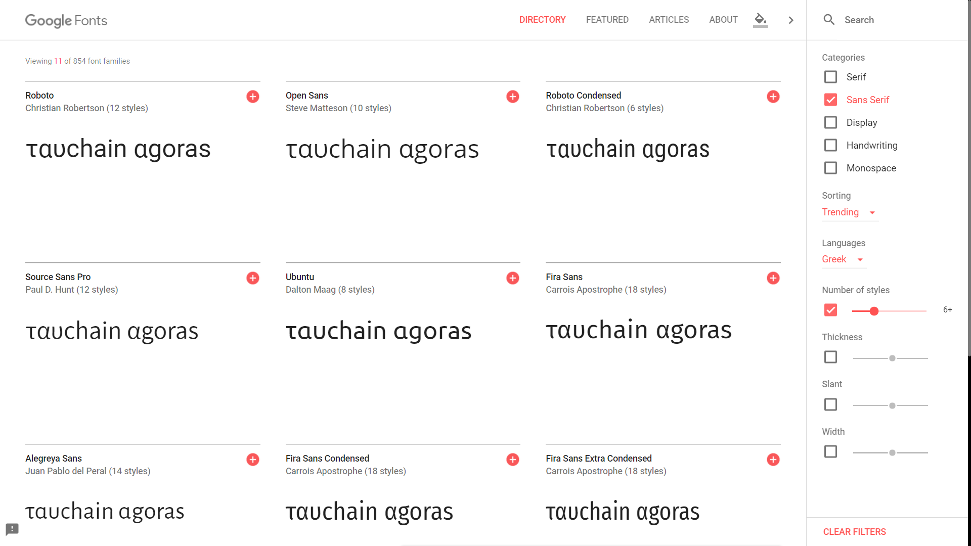
“Ubuntu” looks great. We should take a closer look:
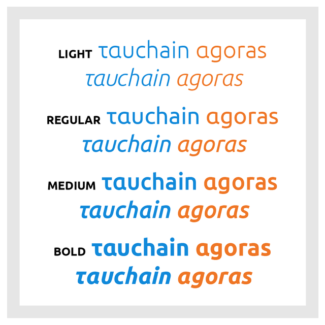
Ubuntu is a font family designed by Dalton Maag. It consists of 13 fonts: Light, Medium, Regular and Bold – each with an Italic version –, Condensed (only Regular) and Monospaced (Regular, Italic, Bold and Bold Italic). It comes with the letters of the Greek alphabet. That makes it the perfect candidate for our logos.#curiousfacts
The Greek Font Society is a Non-Profit Organization with the express aim to research the history of Greek typography and the design of historic and contemporary Greek typefaces, which shall bridge the gap between metal and digital technology.
Testing
Great! The logos look good like this, but that doesn't mean that they'll work in other contexts. So let's go to the laboratory, we'll have to put them to the acid test. First of all, let's see how they look like on different backgrounds: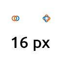
Yes, that works. We can try some other things, like blurring, desaturating and rotating the logos. It's important that we can still recognize our logos after torturing them like that. Now that we know that our logos work, we can create some more versions.
We need gray-scale and black&white versions of our logos:


We also want horizontal logo lockups:


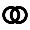
We also need the logos without the wordmarks:


Great! We can always open our Illustrator file and create additional versions, should we need them. But I think that's enough for now.
We're done. Thank you for going through this with me. :)
this has been a detailed study. good luck :)
Thank you very much :)
Great combo! @crypticalias
This design is done using what platform?...
Thank you :) I used Adobe Illustrator.
Wow... Cheers!
I sure need to learn Illustrator, i use mainly Photoshop or powerpoint for my designs.
kudos!..
There are a lot of tutorials for Illustrator. You can also use free software like Inkscape. The advantage of vector based editors is that you can scale it up as much as you want, you'll never see any pixels.
CONGRATULATIONS YOUR PUBLICATION HAS BEEN SHARED BY @Untapentuoreja, will be seen by 2884 steemians.
Great post
Thanks :)
Great job
Thank you :)
Congratulations @crypticalias! You have completed some achievement on Steemit and have been rewarded with new badge(s) :
Click on any badge to view your own Board of Honor on SteemitBoard.
For more information about SteemitBoard, click here
If you no longer want to receive notifications, reply to this comment with the word
STOP