Square STEEM Coin Symbol?
There's a big post going on about choosing a Steem Coin Symbol
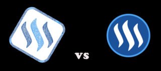
A user by the name @cheftony made and suggested a Square version of the symbol that I thought looked really unique and cool, so I decided to make some variations of it.
@Cheftony's 
.
.
.
The other post seems to be dying out so I thought I would start a new one to see what everyone thinks...


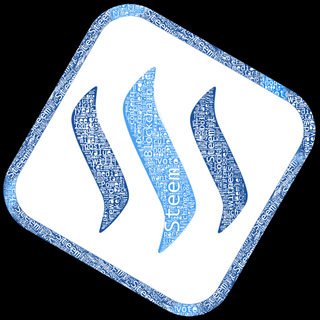

I did these kinda quickly to get the communities input first so they are a little ruff
I've posted bigger pictures in the comments,Like the Logo you think is the best design* and I can clean it up and make more variations of it if enough people would like. Also feel free to make any variations and post them up as well! Lets find that PERFECT design.*
Is That Something You Might Be Interested In?
A few of my circle variations as well:


.
.
Here's a link the other thread
.
.
.
.
If you like my stuff, Here's another thread with some banners and logos I made


.
Thanks <3 Have a Good day!
Welcome on board
some of my thoughts
For me at least your submissions are almost to noisy - A coin symbol should be viewable at 16x16px as for example CMC (coinmarketcap.com) are using still these sizes to display currencies!
So maybe try to get rid of the typo within the steem shapes .. just as an idea! Pls, don't feel offended personal, i'm just trying to assist on this topic :)
Hope this helps
c
No offence taken :) I really do want the feedback.
For me there something cool about having a picture with a ton of detail hidden in it when its small but revealed in the larger version is the reason i designed them like that.
I've been up all night :P when I wake up ill put some more together that are more basic
thank you :)
Oh also, you didn't answer if you prefer the circle or the square? :P
i'd prefer the circled variant …
…as this would have more coin analogy! But also IMO, it wouldn't be necessarily required to have a coin symbol as the icon itself is working for that purpose (also at CMC etc) - but this just my personal opinion on this topic - go ahead :) but if .. i would GO with a circled one…
last thing to add - for example due the doubled border this icon is getting a kinda 3d look and feel.. whereas the main design mroe flat then 3d
Go ahead :) happy steeming