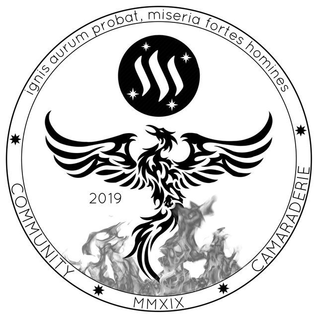
Why you should have, but probably didn't, vote for this design....
With voting for the 2019 #steemsilverround due to close in a matter of hours, I think it's safe to say I'm pretty much out of the running to win this year.
So as the title of this blog says, allow me to run you through why it should have won, but probably didn't tickle your fancy and get your vote.
- OVERALL DESIGN
So let's start with the over all design;
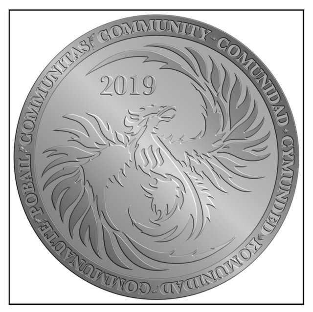
The image of the phoenix was used to represent fire, so why does my phoenix look like a wet lettuce sandwich??? Well the truth was it was actually meant to look more menacing than it does in the design above, but due to my lack of computer imaging skills and artistic ability, I couldn't get the phoenix to look as good as I wanted it to.
The final appearance;
Now this coin was always going to have a "mirrored" background which would make the phoenix POP out of the coin, once again unfortunately I have no idea how to do that. So you got stuck with a grey-on-grey design, which definitely doesn't appeal to the eye!
- WHY SUCH A SIMPLE DESIGN?
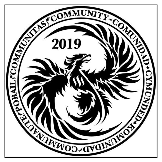
This was 100% intentional. I'm guessing you looked at the design and thought "how bloody boring"..... Well as I said, that was the way it's meant to be, I'll explain why now:
I dont know if I've ever mentioned this, but I was the winning designer of the 2018 #steemsilverround! 😂
The things I learnt from that experience last year meant that I knew that any over detailing would be lost in the process of making the stamping dye. The simplicity of my design was intentional for that exact reason. Dont believe me, go pick up your 2018 SSR and try and make out the leaves I painstakingly drew on or the tiny minnows I added to the branches..... The design submitted by myself through @sevinwilson to the mint was originally returned because of its initial intricacy. The incredibly helpful people at the mint asked if we could "dumb it down".
- WHY SO BLAND?
OK, by bland I mean, why no over the top, extra detail? Why just one big bird on a mirrored finish?
Well this one is easy again. The design I came up with is boring enough to not be distorted when the dye is made so that the overall feel of the phoenix isn't lost, but also uses the entire face of the round.
On such a small round (1oz), I feel that you should use the available space and leave as little blank space as possible. This is purely personal preference, but for some reason I just feel you're getting more design for you doe. Hahahaha
I am a little sad that I didn't win, of cource I am. I honestly feel that this design would look fantastic on a 1oz silver round. Not only would it have been a fantastic continuation to the steemsilverround series, but as a stand alone round would have been an amazing addition to anyone's stack.
Since I've now discounted myself out of the race, I think I'm over 20 votes behind, I'd like to offer some constructive criticism of the other 2 finalists and help you chose between the two
![]()
@edxservirus design:
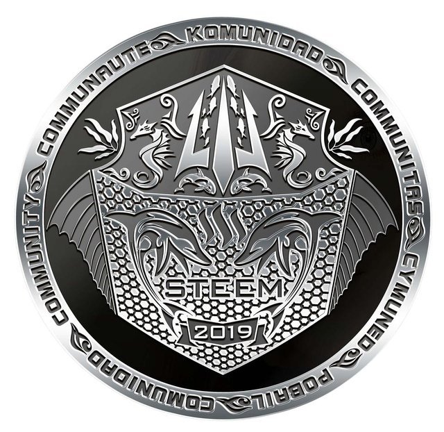
The guy is a genius. I've always been incredibly jealous of his design skill. Whenever there is an opportunity to come up with a new design for a group or a project this guys knocks it out the park.
No one can deny that this design is like a visual orgasm!! I drool a little every time I look at it, but it's amazing design will end up being its downfall. The intrecacy of the detailing, the subtle uses of minnows, swirls and scales will, in my opinion, not transfer well over on to a 1oz round, and that is what this design is all about..... As an emblem or printed on a COA the detail would transfer and be breath taking, but from previous experience, I think it would be lost on a silver round.
MY SUGGESTIONS:
Remove the scaling patter on the main body and just go for a mirror finish.
If you increased the distance between the trident, you could make those fish a little larger and they make come out OK.
forget the swilrs around the seahorses, they won't be able to pick up the detail when making the dyes. You could increase the size of the seahorses to compensate for this.
Once again, it's beauty will be its downfall unfortunately.

@dfinney design:
@dfinney is a shining example of what it means to be a community member. She stepped up to take over a lot of work when she was called upon and always looks to put the community first and you can see that in her thought processes in her design.
What I love about this design is what it symbolises. What is it they say "great minds think alike"?? Naturally I'm drawn to her amazing design because we had similar thoughts in our design process. The flames are a neat touch and I like how the phoenix is reaching up to the steem symbol. I do find it a bit empty and that she could have used a lot more of the face to emphasis her design.
MY SUGGESTIONS
Make everything bigger. Remember we are transferring these down to 1oz rounds.
I'd be tempted to make the bird bigger. Maybe having the wings sweep up to the steem symbol, almost cradling it. This would fill the voids left on either side, at the top.
You don't need 2019 and MMXIX. I think the roman numerals are a great idea and I'd just go with that and remove the the digits all together.
removing the 2019 would free up some space to make the flames bigger/higher.
I think the rim/border is a little empty and if she doesn't want to add more words, she should definitely increase the lettering size to bring the words around more.
for me the ⭐ (I don't know exactly what they are) patterns on the rim doesn't work for me. The possibilities for changing then out are endless, and I would definitely rather something else.
I do apologise to both @edxservirus and @dfinney if I upset or offended you in this post. That was not my intention, I am just trying to help by giving my opinion.
Good luck to both of you, who ever wins, I'm sure it will end up looking amazing and I can't wait to get a few.
If you haven't voted just yet, please head over to the voting page (link below) and cast your decision by upvoting your favourite design in the comment section
https://steemit.com/steemit/@raybrockman/2019-steem-silver-round-round-2
DONT WAIT, VOTING CLOSES TOMORROW.......
I hope the others don’t get offended. Having these suggestions from the former winner will improve the final resulting Steem round which I can’t wait to get into my hands.
I am gutted my vision for the 2019 SSR won't be made, but I'm here to support the community and if Dfin or Edx ever need anything, I'm always here to help.
There’s always next year. This whole community project rocks on so many levels.
Can people change their minds, or still be able to Vote for yours, if they already Voted...??? Yours, should have been the Winning Design for sure...
July 25, 2019... 5.7 Hollywood Time...
They would need to remove their upvote from the contest. You can vote for all 3 if you wish, so nothing stopping anyone from voting for this design if they have already cast a vote.
Thanks for the vote of confidence buddy. I'm happy I made it to the final 3.
Thank you welshstacker! You've just received an upvote of 33% by tommyknockers!
Learn how I will upvote each and every one of your posts
Please come visit me to see my daily report detailing my current upvote power and how much I'm currently upvoting.
Thank you welshstacker! You've just received an upvote of 42% by thejollyroger!
Learn how I will upvote each and every one of your posts
Please come visit me to see my daily report detailing my current upvote power and how much I'm currently upvoting.
Congratulations @welshstacker! You have completed the following achievement on the Steem blockchain and have been rewarded with new badge(s) :
You can view your badges on your Steem Board and compare to others on the Steem Ranking
If you no longer want to receive notifications, reply to this comment with the word
STOPTo support your work, I also upvoted your post!
Vote for @Steemitboard as a witness to get one more award and increased upvotes!
I AM SOOOO OFFENDED!!!
Ha ha ha! Not at all!
Like you I felt totally constrained by my own lack of artistic skills and lack of fancy computer programs to make what I could picture in my mind.
You’re ideas are all good. ☺️ You know in my head I picture the round with the fine details of a queen’s beast coin with fancy background and intensely cool edging!
Your design is great. I still can’t believe we came up with the same thing!
From how I am feeling now, I know what you were feeling in those final days last year. But while I am excited for me I also know this is a bummer for you. So that sucks. Your design and Edx’s and that one Edx fixed up for thedamus later on.... all awesome. All of them would look sweet on a steem round.