Steemitbc Logo Design Concept

Just wanted to put my design concept in a post to provide more background information and in case it gets lost in the comments of this post:
https://steemit.com/community/@steemitbc/looking-for-a-logo-20sbd
This was the design brief:
Here are our thoughts and what we are looking for:
- Logo could incorporate "blockchain" into it.
- Logo could include BC or Blogger Central
- Logo should be clean and able to fit into our profile thumbnail
Our motto is "building communities and empowering leaders". This phrase may also help aid you in your design.
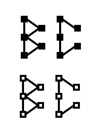
I remember seeing some icons depicting the concept of block chain, which I used to create a custom font for the letters 'B' and 'C' and when combined with the initial sketches of the steemitbc team this is what I came up with:

Since I quite liked the concept, I decided to refine it further by creating a more polished version with more details.
First I started with the letters 'B' and 'C' and tried two different styles:

Then I incorporated the chat icon into the design because I thought the two speech bubbles worked quite well with the two letters:

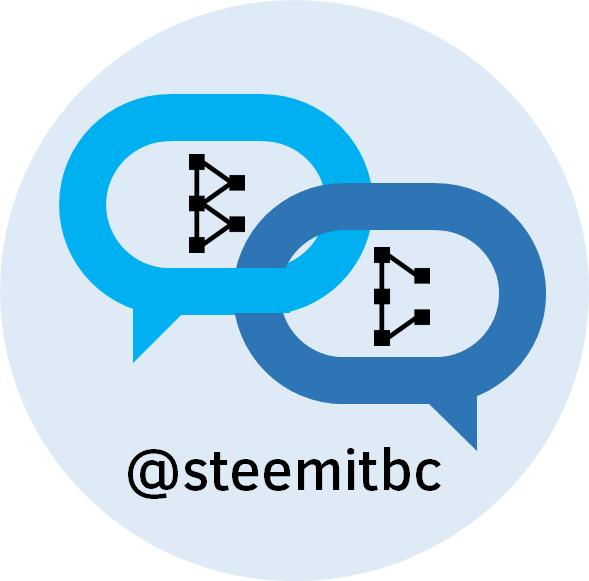
Then I tried some colours and made sure the design fits nicely into a circle:

I thought that the blue theme looked nicer and wanted to accentuate the chain image of the blockchain more by making the interlocking rings, but I realized that I also need to make the font more legible (I used Clear San Medium):

As a final check, I wanted to make sure that the logo was still clear and distinguishable in a small size:

So there you have it, the logo contains two difference references to the blockchain in the customized font and interlocking speech bubbles; it uses the concept of chats and the letters B & C to reference blog central; it fits nicely into a circle and the colours is interchangeable depending on the theme you want to apply (steemit blue or other colour palettes).

I have enjoyed chatting to various people on Discord that are associated with #steemitbc, and very grateful for the opportunity to contribute to the logo design idea. I hope you can provide some suggestions and feedback to help me improve the design
Finally @paulag if you are on the look out for a logo or banner, I would be happy to come up with a design for the great people at #bisteemit as well :)
Update:
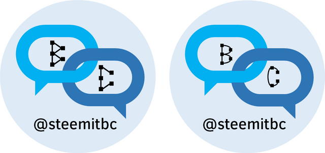
There were some variations that I thought would be good to test here and get some feedback on as well. I tried to use curves in the letters 'B' and 'C' instead of straight lines and I think it looks better:

And also a variation with a very light grey background and a circle around the logo, which I didn't think improved anything:

Oh, and one more thing, I have made the letters more visible in a small size, and left one or two of the 'blocks' in the blockchain unfilled:

Update:
Based on some feedback/suggestion, here are some other variations to consider from left to right (Original; more square speech bubbles; remove chain link appearance of speech bubbles)

I really like your final design and seeing the process you've gone through to get to it. In the beginning, the chat boxes were a little more rectangular and in the final design they have become a little more oval-shaped. I'm a little curious to see how the final design would look with the chat boxes being more rectangular to set them apart from the circle borders and rounded letters just a little more. Is that something you can easily do?
Great work, btw!
@boxcarblue I can definitely make those changes to see how it looks. Thanks for the feedback and I will have an update for you soon :)
Looking forward to it!
I tried two variations to see what you think, the first is to make the chat boxes more rectangular, and the other is to remove the chain link effect to make it more obvious that they are chat boxes.
I think I feel partial to the one on the right, without the linking. I'll run it by everyone else though. Another thing we would like is to remove the @steemitbc because we are trying to rebrand as Blogger Central. Thanks for doing this.
No problems, very easy to replace the text with blogger central instead, and very happy to contribute my small part to the great work everyone else it doing on blogger central :) Potential placement options for the text (may need to pick a different font):

I think the logo looks good, but the dots in the "b" and "c" make it too complex, you should try to keep them to a minimum in order to have a simpler and more striking logo. But good work!
Congratulations @plushzilla! You have completed some achievement on Steemit and have been rewarded with new badge(s) :
Click on any badge to view your own Board of Honor on SteemitBoard.
For more information about SteemitBoard, click here
If you no longer want to receive notifications, reply to this comment with the word
STOPlove your process and all of your variations + your analysis on aesthetics and functionality ! keep up the great work !!
@steveconnor - thanks for the nice comment. I am hoping it will help generate some more ideas for the logo and hopefully help improve my design as well :) You have so many interests on Steemit and I am looking forward to reading a few of your posts!
Oh wow, you've got some talent :):) Nicely done. Love it!!
@therneau - sometimes the design works out okay and sometimes my ideas are way off the mark :D And I don't always stay focused enough to put so much effort into it, as you can tell from the posts on #infographics :p
really good work here @plushzilla, you have many skills and are a breath of fresh air.
And when you have time, yea I would love some
@paulag - I did find a little bit of time and inspiration when I got out of bed this morning and read your lovely comment/encouragement, so here's the first concept:
https://steemit.com/steemitbc/@plushzilla/bisteemit-logo-design-concept
I am thinking that the B and C elements need to be stronger and the chat symbols need knocking back a little. My thought is based around looking at the design from a distance, the B and C might get a little bit lost. Interesting version to try methinks, otherwise people might just think, ah, chat app ignoring the blockchain component of the design. Like your process.
Hi @jimdraw, thanks for the comments and feedback. A design has already been chosen (see @orcheva's feed from some time ago or check out Discord on the steemitbc channel) but it does address some of the issues you mentioned (and I think he did a great job with it). I was glad to contribute to the idea and wanted to create a unique font that can be used for other projects in the future, so I was pretty happy to leave it at that (and work on other logo concepts, like blockchainbi).