New Interactive Steem Tag Explorer Now Available
A new interactive Steem Tag Explorer that I created is now available for you to try (see the link at the end of this post). Steemit's Trending Tags page provides useful information that you can use to look at popular tags, total payouts and comments per tag. However, as a new user, I wanted to know more, and since I am always looking for good examples of dashboards to use in my visualization class, I decided to create a dashboard for exploring the trending tags data.
Introduction
This post demonstrates the features of the tag explorer and gives a few notes on how I created it. In a later post, I will cover more of the details and some of the fancier "tricks" I used to implement the dashboard.
Opening Page
When you first visit the Steem Tag Explorer you will see a page with two tabs:
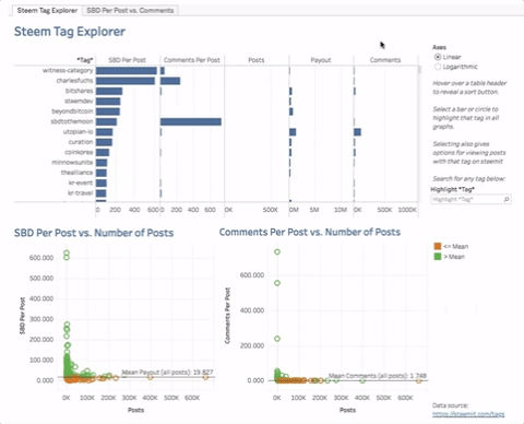
The top graph is called a Table Lens, which is a chart designed for visualizing multidimensional data. By default the Table Lens is sorted from highest to lowest SBD Per Post (Payout/Posts). Sorted this way, you can see that the other variables do not share the same decreasing pattern, hinting that SBD Per Post is not strongly correlated with any of the other variables. You can also see that the tag, witness-category has the highest payout per post, even though it has relatively few posts.
As a static chart, a Table Lens is not all that useful, but hovering over any column header allows you to sort all of the tags by that column and then look for patterns among all the variables:

The Scatterplots
Unlike the Table Lens, which is limited to a handful of tags, the two scatterplots at the bottom of the dashboard show all of the tags. These show the relationship between SBD Per Post and Comments Per Post vs. the number of posts. Tags that are above the mean (SBD per post or Comments per post) are colored green. In both graphs, you see a very steep drop and then a flattening:
Switch to Logarithmic Axes to See More Details and Patterns
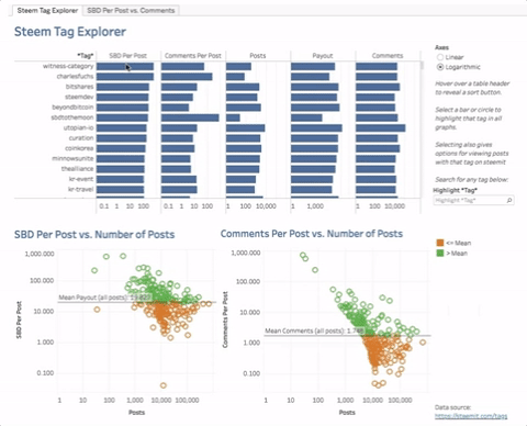
These graphs give some indication of the overall relationships, but the amount of overplotting is so high that is hard to tell the tags apart. To solve this, the dashboard allows you to switch to logarithmic axes using the radio buttons in the upper right hand corner. Do this and you will see a much clearer set of charts (including the Table Lens):
You can now see bars on the Table Lens, where before some of the values were so much smaller than the maximums that no bars were drawn. However, it is still hard to see any patterns between variables with the Table Lens. In contrast, it is now very clear that there is a weak log-log-linear relationship between SBD Per Post and and the number of Posts. The same relationship also holds for Comments Per Post and the number of Posts. In general, the more posts with a tag, the lower the payout per post and comments per post with that tag. The relationship is clearly not perfect (the dots do form a perfect line), but it is definitely there:
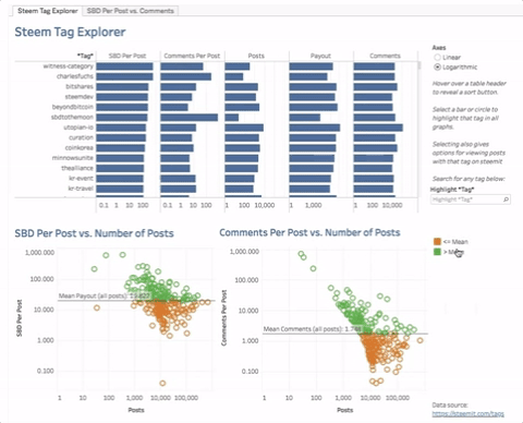
Hover Over Any Mark to See a Tooltip:

!
Click A Mark for More Options
Clicking any tag's mark expands the tooltip with links to jump to that tag on steemit.com, and also labels the marks on all of the graphs:
Search to Find and Highlight Any Tag
Use the "Highlight Tag" search box to find and highlight any tag in the dataset:
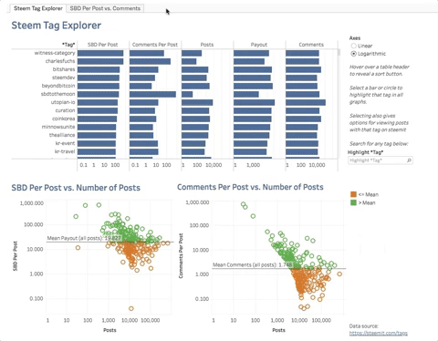
SBD Per Post vs. Comments Tab
This tab lets you explore the relationship between SBD Per Post and Comments Per Post. It is fixed to logarithmic axes and shows a clear log-log-linear relationship. This makes sense since more popular posts will tend to garner more comments and upvotes, thus increasing rewards.
Limitations
- Tableau Public refreshes the data only once every 24 hours. If you scroll down the Dashboard page, you will see the last refresh date and may be able to request a refresh:
- It is not clear to me whether the trending tag data is based on all tags, or only the first tag. If it is all tags, it is double counting rewards and comments.
- The data on the trending tags page is highly aggregated. The median SBD and Comments per post may be better than the mean, but that is not possible without having the detailed data for each post. I would also like to allow drill down to more detailed analyses. Using a datasource like SteemSQL would be better, but Tableau Public does not support SQL connections and I don't have the funds to pay for a SteemSQL account and a commercial license for Tableau Online, which should allow SQL connections and public viewing.
- This is really a steemit tag explorer, but since the steemit logos are copyrighted, I didn't want to use steemit in the name.
Implementation Notes
I will provide details on the implementation in a later post, so here I just cover a few basics:
- Data from Steemit's Trending Tags page is read into a Google Sheets document using the function:
=IMPORTHTML("https://steemit.com/tags", "table", 1)
Tableau Public allows connecting to Google Sheets and then publishing the data connection as an extract on Tableau Public's server, where it automatically updated once a day.
The dashboard uses a couple of Tableau "tricks" or workarounds:
- Switching from Linear to Logarithmic axes is done using Sheet Swapping. So what looks like a switch to the axes is actually done by hiding the three visible charts and showing the three with the other axes.
- Sheet swapping also required a hidden worksheet (buried behind the dashboard) to allow the Highlight Tag search box to work for all 6 graphs.
Try It out
Try out the Steem Tag Explorer and let me know what you think. If you like it and/or this post, please consider resteeming and upvoting this post and following me.
Read the next post in this series: Part 1: Creating the Steem Tag Explorer in Tableau Public--The Table Lens
I'm new here, but if you like what you read, please check out my other post on visualization in Tableau Public: # Create Innovative Visualizations by Understanding that Visualizations are Mappings from Data to Visual Marks and Features
Congratulations! This post has been upvoted from the communal account, @minnowsupport, by toddrjohnson from the Minnow Support Project. It's a witness project run by aggroed, ausbitbank, teamsteem, theprophet0, someguy123, neoxian, followbtcnews, and netuoso. The goal is to help Steemit grow by supporting Minnows. Please find us at the Peace, Abundance, and Liberty Network (PALnet) Discord Channel. It's a completely public and open space to all members of the Steemit community who voluntarily choose to be there.
If you would like to delegate to the Minnow Support Project you can do so by clicking on the following links: 50SP, 100SP, 250SP, 500SP, 1000SP, 5000SP.
Be sure to leave at least 50SP undelegated on your account.
Excellent post. However I would suggest that you put the link to your tag explorer page right up near the top of your post to make it more visible to everyone.
It's kind of a marketing thing, make your stuff more visible.
Thanks for the advice. I'd read somewhere on here that it was better to put such links at the end of a long article, so I actually moved it. I think I will edit before its locked to include a link at the top.