Create Innovative Visualizations by Understanding that Visualizations are Mappings from Data to Visual Marks and Features
Once you understand that visualizations are simply mappings from data to visual features of marks on a page, you can dramatically improve the visualizations you make and even easily develop novel ones. Instead of using chart libraries that are found in most tools, you can experiment with a wider variety of visualizations--all possible once you start exploring different mappings.
In this post, I will explain this concept by using Tableau Public to walk through a series of mappings for creating different visualizations. Tableau is perfect for this, because you develop Tableau visualizations by telling it how to map data fields to visual features. Tableau Public is free, and I encourage you to download it and start using it. As a disclaimer, I have no relationship with Tableau other than as a user of their software.
Companion Interactive Tableau Workbook
I created an interactive Tableau Public workbook, Visualizations as Mappings from Data to Visual Features, that gives a short version of this walkthrough, but unfortunately, I cannot embed it here, because Tableau Public is not on the iframe white list (why not?). You can check it out below, or just keep reading. I encourage you to do both. You can even download it and modify it in Tableau Public.
Step-By-Step Example: World Indicator Data and Visualization
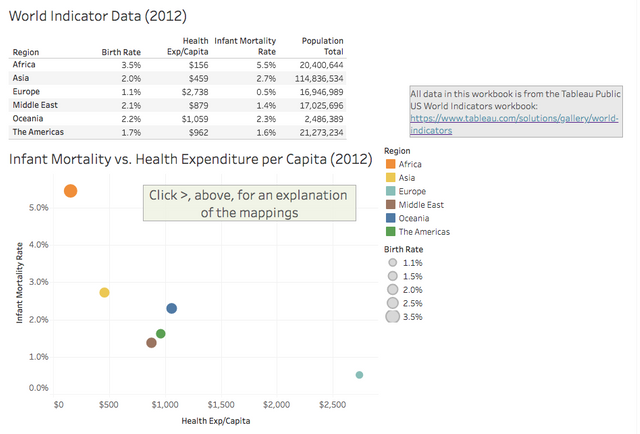
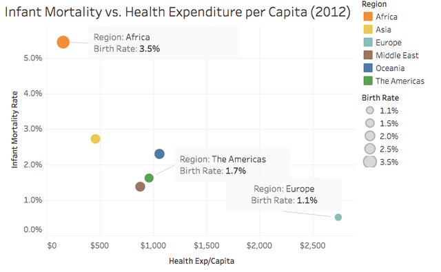
I mapped the small data table shown below to various visual marks and features to create this simple scatterplot. Below I walk through how the data is mapped to create the chart, then I show how changing the mapping changes the visualization.
Region is Mapped to Different Marks and Colors
As a result of this mapping, each region in the data table gets its own mark and distinct color. At the end of this walkthrough, you'll see exactly how I tell Tableau to do this mapping, but for now my goal is to convey an understanding of the concept of visualizations as mappings.
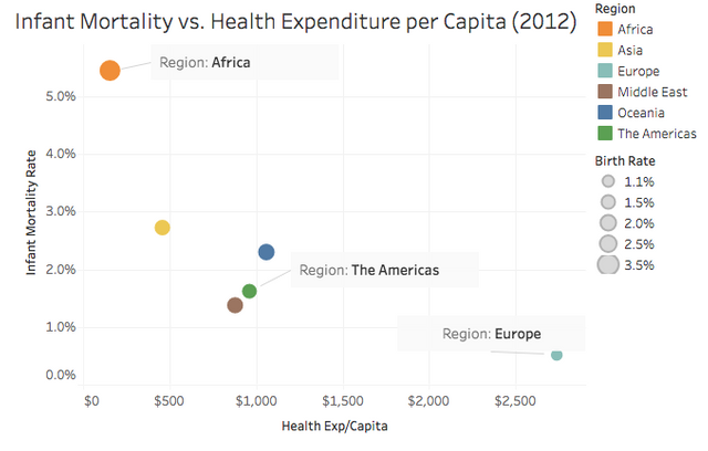
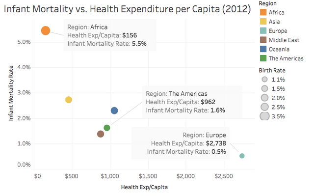
Health Exp/Capita and Infant Mortality Rate is Mapped to a Mark's Position on the X and Y axes
The labels make this clear:
Birth Rate is Mapped to the Size of Each Mark
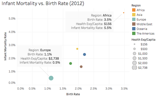
Changing the Mapping Changes the Visualization
On this visualization, Region and Infant Mortality are mapped as above, but Birth Rate is mapped to X axis and Health Exp/Capita to the size of each mark. Compare this visualization to the ones above. By changing the mapping, I've changed the visualization.
Using Mapping to Show More Data
The underlying data source actually contains several years of data on each region. Let's see how we can modify the mapping to see it all on one chart.
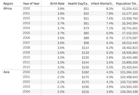
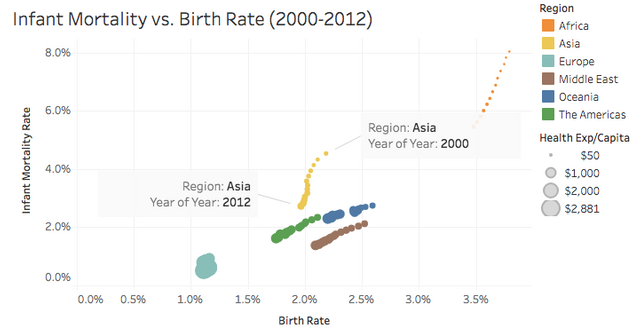
Creating a Scatterplot with a Mark for all Region/Year Pairs
Here, I mapped both Year and Region to different marks. Now Tableau shows a mark for every row of the table above. Since Region is still mapped to Color, all of the marks for the same Region share the same color. This is useful, because it packs a lot of information into one display, but now its impossible to determine the temporal sequence of the data. I've labeled a couple of years, but labeling all would visually overload the display.
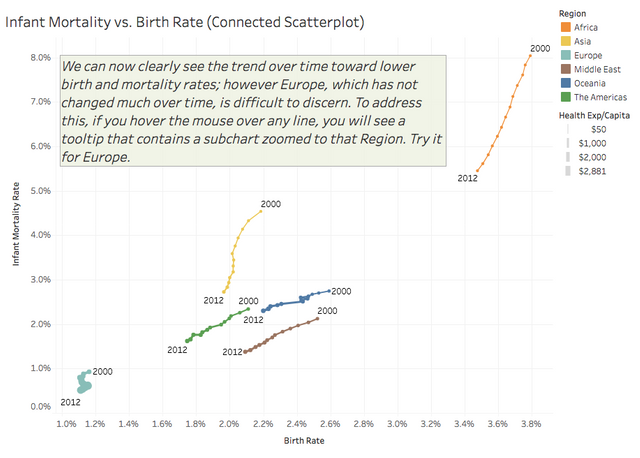
Correctly Visualizing the Temporal Sequence of Data
Here, I told Tableau to use the Line mark type (instead of circles). I then mapped Year to the line's Path feature, but I kept Region mapped to Color. This tells Tableau to create one line per region, where each segment of a line connects all of the years of mapped data for a Region, starting with the first year of data. I also increased the size of the graph to show more detail and labeled the first and last point of each line. This type of chart is called a Connected Scatterplot.
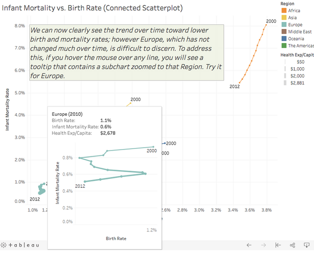
Seeing More Detail By Using a Viz as a Tooltip
Here you can see how hovering over any mark for a region shows a tooltip with details of that mark and the same graph, but focused only on that region so that you can see its details.
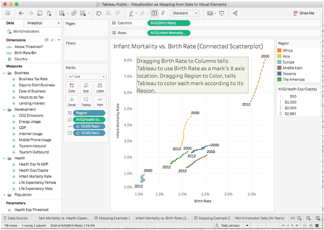
Creating the Visualization in Tableau
To create this in Tableau, I dragged data fields from the left to Columns, Rows, Color, Size, Path and Tooltip. In Tableau, Columns corresponds to the X axis and Rows to the Y axis. Looking at the Marks area to the left of the graph, you can see how each of the other variables are mapped to create the visualization. The green and blue "pills" are all of the data fields mapped to this visualization.
Conclusion and Next Steps
Once you realize that visualizations are just mappings from data to visual features, it opens up a whole world of novel visualization types. Look around at newer types of displays, such as Circos, and you will see that they are just different ways of mapping from data to visual elements.
As next steps, I encourage you to try Tableau Public, or other tool's that are based around the concept of mapping data to visual features, such as ggplot2.
Thx for another informative post. Easy to read.
Please continue up with creating interesting content - it may be hard at the beginning to build reach and solid followers base.
Steemits needs solid content builders so just dont ever give up! :)
Already followed and upvoted :) Cheers,
Thx for another informative post. Easy to read.
Please continue up with creating interesting content - it may be hard at the beginning to build reach and solid followers base.
Steemits needs solid content builders so just dont ever give up! :)
Already followed and upvoted :) Cheers,
Hi there :)
On behalf of the #steemitbloggers and in support of our recently launched #steemitbloggers Minnow Blog Support Initiative... this post has been upvoted by me and shared with my @steemitbloggers community.
You can view the published version of your post here: https://steemit.com/steemit/@jaynie/steemitbloggers-blog-support-initiative-5
Happy Steeming and keep up the awesome content :)
Follow our AMAZING community of QUALITY bloggers @steemitbloggers
Informative post my friend - you've just been curated by the #steemitbloggers community :)
Congratulations! This post has been upvoted from the communal account, @minnowsupport, by toddrjohnson from the Minnow Support Project. It's a witness project run by aggroed, ausbitbank, teamsteem, theprophet0, someguy123, neoxian, followbtcnews, and netuoso. The goal is to help Steemit grow by supporting Minnows. Please find us at the Peace, Abundance, and Liberty Network (PALnet) Discord Channel. It's a completely public and open space to all members of the Steemit community who voluntarily choose to be there.
If you would like to delegate to the Minnow Support Project you can do so by clicking on the following links: 50SP, 100SP, 250SP, 500SP, 1000SP, 5000SP.
Be sure to leave at least 50SP undelegated on your account.