 When approaching this design challenge, my main point of focus was how best to portray the decentralized nature of Steemit in an abstract way. I decided that tree branches were an excellent way to symbolize this, so I found some royalty free images and developed a design.
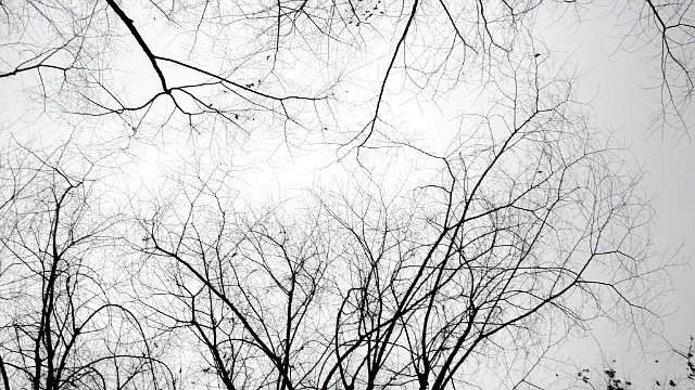
Here are the images I started with. I sourced them using a google search and selected 'labeled for reuse' to ensure there was no copyright liabilities.

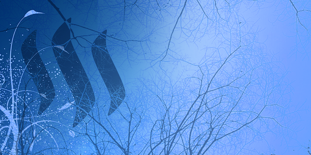
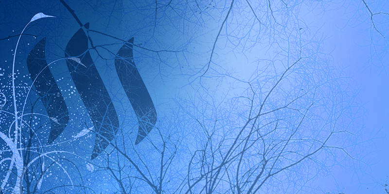
Next, I collated the images together and added a gradient. I created a clipping mask for the steemit logo and played around with the filters a little, then I simply had to tweak the transparency and luminosity to get the desired result. Finally add some text and you have yourself a landing page banner for Steemit. Below are the final results.
Without text
With text
Animated version
Feel free to provide constructive criticism or put forth any ideas on alterations that I could make to improve the design. The colours can be easily manipulated if necessary.
If you like this design and want to see it become the new landing page for Steemit's new users, then please give this post an upvote and a resteem to show your support. I have also produced a second design now, so if you would like to check it out and tell me which you prefer, that would be great.

As always... Have a great night, Steemians
These are really nice. Great job!
Thank you.
Good job and thanks for the explanation on how you made it happen. Namaste :)
Like the animated version. Nicely done.
You definitely did a good job.
I hope this wins :)
I think I would like that too.. Lol.
Awesome!
Thanks! Do the dimensions look okay? I was too sure how wide the banner ought to be, and judging from the other submission I seen on your post, I wonder if I have given mine too much height?
I think they are ok. We really won't know for sure until we plug them in to the site to test.
Well, I can make any changes that need to be made should there turn out to be a problem anyway.
Ok, sounds good :)
there's a contest?
Yes. You can find it here.
It looks really cool! Where does the guide fit into this though?
I also think that the main board on steemit should have more color. The bar where it says active/hot/etc.. could be in sky blue and the words could be written in white. It would just be a small color change but it would make the site look much better.
Great design!