Steemit.com just got a small makeover
When logging in today I just felt something was off but did not immediately spot it.
then it hit me
STEEMIT.COM looks different
the user interface has been cleaned up a bit
- trending new hot promoted have been moved to the top middle
- Steemit is apparently still in beta
- When going into the wallet tab my rep flashes 25 but then appears as it should be so at least that issue has been approached even if its not completely fixed
- The search function only displays Steem posts now which i had not noticed before


now in themselves these are not major things and I have no idea what they did in the background but for me this shows a cool message to all of the Steemians:
Steemit inc is on the ball
They are not only giving us more regular feedback (thanks @ned for the recent updates) they are also focusing on the end user and making it better for us whilst keeping up on the development of the SMT project.
So in a sense this shows me that there has been a turnaround for the better in communication and management. And in a time where crypto is bleeding left and right this is some good news and I hope this will allow more people to come to this amazing blockchain.

now the only thing we would need is to have the beta officially removed when they update the whole interface

As seen in the pic above there are also these links in the trending/hot/new page leading back to the wallet/blog/feed which makes navigation a bit lighter as well
I know we have many alternatives to reach the steem blockchain but Steemit.com is still one of the most important ones around and it started lagging behind on functionality and practicality. Nice to see this is changing.
has anyone noticed other changes or things that have improved?? if so, let me know and I will amend this into the post
what do you think about the new STEEMIT INC behaviour? (I like the new vibe going on)
what could they improve even more?
lets use this as some feedback here...
small change
better then no change right?
Hi Felander =)
Nice to see you around ! I just saw like you this morning the little change. Looks clearer but not sure where to find the 'feed' section anymore to follow only the post of my friends. I just saw your message on Discord too, sorry it's been a while since I logged in. Take care =)
hey @jlcrypto, thanks for the vote
as far as I know the feed hasnt changed, you click on your avatar and then its on the top.
no worries, we all have time issues now and then.
Ha yeah you're right I just saw it haha
Thanks =D
Cool. Hope the improvements keep on coming.
same here, they need to keep up the good work
I like the new icons and the whole design impact! The search engine still sucks in my oppinion though!
ah well, they have to start somewhere with the changes and its a step in the good direction at least
True! Of course there's a lot of work and we have to wait a news after another
This small change is also nice:
We can click the feed now directly :)
yea, the extra shortcut there also makes it easier to jump from trending/hot to your feed or wallet
While it does look better it do find it harder to go to the trending or hot pages on my iphone.
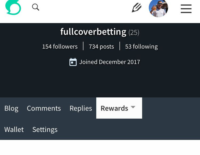
The rep in the wallet has been fixed but does still occur on the reward page as can be seen below.
Considering changes I would really like to be able to resize an uploaded picture. I know it can be done, but it is not easy and it does not accept all ratios.
yea, there are still things that you need at least a desktop for. I still go through imgur to resize them which is probably not the best way either. On mobile its getting better to read but creating posts in not the best
I can life with the fact if they are taking small steps. Better to do it good then launching a lot of new features which are buggy!
Yah just noticed it a few hours ago. It's a small update but it's cool. The interface looks more modern now.
well, even babysteps bring us farther along the way. its better than standing still
Its a welcome development to see this changes. It looks cool and trendy.
I think they should improve on the algorithm in charge of making posts exposure, it sucks when one is still in the lower reputation and his quality posts is not seen by many while a random picture by a user with high reputation will be easily seen
yea, but this should be a lot better when communities hit so there we need a bit more patience
Definitely, you are right, patience is the key.
yea i noticed it when i logged in to my account few minutes ago.nice update and improvement.
hope they keep it up and send more updates
I also noticed that..Steemit Home page was changed...
i think its good to have change here, it shows they are working on improving
Yes i also think that...