Registering My Discontent - STOP SCREWING WITH THE U/I!
"I rant, therefore I am."
- Dennis Miller -
Fasten your seat belts, apply your ear plugs, and lean into the raging wind....
FLAME ON!!!
I protest.
What are we, a bunch of children?
Do we really need Steemit programmers to hold our hands?
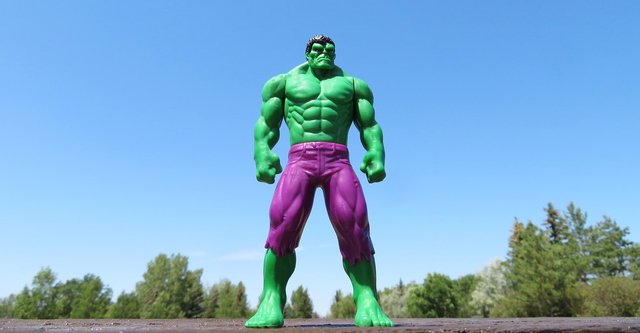
Hulk MAD!
Image courtesy of ErikaWittlieb and http://pixabay.com
All of a sudden,
every freakin' external link in all of my Steemit articles have BOTH a graphic AND a hover-warning.
After every link, there is a little out of the box arrow symbol.
That's right, folks, all those annoying little "[->" symbols scattered all through this (and now EVERY OTHER) article in my blog, those extra lines and spaces, the DIRE WARNING that
"This link will take you away from $teemit.com"
... Seriously? SERIOUSLY? Is this REALLY NECESSARY?
Oh, that's right - the Steemit U/I programmers need to have something to do - heaven knows, they are too busy to give us THE ABILITY TO EDIT OUR OWN ARTICLES that was promised a year ago.
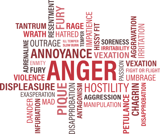
"SERIOUSLY? Is this REALLY NECESSARY?"
Image courtesy of Mary Pahlke and http://pixabay.com
Formatting articles on Steemit is hard enough.
I don't need any more "help" from the Steemit powers-that-be.
Come ON, guys... Anyone who has been on the internet for more than a day knows that links take you places - that they can take you anywhere.
Have you ever heard the term caveat emptor?
Sure, you want to educate and help the naive among the Steemit audience, but please don't burden every link on every page with this obscene overload.

Please don't burden every link.
Image courtesy of Martine and http://pixabay.com
Whose genius idea was this?
Surely you can find a better way to gently warn Steemit users. Why not be classy about this, instead of visually trashing ever page on the site?
Hey, how about this.
How about a redirect page?
Go ahead, put whatever warning you want on it. Ask the user if they are sure they really want to leave Steemit.
But, for crying out loud,
don't clutter every article with warnings. WAIT FOR THE CLICK and THEN warn the naive user.
Please restore a clean visual interface.
Eliminate the little boxes and arrows now.
Do it today. Then you can go back to whatever it is you were smoking...
[End of rant.]
Now that you know how I really feel about this,
Fellow Steemian, What do you think?
~FIN~

I can't believe they're at it again!
Image courtesy of Clker-Free-Vector-Images and http://pixabay.com
For more rants, raves, and complaints, CLICK our Library Steemit Shelf.


Introducing: The SILVERengines proton - Image by @creatr
CONTACT US - Will Exchange for Steem
You are why I'm here on Steemit!
I have very eclectic interests and hope, over time, to write about them all.
⬇️To Check Out @creatr's World⬇️CLICK Each Image Below⬇️

|
|

|
Rant on, LOL!! I had my hissy fit over short links and the mega notice they affixed to the comment section of my post - I felt it made people wary of my intentions and that riled me - lydon steemed right on and just ignored them :)
I'm usually pretty calm, John, usually one to take things in stride...
But I'm getting tired of the sudden surprises here! :O
Oh, well. Steem on, my friend! ;)
All I know is every time they screw with the thing, it runs worse than before. No you have to pray the vote actually takes hold. Plus its forever and a day before a comment is actually posted while you wait for the interminable spinning!
Eh, whad' you sey?
I can't tell, hypnotized by the spinning widget... :O
Petition signed
This is an ugly "feature" that needs to be removed.
I appreciate your concurrence, and hope your travels are going well... ;)
I’m pretty sure they added it because of phishing scams like this. But still! It’s ugly and needs a better solution.
Thank you :) We’ve been in Puerto Vallarta for a couple weeks and are heading a few hours away to San Blas next, which has been recommended to us by a lot of locals. Vallarta isn’t for us and we’re ready for something else.
I'm pretty sure you're right as to the why behind this mess, but there are seriously better ways to deal with it! :O
Good travels!
Or, perhaps I should say "Buen viaje! :D
@creatr totally agree with you, we need to spread tools that help in the post quality edition in steemit. For now it seems good that you have indicated this situation. Best regards
I just want the ability to set links to open in a new window so that inserting links in my post doesn’t automatically mean that a visitor to my blog has to leave my post to follow a link.
Hi Jayna,
Thanks for weighing in...
I have heard good arguments for not popping new windows... I actually used a similar one in my rant here. Anyone who has used the internet more than casually already knows how to pop a new window themselves, and/or how to use the "back" button to get back to your article.
Nevertheless, I do find it frustrating that the programmers take such decisions out of our hands. And in this case, they've just made our blogs look butt-ugly, with no workaround! <grrrrr!>
Cheers!
It really does create a visual commotion and congestion.
They are just too much needless to say they are for protection of steemians, they can make articles look clumsy
I do agree with you on that. @creatr
Is there a way to speek directly to the programmers? @creatr
Thanks for your supportive comment.
Sorry to tell you, but if I knew who to talk to, I'd talk to them first before posting a rant like this... :(
Ok.
Well done
I think I have seen those before too. Wondered what the hell they were. Thanks for educating us @creatr. Hell if Steemit won't, caring folks like you will, and you give a damn thank God. Blessings. - Troy
The frustration is killing me.... <grumble, grumble, grumble!>
You will e in my prayers as will this mess. Blessings @creatr
Agreed, the extra little icon makes things look way messier. I wonder if they are doing a little CYA for all the hacks that have been happening recently? Although I have found the changes are making things LESS usable- I keep getting logged out and having to log back in to vote or comment, and half the time my votes don't go through :/. And I agree, being able to go back and edit older posts would be super helpful! Whenever they get around to it....
Yeah, I'd say that's very likely the motivation. It's a good motive, but a really, really horrible solution.
Yes, the platform performance has been terrible lately. Almost as bad as the DDOS attack period a while back.
The inability to EDIT is a perpetual annoyance.
IN OTHER NEWS, dear @sunravelme, I recall and very much appreciate your interest in the B&TB props I'm working on.
I have been too busy actually working on the props to write about them, but I haven't forgotten that intention. When the rush is over, I hope to write several descriptive articles. I will certainly let you know when that happens! ;)
Thanks for stopping by and commenting.
<3 I am soooooo excited to hear about the props!
:D
I was thinking the same thing.... i thought it was something that I was adding! and I kept going ummmm did i screw up something AGAIN in the code?!?!
aghhhhhhhh it is so ugly!!! but your ranting is a little hilarious ;)
Just a little?
You want to educate and help us thats good.Really amazing thinking.