Steemit changed the style again. New logo, new colors, same old errors
Hi Everyone
The new Steemit is GREEN now! and the logo is completely redone. New style again in less than a month?
But a lot of things that caused Steemit members grief still there...
This is an example how myself and others have to explain to inexperienced members how to vote for their Witnesses
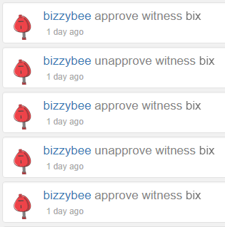
Why? Because most of them simply FOLLOW INSTRUCTIONS which appear to be misleading causing this:
Why? because after VOTE it shows the name of the witness and when you point to it, it says "VOTE". When people do that, they actually UNVOTE (UNAPPROVE) you.
Same happens when someone forgets that they voted for you, they type your Witness name in the input field and click on VOTE expecting that if it says VOTE and they already voted for you, nothing bad should happen.
Not really!
When they click on VOTE but they already voted for you it make them to UNVOTE you. So the VOTE button does not really mean VOTE. It means to TOGGLE your voting status for that witness, whatever it is.
This is not quite how a well-thought user interface supposed to act.
Leaves me puzzled why spend time and efforts on cosmetics when seemingly major things are not addressed.
How about having the VOTE input field and the button on the top and the bottom of the list so most people would not have to scroll? Don't developers know that most people actually do have to scroll? It is a common design principle that most commonly used functionality should be the most easily accessible. Well, that would be too much common sense, wouldn't it?
Why not having voting page respond to a parameter with my Witness name in the URL so i could give people i want to vote for me a URL that when they click will pre-fill the VOTE field with my name? Is it too much to ask? Or is it too hard to program (I think i remember it took me somewhere between 1 and 3 extra lines of code).
How about a small page with just the voting form without showing everybody else who are unrelated to voting for my Witness?
How about showing more than top 50? Is it too much to ask? It is usually given to students on a 10-minute quiz to write something like that.
What about a simple search for a Witness with certain name, maybe even show a position of the witness I am looking for?
I guess it is all too much to ask. A new color pick and a new logo is way more important.
Maybe I am missing something and there is master plan behind those priorities. But i guess there is no such a thing as "common" sense! Our common sense does not have that much in common.


▀
EXACTLY! Not once, but twice in a row! While so many other things that users really need but do not get...
Well put. Lets hope this is the last one, so we can now focus on more important thing
yeah... many issues... but it is getting better... albeit... painfully slowly ...I for one... would love to see a person to person messaging option on here... it is a BIG reason why people stay on facebook.
As for person-to-person messaging there is actually something here. not directly integrated but there is a chat. there you can chat directly to anyone in private. you can try it actually. This is how you can contact me:
https://steemit.chat/direct/bix
as for painfully slow - yes, especially taking in consideration that a lot more and way more serious things were not fixed while efforts were spent on the make up:
https://steemit.com/steemit/@bix/how-i-posted-the-same-post-3-times-in-a-row-transaction-broadcast-error-typeerror-network-request-failed
Lots of people complained about that one, as far back as last year! Plus a lot more.
Hope someone would listen. It discourages a lot of people
strange... this reply of yours... is impossible to read and in a yellow window.
Hi @rich-oth-hegy, why is it impossible to read? Is it because of the way it is written in English or visually on your computer in your browser? Could it be your browser (try in another one) or monitor settings? I think Steemit uses new style to show replies from the original author of the article on yellow background.
the last message that I could not see... is now visible and in the same color/font/background as everything else... your last one tho.. .is now unreadable in the full context as it is now in the yellow and seemingly blank window. ... weird right?
the yellow window seems to indicate the last communication from you... it shows up only when looking at a comment by way of "viewing full context"
Please file this issue under:
https://github.com/steemit/condenser/issues/new
Thank you.
I will, thank you. I was somewhat discouraged to do so because it's been known for a very long time and nothing changed, other more serious issues were known since last year at the very least and they are very well known too but not addressed. So i thought i'd be just wasting my time reporting on something well known yet not addressed yet. If you think it can really make a difference I'll file it, just in respect of your opinion that it might make any difference and anyone would listen. Actually it would be an interesting test what will happen, if anything, and how long it will take. :-) thank you for your feedback