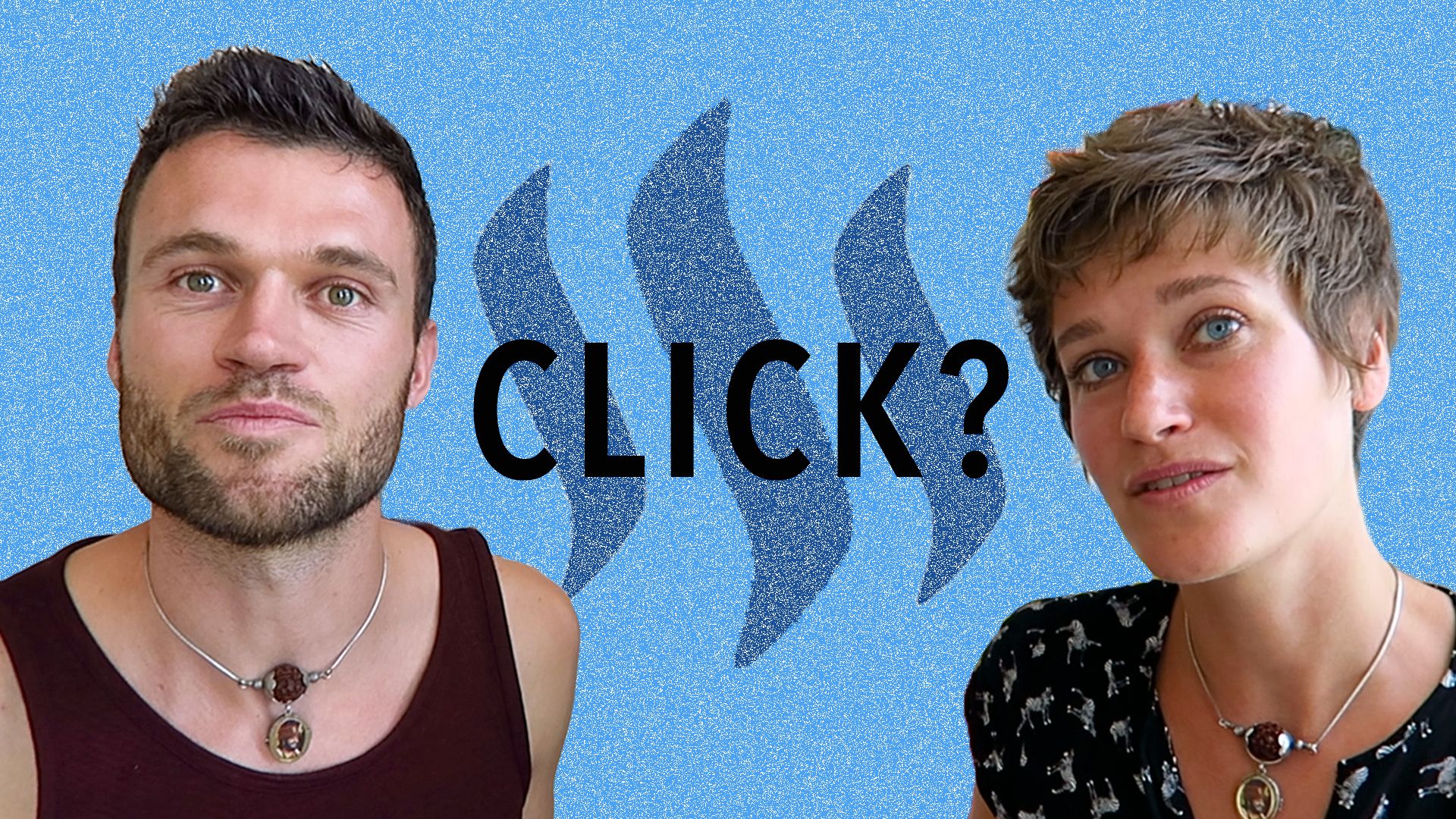
What makes a thumbnail clickable?
Question
Hey Steemit friends! I’m just having a quick question, would like to hear your opinions. In Steemit, as in all social media platforms, visuals play a huge role of course. And thumbnail images always do a lot for making a post look inviting or not. So my question is: what kind of thumbnails do you tend to appreciate and which ones have most appeal for you to click?
What makes a good thumbnail?
Here are some of my thoughts on the topic. First, I feel a good thumbnail should reflect the content of the post and match the headline – there has to be congruency between what is promised before you click and what is in fact delivered. If there is one thing I don’t like, then it is for visuals and headline to look ever so promising and then for the actual post to be a disappointment. Feels like someone put all his or her attention to grabbing mine, without actually caring about me and my user experience. If I’d want to exaggerate Id say – that just makes me feel used.
Next, I would say personal touch is mandatory. For two reasons: personal touch shows the author put their effort in. Any author who puts sincere effort into their post, I feel they deserve my sincere attention also. Of course, that effort can show through many things, for instance the quality of writing, the amount of research done, the detail of the content, the perseverance someone has shown to get to the point of bringing this specific content out as a post. And second, because a personal touch creates a style, a brand, allows you as a reader to connect with the author on a gut level.
Third, I feel the thumbnail pic has to capture some of the essence of what the post is all about, ideally without revealing too much – more like a teaser that puts a question in your mind, giving you this feeling that you need to click this post for you to get the answer. Subtly of course, no time for all of this to happen explicitly and out loud. But I’d say typically, a great thumbnail and headline combination gives you this feeling of an urgent question (which 0.5 seconds ago didn’t exist for you yet) that urgently needs to be answered, and that the actual article is going to help you with that.
So my top 3 for thumbnail pic guidelines is as follows:
- matches the content of the post
- has a personal touch
- raises a question which can only be answered by reading the post
Steemit versus YouTube thumbnail
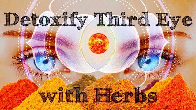
So before Steemit, I’ve spent time on YouTube. I just love putting a new YouTube video out and please don’t laugh at me for this, but guess what my favourite part of the thing is? That’s right – making the thumbnails. I adore making funny, colourful thumbnails. I get a screenshot from somewhere halfway through the video, put it in Photoshop and mess around with background images and title. If I could be making three thumbnails a day I would do it. But typically we make waaaay less videos than that. And for our YouTube channel (my husband and I always make our videos together), I feel I found our style and also that I’m getting close to meeting the above three requirements. But, and here comes the whole point of this post. I’m not sure if I also feel the kind of thumbnails I make for YouTube also work for Steemit. And here is also where I would like your opinion.
So what is the difference between Steemit and YouTube when it comes to best thumbnails? Two points:
- Thumbnail pics show smaller in Steemit. Doesn’t matter in which browser I open, so guessing this is platform layout. And size does really matter, because where in YouTube I feel our thumbnails look fun and inviting, as Steemit thumbnails I feel they are too much and too crowded. So that would mean Steemit thumbnail pics need a bit more focus and simplicity.
- YouTube is a video only platform, Steemit allows for video sharing but is more for blogging and written text content sharing. I’m new on the platform, please correct me if I’m having wrong assumptions. With written content, connecting with the author happens in a different way than connecting to video bloggers, is what I feel - Faces and personal pictures don’t matter as much for establishing a relationship. So maybe that is why I feel more weird about putting up our personal pictures in the thumbnail image, when sharing a post.
So what do you think?
Many of the things I mention above are my personal assumptions, even my personal taste. Not a lot of research findings to back my up here ;). However, I feel it would really help my (and our common) understanding if you guys share your opinion too. Do you like thumbnails to be more artsy or rather more clean and focussed to the point? Especially for bloggers who share their posts – would you recommend seeing personal stuff or would you say to stick to the topic? And do you see a difference between thumbnails that work well in YouTube and those that work well here on Steemit, and if yes, what difference is that?
Thanks for reading and especially for your comments and input!

.jpg)
Hi friends @amritadeva! I have been pondering this exact question myself, not explicitly about thumbnails but in the general guise of how to get people to click and read. This from another friend of mine who is very successful at online ad campaigns and if it works for ads it should work for thumbnails:
The image's number one job is to grab people's attention and pull their eye to the headline. To do this effectively, the image must function as a pattern interrupt.
That's why nice shiny stock images almost never work: they just blend right in.
The key is to pick bright, unusual, or strangely-cropped images that leap off the page and catch the eye.
But that's only half the equation.
Being eye-catching alone isn't enough. The image must also have a "loose connection" to the offer.
In other words, you want the image to be relevant to the headline and offer... but not TOO relevant.
You want there to be just enough dissonance that the viewer has to stop and try to figure out what the connection is.
His website is thirdwayman.com, he usually focuses on helping find what drives our passions and getting moving, but is also giving pointers on how to establish and grow online businesses.
Anyway, I agree with your intuitive premise that print and video venues need different thumbnails, their user bases are different...as well as the size issue. If you figure it out share because I am confused too! Your backgrounds and thumbnails are really nice:-)
Cool, thanks, that is really valuable info!! And also makes a lot of sense, the way your friend puts it. I would have guessed that a nice shiny stock image doesn't do the trick, but this helps a lot to understand why :). Will definitely take into account for next time. And yes any other tips and tricks we learn along the way let's share them :)
Here are more tips!
I like your thumbnail by the way!
Have a nice day :)
Thanks! Yes, right size definitely matters :). And I like your idea of brand colours. It connects to the point of personal touch - having a style that people can recognise and grow familiar with. Great input :)
Exactly.
Bonus tip: Upvoting each other while commenting increases reputation quickly :)
Haha, cool :)
You learn quickly :-)
I think you nailed it with the focus and simplicity part. This especially applies to text, I would limit thumbnail text to just a few words
Thanks! And true. I think even layout and pic should be simple, but especially text easily creates an overkill of information...
Whuddup! I saw that you are new on steemit so this is me supporting you. I just upvoted you for this as you deserved it and maybe upvote some of my stuff too!
As a newcomer to steemit, it's not easy getting those big upvotes so maybe you want to try @MinnowPowerUp where you can earn up to 30% more steem power than just directly powering up! It's a subscription based daily upvote bot that draws its power from a delegation pool. I have more info on my experience with the system in this post where I explain how I earn over $1 a day from upvotes.