My take on the new Steemit logo and Steem.io website
I've been taking a few days to think about the changes we've seen to Steemit, and I'd like to share my honest opinion on the future of this platform.
When I opened up Steemit on Wednesday I was pretty shocked to see the new design, colour scheme, and logo. Not that I thought it was bad in itself, but I am such a believer in the Steem brand that I thought redesigning the whole interface, and taking away the visual links between steam and Steem, something that is so popular and loved within the community, was a critical strategic mistake by the leaders of this project.
I mean just imagine Apple changing their logo, and instead of an actual apple, it being something else that has nothing to do with apples!?
After all, it's the brand that gives a product or service value above all else, especially in the cryptocurrency ecosystem, which is moving and innovating so quickly.
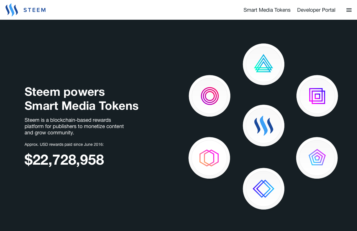
I'm happy to say though, that after seeing the announcement yesterday of the new https://steem.io website release, and taking the time to look over it and think about what it's trying to be, I have a better understanding of the direction that Steem is going in, and I think the future looks very exciting.

The first thing that you see when opening up the website is a graphic about Smart Media Tokens. Most of us have probably heard of SMTs, but if you haven't, this is what they are:
An SMT is a native digital asset on the Steem blockchain. SMTs can be launched by anyone to help monetize online content and create incentives to encourage desired user behavior.
SMTs like Ethereum's ERC-20 tokens, but with certain built-in ‘Proof-of-Brain’ properties and a token distribution reward system designed specifically for digital content businesses.
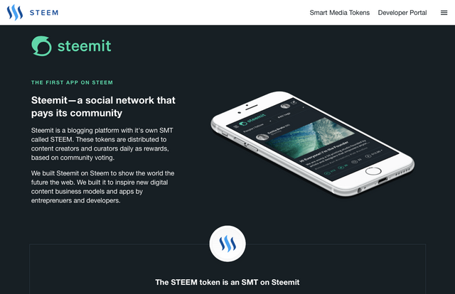
If you scroll further down, Steemit is presented as the first app on Steem, and the STEEM token as an SMT on Steemit.

I think this is more than just a creative reshuffling of words. What I think is happening here is that Steemit has been rebranded, and its brand weakened slightly, in order to strengthen the brand of Steem as a blockchain, and differentiate between one that's an app with a particular use case, and the other that's a platform for a whole ecosystem of apps just like Steemit, and dTube and dSound, and many more coming in the future.
Of course this is a really tough call to make, because we all love Steemit the way it used to be, but I can understand the incredible potential of creating an ecosystem of apps around Steem, just like there is on Ethereum, but for social media. Focusing the power of the Steem brand on that is probably the best decision to achieve that goal.
It's like in Chess, sometimes you have to sacrifice your Queen to put yourself in a stronger position and eventually give checkmate.
As for me, I'm slowly getting used to the new look, and I'm spending most of my time in Night Mode. 🌃

I'd love to hear your thoughts, do I think I've got it right? Is my analysis on point? What do you think about the changes and do you like them?
Leave your comments below and...
Full Steem ahead!
I also was pretty shocked to see the new design, colour scheme, and logo
Yeah same! I've been panicking the last couple of days but I do think I understand now. It is better for the Steem brand, with the original logo, to be kept for the Steem blockchain.
If you think of it like Chess, Steemit is the Queen and the most valuable piece, but it is still just one piece. Encouraging an ecosystem of lots of other pieces to grow up around the King, which is the Steem blockchain, and playing with all of those pieces together, is what will make this project stronger in the end, and I think that's what they're doing.
I was really against it, but now I do support the change!
I'm also just using night mode now, I'm getting used to the logo and colors, the only thing that I can't handle is that green bar on the right of the post's section.
Yeah it's taking me a while to get used to everything. Hopefully they'll keep upgrading the website to make it fit better with the new theme in time.
I really did love the old Steemit, but if the Steem blockchain succeeds in becoming the platform for SMTs they are planning for it to be, then it does deserve to take over the brand and the logo.
If that happens the price is going to the moon, and it will be worth it! 🚀
Yeah, I'm seeing a lot of projects whit great potential being build on top of the steem blockchain. I really liked the idea of utopian.io, I think it has a great potential if open source developers adopt it on their projects.
Great post, I just liked the previous steem logo more then this green/white one...
Thank you for the resteem I really appreciate it! I did like the old logo and design more, but at the same time I think keeping the strongest brand exclusively for the Steem blockchain is the best decision.
Very exciting things are happening soon. We're already having the first ICO on Steem, a project called Appics, and I'm sure many, many more are coming in the future. Steemit.com is taking it's place now as one app in a whole ecosystem, and that's better for us all in the long run.