7 Days to a Better Steemit Blog - Day 3: Using the Steemit Settings to your Advantage
Welcome to Day 3!
Yesterday we talked about how to design a value proposition for the target audience of your blog. Make sure to check out that post if you haven't already!
Using the Steemit Settings to your Advantage
With Steemit open, if you click on your avatar in the upper-right hand corner, and then click settings from the drop-down menu, you'll be directed to the page we're going to discuss today. Out of all the features available to modify at the time of writing this post, there are 5 that are of concern to us:
- Cover image URL
- About
- Display Name
- Profile picture URL
- Website
We'll address each one of these topics, with the topics from Day 1 and Day 2 of this series in mind.
Your Cover Image
When someone navigates to your Steemit profile, i.e. https://steemit.com/@stevecronin, the first thing they will see if your cover image. This means it is also your first opportunity to use your cover image in order to convey your value proposition to your target audience. This same concept is used on YouTube and is a handy trick I learned from Tim Schmoyer that assisted in my own YouTube channel reaching 22k subscribers.
Why is this important? Because, despite what we may think, people tend to spend a very short amount of time on a web page before they close it and move on. Not many people are going to start reading your blog or watch your video after reading the title, and so very few will even read or watch until the very end. TributeMedia suggests you have only 7 seconds to grab an individual's attention before they move on to something else. So, it is within that time that your cover image should be used to make a person realize, Wow! This blog is exactly for me! I'm going to spend more time reading.
Here are some examples of good cover images I've seen:
https://www.youtube.com/videocreators
https://www.youtube.com/everydaydrinkers
https://www.youtube.com/starwarsminute
You'll notice these are all on YouTube, I'm having difficulty finding Steemit users following this concept!
The About Section
The principles for what you should write in the About section are the same for your Cover Image. You want to quickly address your target audience and communicate your value proposition.
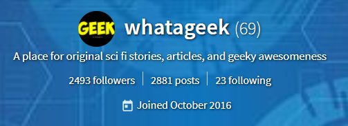
Here's someone on Steemit called @WhatAGeek I was able to find pretty quickly in the Trending section who does just that:
Simple and to the point, after reading "A place for original sci fi stories, articles, and geeky awesomeness" I have a decent idea of what to expect from this Blog before I even read a post. The value proposition could be narrowed down more to reach an even more defined person, but maybe that's not what that user wants to do at the moment.
Your Display Name and Profile Picture
Speaking of @WhatAGeek, something this user also does really well is his display name and profile picture provide a message consistent with the about section. His profile picture is a branded logo with the text "Geek" (many users, like myself, have a photo of themselves, which is fine if that is part of your brand.) Furthermore the display name "whatageek" correlates to the profile picture and everything in his about section, particularly the text "geeky awesomeness."
The point here is branding consistency.
Your Website Link
This one is tricky because you're immediately offering a user to leave your Steemit blog and go somewhere else. Is that what you want them to do? It depends. This is a good opportunity to either allow a user to learn more about you or your work - or - link a reader to a website where they can get free content by signing up for your mailing list. The point here is, if you're going to take someone away from your Steemit page, take them to another place that's yours. I personally wouldn't recommend placing a social media link here unless you have a lot of content and followers to further establish credibility with your audience.
Conclusion: How to think about Steemit Settings
Here is the thesis for Day 3, use all the features in your Steemit Settings dashboard to assist in communicating your value proposition to your target audience. That's it!
Do this Exercise now!
Comment below with the text you currently have in your About section and write one way in which it can be improved!
If you enjoyed this pose, please give me a follow here on Steem and consider upvoting!
See you tomorrow :)


Good post and thank you for sharing
Thank you! Day 4 out now :)
https://steemit.com/steemit-help/@stevecronin/7-days-to-a-better-steemit-blog-day-4-how-to-use-thumbnails-effectively
Great entry as usual <3
I had that in mind when started to fill my profile but steemit doesn’t like instagram link so I still need to find a solution. Too much work and too less time but I’m going to solve it, word.
Said that I want to notice you about your profile about since it is bigger than the mark almost from my iPad so soe text it’s cut...
Check it please! If you can point me a solution for image hosting it will make us even ;)
Oh interesting! I don't have an iPad but I would imagine that the cover image would show up differently on different devices because of resolution and maybe other factors. I'll have to do some research about the appropriate size for these headers. Thank you!
Day 4 out :) https://steemit.com/steemit-help/@stevecronin/7-days-to-a-better-steemit-blog-day-4-how-to-use-thumbnails-effectively
Amazing mate!
This is organically grow. ;)
I follow your suggestions and I think I nailed it finally!

Check how it feels at my home page and share your opinion, please!