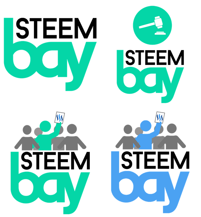
My Entry For Steembay Logo Contest
This is my entry for the Steembay logo contest. Informations about the contest you can find on THIS LINK.. Leave a comment if you like it or dislike it, would love to hear your opinion. So let's see what I done.
- Full resolution of logo design here :
STEEMBAY LOGO Contest // White background
STEEMBAY LOGO Contest // Transparent background
LOGO DESIGNS


TYPOGRAPHY
For this one, I use two kinds of fonts, one for "STEEM" and one for "bay" as you can see. I don't do it often because I can never hit two different fonts to fit well. But this time it was somehow better for me to divide those two parts with the font and color. Font I use for "STEEM" is standard, minimalistic and simple but "bay" font make it more interesting and groovy.
- STEEM font : Baron Neue
- Bay font : Embrionic
OTHER STUFF
The only thing that was downloaded from the internet was fonts, everything else was made by me in Photoshop PS. Like that hammer and and these people who bid with steem dollars. There are two types of characters.
The main one is biding so it is painted in steemite colors.

COLORS
There was no need to think much about choosing a color. The colors that I am in are the colors of the old and new steemit logo.( #04d6a7 / #4ba2f2 )

If you like my design, please upvote it in post comments from Steembay. Here's a link of my comment/entry on the contest post because only the first three with the most upvote are entering //
thank you // MY ENTRY COMMENT // White background

thank you // MY ENTRY COMMENT // White background

Awesome logo my friend, keep up ;)
@originalworks
The @OriginalWorks bot has determined this post by @antoniokarteli to be original material and upvoted(1.5%) it!
To call @OriginalWorks, simply reply to any post with @originalworks or !originalworks in your message!