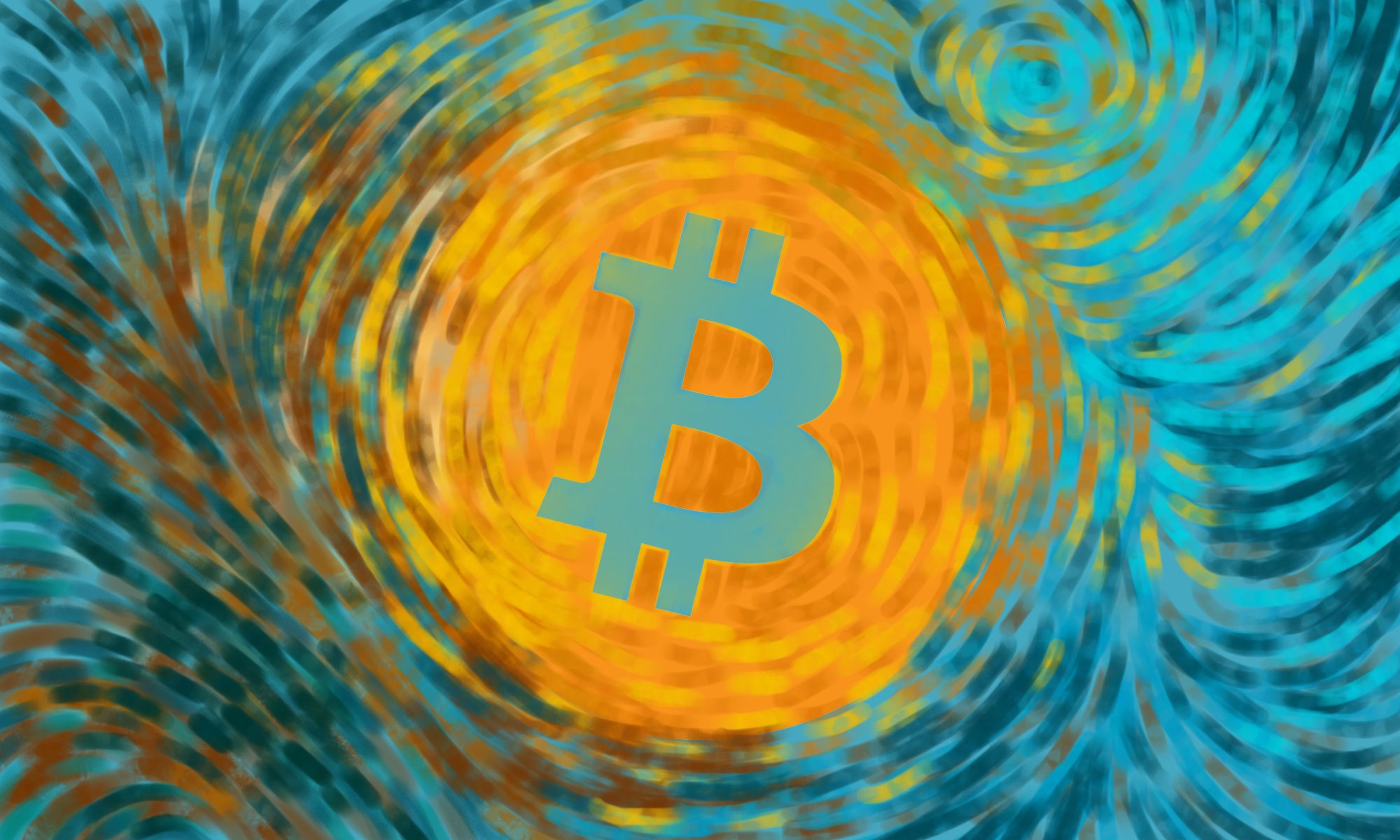
Van Gogh [Bitcoin Edition] ^.^ Crypto Logo Art Challenge - Entry ^.^
.png)
Yesterday I found a really interesting challenge - Crypto Logo Art Challenge [Bitcoin Edition] by @SndBox.
I was very excited to give it a try because the thought of combining art style and logo design was truly appealing.
Creating a logo requires compliance with certain rules, but in this case the sign is already set so it just needs to be incorporated in appropriate background.
.png)
THE SOURCE OF INSPIRATION
The whole idea started by combining two main things - the Bitcoin logo and the Van Gogh style. I really wanted to see how this is going to turn out, most of all, I haven't used this technique before.
This is the piece I used as an inspiration:
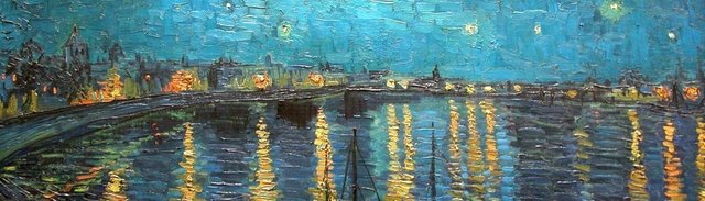
Source
CHOOSING COLORS
Next step was to choose the right colors.
I didn't want to just pick some random colors so I used the help of two programs.
The first one is called The Pictaculous by Mail Chimp. I've known this little online program for years and it did a pretty decent job.
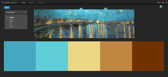
But last week one of the great designers I'm following on Steemit @multi4g submitted a post called Affinity Photo - How to Match Color. There he showed a new tool from Adobe - Adobe Color CC. It's also free and measures every photo that you like.
And here's a quick gif with the selected colors:
From here on I can start doing my project. ^.^
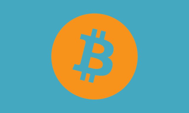
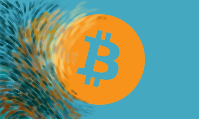
Using the Bitcoin logo and one of the colors from the palette to make a contrast:
Maybe this tone wasn't the right choice but I had to start from somewhere.
Also, my idea was to make the circle a light that shines brightly trough the night.
Next was making the brush strokes.
Started from a simple round brush and with some trials and errors came up with this:
Using the previous color palettes and controlling the opacity of the brush from 70-100% I started making strokes from the center out.
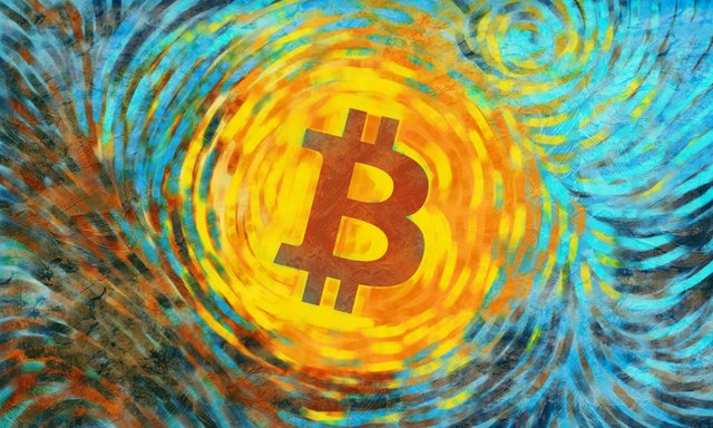
WORK IN PROGRESS
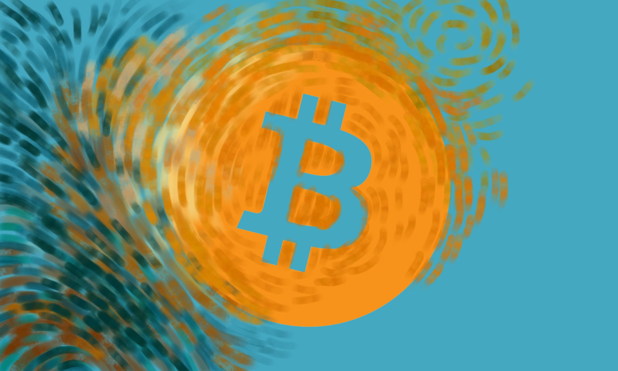
Adding more and more strokes until the whole canvas got covered up.
At this point something there was still missing.
The painting didn't look traditional at all. ^^'
That is why decided to add some texture on top of it just to give the feeling of embossed oil paint, reflected by another light source.
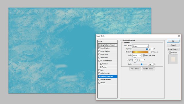
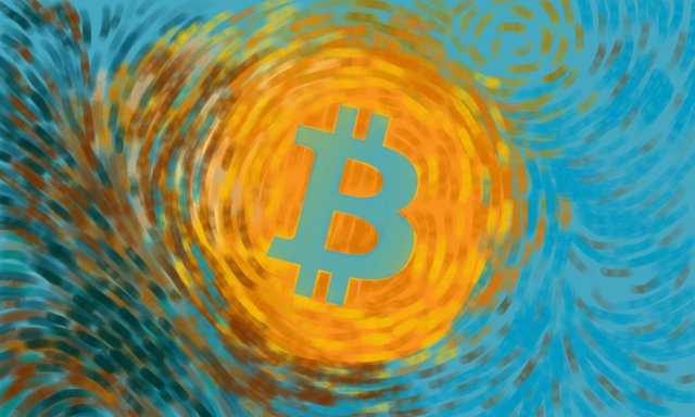
For a better contrast, I had to duplicate the strokes' layer and chose Vivid Light mode with 50% opacity.
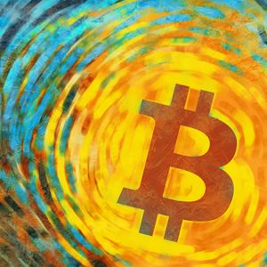
And here's the final result:
I hope you like it!
^.^ Have a sunny day, everyone! ^.^
Thanks for stopping by!
Cool! I'm thinking about maybe doing a real painting with some oils in honor of Van Gogh!
That would be great! ^.^
Unfortunately, I'm not good with oils so I tried it digitally.
that looks really cool :)
Thank you, @multi4g! ^.^
And great thank you for the post about the colors! ;)
Watching it turn into an impressionist painting was fun :D Think that logo looks much better as a painting XD
Thank you, @ryivhnn! ^.^
I don't know if the result is good enough, but at least the idea was interesting. ^.^
i love your drawing ! Especially your last post !
Thank you! It was fun to do! ^.^
Много яко!
Мерси, мерси! ^.^