DLive Logo Contest - Entry ^.^
.png)
I decided to share with you some simple projects for the DLive logo contest.
I say simple, because I have not developed a new font or researched for others, I think the one they are using is appropriate enough.
What I have worked on is the development of a ninja symbol combined with the letter D.
The main element I choose from the ninjas' weapons is a kunai just because of the fact that the blade resembles the play button.
My inspiration came from the preview pic of their post - it has a small minimalist form of kunai under the logo. ^.^
I wasn’t very sure about the direction of the kunai so decided to make couple of variations of this idea. There are total of three to this submission, each on a white and dark/black background.
.png)
Here’s a first draft where you can see some simple shapes made free hand.
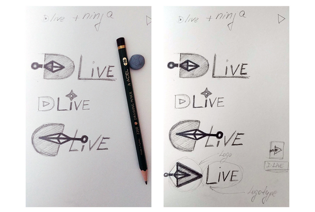
Version 01
The first design represents a small kunai with no handle, just the blade that also symbolizes the play button like in the original logo. Some yellow color was also added as part of the rules in the contest. Not much, just enough for the weapon to be recognizable.
Usually this color combination (yellow-black) has a rather aggressive impact so I don’t want to go overboard with it.
I also made the same version on a dark background, because I read that there’s going to be a night mode DLive. And also because this is one of the requirements for building a logo.
![]()
It looks quite simple (the simplest things are always the most difficult to make), but hope it’s effective enough.
Version 02
I wasn’t very satisfied with the shape of the D letter (I initially wanted to leave it like the original logo, but that required changing the tip of the kunai - it’s a bit rounded, not sharp as the real weapon).
So later decided to make the D letter following the shape of the blade. And here’s the result.
![]()
In this design the D letter is starting to lose its semantics and looks more like a play button. This may be a bit confusing for people outside the Steemit community who doesn’t know about the platform’s name.
But I kept the design hoping that in some form or another you will appreciate it.
I know from experience that the first version is almost never the best one.
Version 03
In this test the direction of the kunai is the opposite to the first two. This also requared changing the position of the D letter. I just flipped it horizontally.
There’s been some changes on the letter i so that it fits the weapon.
Hope it’s still readable.
![]()
And here are all of the designs the way they were submitted in the contest.
![]()
Good luck to all contestants and let the best one wins!
A already saw some really awesome projects.
I hope you like my designs.
Have a great day, everyone!
Thanks for stopping by!
Very nice design of the logo, @katalinaooma ! I like the cleanliness and how the kunai's finger space becomes the dot of the i on the DLive logo :>
GOOD LUCK IN THE CONTEST!!!
Thank you, dear Spidey! ^.^
I'm glad you like it, it came out too simple tho'. Yeah, you can even see a stick figure in that last version. It's kinda weird. XD
Woah havent seen this entry before! It looks really great and super clean and simplistic! I wish there was a way to do the flipped D, because it looks really cool with the kunai and the "I" combined but thats just my opinion haha!
GOOD LUCCKK :D
Thank you, Maya-chaaan! Yeah, I wanted to do add only one simple object and concentrate on the letter D. But maybe this came out too simple boring (and that's why it's hard to notice XD).
Thank you and good luck to you too! ^.^