STEEM SCHOOL EP 2 - HOW TO PERFECTLY FORMAT YOUR STEEM POST!
A good post formatting says a lot about you and today I show you how to perfectly format your posts! *
Welcome to Steem School episode 2 ladies & gentlemen.
Yesterday I wrote about how to write the perfect comments that will get you a lot of upvotes and followers which you can read HERE.
Don't worry about missing episodes, every 15 episodes I will write a post that lists all the recent episodes so that you don't miss any of them!
Let's get started with todays episode!


Step 1: The Thumbnail
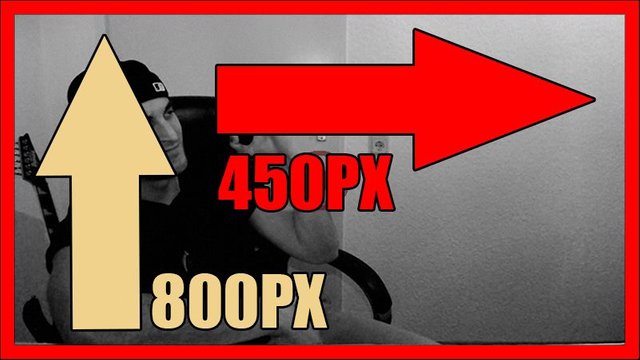
The thumbnail must be 800px wide and 450px high to be perfectly displayed in the Steem feed and in your post. I always add two frames to my thumbnail to get more visibility on the Steem feed!
I use Photoshop to create my thumbnails and I have created a template so that I just need to add the text and a graphic and be done with it, that takes 2-5 minutes and I don't need to create a new one every time!
Just realized I did a mistake with that picture below, of course it is 800px in width and not height.


Step 2: Separators (Graphic and Code)
Separators must be 800px long and the height is up to you (it shouldn't be too high tho!). The graphic must be saved as a .png
I recommend Photoshop to create these separators. If you want your own Separator but cannot create one you can contact me on my Discord server and for $5 SBD I will create one for you.
I make way more money in the 10 minutes required for that so It is a bad deal for me to do that for you guys.
This is a one time offer from me.


Step 3: Markdown
Markdown guide: https://github.com/adam-p/markdown-here/wiki/Markdown-Cheatsheet
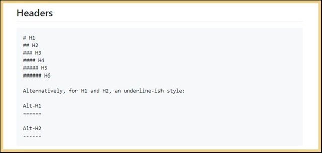
Markdown is simply one or a couple of signs in front of your text or in front of your text and at the end of it, that converts your text to bold, italic, to a link to a header or more.
The markdown guide that I posted above is very simple and easy to apply, you can learn all markdown on that guide in just 10 minutes!
You won't need to read another Markdown guide after you have read the one that I have posted above and if you still have questions you can ask me anything that you didn't understand.


Step 4: Footer
A footer is not required but it is the perfect place to display some statistics about you. I have created a graphic where I display my stats in which I upgrade to show you Steemians my progress.
You don't need a graphic but I highly recommend one. If you want to create a footer it must be 800px long in a height you like.
In my footer I display my current reputation, the number of posts (that means posts & comments), the number of followers that I have and the days that I actively started posting on Steem (I am currently writing 2 posts in average every day for 113 days).
In the middle of the logo is a Valknut which is the sign of Odin with his crows around it and the runic alphabet. You can use that place for your logo!


Step 5: Graphic Size
All graphics must be 800px long which will fit the whole page. You don't need to find 800px long pictures, you can just edit pictures to be 800px by increasing their size or by cropping the height away.
The pictures should not be too high but the length (width) must be 800px otherwise the post will look chaotic!
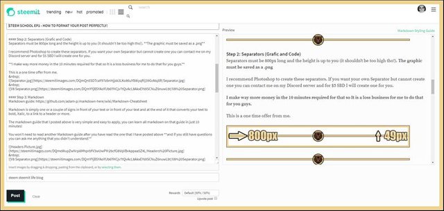
Protip to see a preview of your text while you edit it: Install the app called "Steemit More Info" which does not only show you the preview of your post while you edit it but it also displays the current worth of your upvotes and your post and more!
You can download "Steemit More Info" HERE.
Below you see a screenshot with the preview of your text & markdown on the right side and that will be it for today, my friends!


Berserkers Discord Server: Discord
Convert your Bitcoin to EUR/USD (Europe:) Wirex
Get More & Higher Upvotes: Steemfollower


Hi and thanks for your effort,
I'm learning about steemit for a week or so, and today I decided to write my first post, but I come across to your school and after episode 2 I have to delay my introduction post until I watch at least all of episodes in this Steemit school season. Tnx a lot :p
This is my first comment and you have deserved it. And I will probably upvote you first.
Also, I am curious will I write this comment well.
Keep up the good work!!!
This is indeed a very good comment!
Welcome to Steemit!
Wow tnx, for the upvote!
I was so excited that I was accidentally voted for myself also :D
Ok you have seriously raised the bar now. And I am not talking about the post because you have demonstrated those skills for a long time. I am talking about the presentation. Clearly you are totally at ease in front of the camera after doing it for so long( which is also something you advocated to people) and you know your shit. It is just staggering how far you have developed over the past 100 plus days. I sound like a kiss ass but credit where credit is due mate. Do not upvote this comment because I do not want to profit from your hard work when it has motivated me so much.
The steemit school is another big hitting idea that will send you to the top here. You have found your stride and when that happens with someone it becomes infectious and people admire it. I will attain this at some point hopefully and am posting every day and taking cold showers thanks to you.
Nice one. Onwards and upwards (TM @jist)
Thank you Jist.
I have found my purpose after being embraced by the darkness for too long.
I made my decisions and I stick with them till the end at which I will find a new path and a new decision to make which will change me again.
We can decide who we want to be and I have decided to become a person that knows how to make and maintain a high amount of money to have more options in my life.
I am having a similar experience. It is the catalyst to greatness , Forged in Fire!
I would describe it like this: Having been defeated too many time and now chasing revenge with bloodlust.
It is a revolt against the status quo and a quest for greatness.
Thank you for the info on the separators. I could never get the length right. Plus, you gave me an idea I hadn't thought of. Definitely worth a follow.
Thank you Omra!
Class is in Session. I like Your Separator Btw @valorforfreedom
it only took you 55 seconds to teach me something new, I did not know about the More Steem options Addon.
Really Enjoyed being in Steem School haha! Steem-on!
I am glad that it helped you Nova!
So the Thumbnail you talk about is always your first photo? and that needs to be 800px wide and 450px high which if I don't have Photoshop I can use Paint to resize things? I'm assuming.
This was a very wonderful thing you offered!! can I choose anything for the center for that price that is just for today? Like colors and stuff?
I think in Pizap.com you can make thing transparent but not as easy as it is in Photoshop........which I don't have but at least now I know the size I need to make the separator if I ever have time to try and do it.
Once again thank You for the sizes. I will bookmark this post!!!
Great information and loved the video!!!
Have a wonderful day!!!
Yes the first picture of your thumbnail is always the first post and in blogging standards that is the first thing on your post. Yes, you can use paint to resize it, I don't know if you can crop with that tool tho, I never use it.
Contact me on Discord for the separator.
I am glad you like the post!
Good tips on the dimension of thumbnail. I remember I searched around before for that, 800px width does seem to work well. Thanks for the tip!
And the overall formatting tips of course, I have used a lot of them already! Professional formatting is a must for attracting followers.
100% Evan.
My friend, thanks for an excellent and in depth article, however , I have a problem. You're assuming a certain knowledge base before you start.
'Step 1: The Thumbnail
The thumbnail must be 800px wide and 450px high to be perfectly displayed in the Steem feed and in your post. I always add two frames to my thumbnail to get more visibility on the Steem feed!
I use Photoshop to create my thumbnails and I have created a template so that I just need to add the text and a graphic and be done with it, that takes 2-5 minutes and I don't need to create a new one every time!'
Sorry about the simple questions, Im 51. If you ever need to know about registers in a Z80 processor or develop a database in cobol, Im your man :-)
1.You need to edit the size of the picture and the size is usually displayed there. Where those options are depends on your Software.
2. A frame is a border around the thumbnail. I just add 2 because it looks better.
This post will help you further: https://steemit.com/dtube/@valorforfreedom/3xnnkuzm
And don't worry about it, we are all newbies when we learn something new.
Thank you !! I look forward to your up coming articles :-)
@valorforfreedom
Hmmmmn... Thumbnail, Separators, Markdown, Footer and Graphic Size. You know, I like the details you prescribe.
Excellence, they say, is paying attention to details. This you've shared will help me present my posts in more excellent ways.
Thanks. Great work!
Thank you Restandreign.
This is really great material, I love the info about the steemit more info, I thought it was just going to give me the preview. But no!!!! So much more info provided by it, like the people who I follow, how often they update steemit and their VP power thank you so much for sharing this.
Enjoy!
@valorforfreedom - I'm not only back on Steemit after reading @hopehuggs book on how she is profiting from Steemit now, but I am also back in school after I followed her links to your posts.
I am so glad that she pointed me to this particular post of yours especially as regards to the size of the thumbnail and also the borders around the images.
So last night I sat down, created a template and added my images to it. The colours of the borders around the images were inspired by green which is a sign of new beginnings and yellow because sunshine is an integral part of living in South Africa.
I also created seperators, used markdown feautures and all in all, learned a lot on my first day back in school.
Thank you for being such a great teacher!
Great comment Elsievr, if I wasn't currently saving vote-power I would have given this a 100% upvote.
Thank you @valorforfreedom. Voting and upvoting and all the other things you can do here on Steemit is on my educate-yourself list.