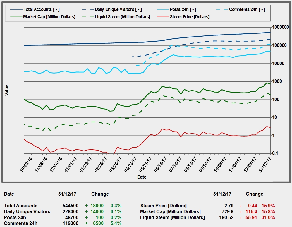
Steem Statistic Charts Week 53
Here are my weekly steem charts:
In the last week of the year, the steem price took a breather. Steemit activity levels were up slightly. Very positive is the fact that the daily unique visitors have increased by 6%.
If you have some advice to improve the statistic chart, please let me know.
----------- Comments will be voted. -----------!

You are looking for

advices, you are asking if we have advice for you, which is singular not plural. You can ask every to give youpeices of advicesee also https://www.englishforums.com/English/AdviceAdvices/jqgw/post.htm
Thank you!
My advice on this chart would be to please use a different color for the blue and cyan to make it easier to see the difference. Also a bit coin price would be interesting. Also on the Steem Price in dollars needs more detail, can you add in the 5 dollar mark in there on the axis or put one tick per dollar under 10?
Thank you. I will add a chart with the coin price with a lower scale soon.
I would maybe make another graph that only shows total accounts and daily unique visitors, because the scale is so wide on this graph, you cant really tell how much the increase is... but thats just my opinion ;)
Thank you.
Resteemed to over 7000 followers and 100% upvoted. Thank you for using my service!
Send 0.100 Steem or 0.100 Steem Dollar and the URL in the memo to use the bot.
Read here how the bot from Berlin works. News you will find under the hashtag #resteembotnews.
Please help us grow and use our link to trade #IOTA #BTC #ETH and a lot of more. https://www.binance.com/?ref=10230705
@resteem.bot
For more information, click here!!!!
Send minimum 0.010 SBD to bid for votes.
The Minnowhelper team is still looking for investors (Minimum 10 SP), if you are interested in this, read the conditions of how to invest click here!!!
ROI Calculator for Investors click here!!!
I appreciate your work on this chart. The colors are hard for me to distinguish, but I have to assume that's mostly me because I'm slightly color blind. But, the data at the bottom of the chart doesn't have a time period listed, just an ending time. I assume the time period is over the last week because of the paragraph above it, but that should probably be included in the graphic. Other than that, great work! Thank you for sharing.