I am not a graphic designer, but this is my concept of STEEM POWER symbol. What do you think?
I am programmer, not a graphic designer, nevertheless I realized that I need some graphical representation of STEEM Power, to prepare detailed guidelines and tutorials for my folks from Poland.

Here is STEEM logo, to compare:
I am preparing this in the scope of project B.O.O.S.T. - Big Organized Outing* To Steem (*from Polish clone of Reddit - Wykop, to Steem)", scheduled to start at: Jul, 20 6:00 UTC.
It would be great if someone more gifted could help me with this concept. It would be also cool to prepare something for STEEM Dolar. Maybe similar concept, but with $$$ ?
What do you think?
[EDIT] Another idea....
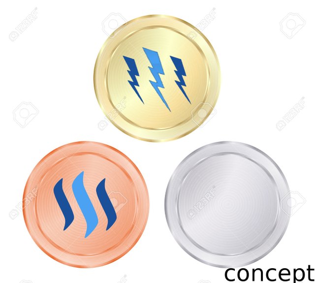
Maybe we should also correlate each symbol with color of :
- gold - of course for STEEM Power
- silver - for STEEM Dolar
- bronze - for STEEM
Not bad! I agree that each part of steem could use it's own dedicated logo.
Nice. To make it more logo like and easier to remember try to use less details and complexity in the artwork.
Have you tried flipping the lightning bolts the other way? It feels unnatural because it's mirrored (flipped).
That would be something like this:
disclaimer: still not a graphic designer :)
Thank you for the reward that was very kind of you. I didn't expect it.
I just thought that you did better job then I with graphic for STEEM Power, so you should be reworded at least as me.
BTW, I just discover how easy it is use transfers as direct message (but so private, but still direct) :)
you mean the message attached to the transfer? I discover that everyone can see your wallet, and the messages.
Yes. I think that looks a lot better.
Also, I would try it with the font for POWER the same size as STEEM. Try one with the baby blue and maybe another version using the same navy blue.
I agree.The font should be at least the same size as steem. And the graphic for the steem dollars could be something like this with a slightly thinner steem symbol instead of the dash from the regular dollar .I wish I would have seen your post earlier

I like the below better.
If you had any doubts which is better, then I think I can be proud from myself :D
This is just a concept of 2nd Token
STEEM POWER. I think that each token: STEEM, STEEM POWER, STEEM DOLLAR should be graphically distinguishable :)I think that is the worst thing I have ever seen
I think that this concept of STEEM POWER is great!
Im also making some tutorials for my friends,and people who are not really into steemit,can i use it please? :)