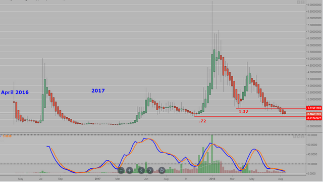
Steem chart review Aug 25th @ 05:15 PST
The weekly chart of Steem since the start shows the volitile nature of 'alt' cryptos.
It has been in a downtrend since late April of this year indicated by the red heikin ashi bars
It broke support at the 1.32 level and is descending down towards the .72 support level which was seen back in late 2017.
Stochastics are deeply oversold and will eventually break out and above 20 if the asset continues to trade. (And not go to zero)
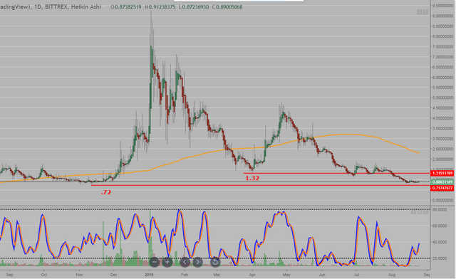
The daily chart shows how close the price is to the lower support level.
200 dma is in orange.
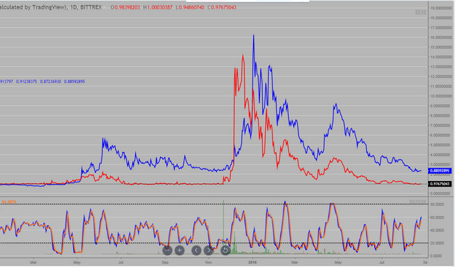
A line chart comparison of Steem in blue and SBD's in red. Will they be 1:1 again?
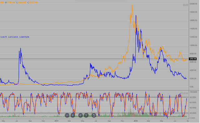
A line chart of BTC in Orange and Steem in blue. Most if not all of the 'alt' coins have shown weakness for months while BTC has been in general, a trading range...
Hello Sir, you have published an important information. You did a great job with graphics chats. It will come to our advantage.
Nice chart - just found you and following now. Let's go cryptos!
Hi, as far as this steemit blog, it's all over the place with mostly btc or steem charts or fitness / cycling related.
nice chart awesome i like it keep it up bro