My entry for sndbox thumbnail contest.
Hello y'all...
I just want to share my "state of the sandbox" design with you. I saw the contest yesterday and I felt I would definitely sign up for this.
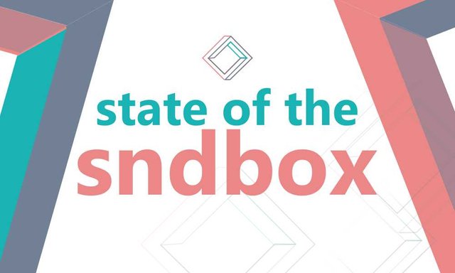
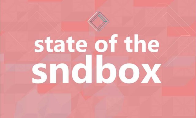
There are two designs here.
Number 1 was done using the both sides of the logo. The right and the left side of the original brand logo is represented here to give a nice visual appeal of the brand "sndbox". As consistency is the hallmark of great brands.
Number 2 was just trying a different style using colours as the tenet. A transparent 3D box pattern in the background. And also a representation of a one colour logo on the main design.
1
2
So, guys... Which one is cool to be the thumbnail design for sndbox this month.
I will appreciate your comments and feedbacks. Kindly upvote my design as well. Your upvotes will go a long way. Thank you


Nice design!! Upvoted!
Thanks @prechi
upvoted and follow do same
https://steemit.com/website/@abiolagbode/how-to-create-a-website-in-5-minutes
This is spamming! U can get flagged for this!
Hi Friends! Your good post looks to be successful in this steemit,
I post about art drawing food, Look at my post and up vote thanks, @andriannaa
resteem--bot invested in your post. Follow restssm--bot
upvoted and followed you if you like salaheldeen0 please upvoted and follow me lets help each other :)
Great design! the second I like more! there more clean lines and warm color looking more interesting
Thank you
Number 1
Nice one. I need your upvote too. Thanks dear
Base on simplicity the first shud be ok...sir
Yh..really, funny how my eyes just remain glued to both
Hi, I've upvoted you, here are some related posts I found:
I'm the AskSteem Bot [BETA] - I try to be helpful but if you don't want me click my username and hit "mute". You can also leave feedback.