"It's Summer Time!"(State of the Sndbox Competition Entry)
Hello guys! I just want to share my entry to "The State of the Sndbox Monthly Thumbnail Competition #9". And again, I want to thank @sndbox for this amazing opportunity they had given to every artist all over the world to join and participate this amazing contest to showcase the talent we have. Moving on, the inspiration of this work is the Season where most Filipinos have been waiting for! Especially to every students here, long nap! long vacation, no classes, no assignments, you're right! It's "Summer Time" here in Philippines! But before anything else, let me first share my work
Here it is!
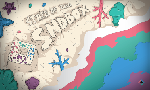
"Summer Fever"
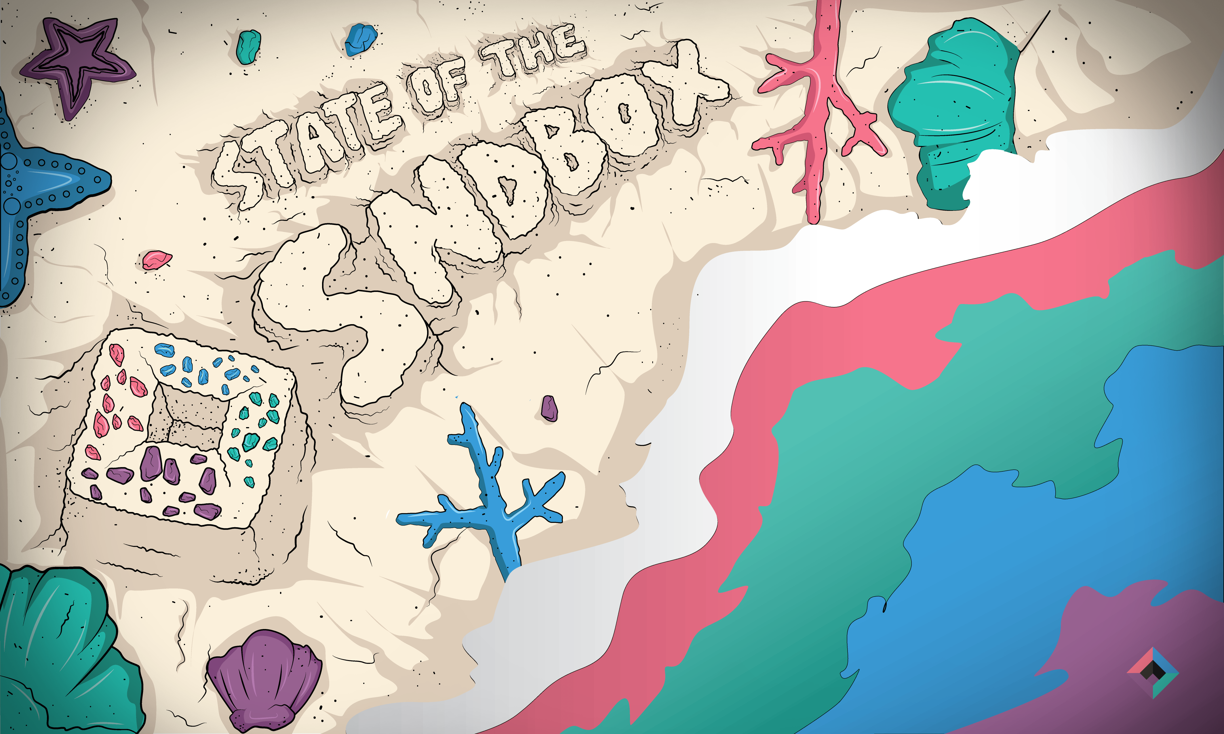

That served as a inspiration for me to in conceptualizing my work/entry, I've just tried to make it simple yet at least appealing to the eyes. I've illustrated a shoreline, above it is a work of art, a sand art which is a text, "state of the sndbox" it is required and a must because that's whats our task is all about to make a creative thumbnail for sndbox, if you haven't followed them just search @sandbox or you can just click the word "@sndbox". Along with the sand art is the elements I've illustrated to add more feels and ambiance to the shore, I've added Sea Star, oh wait,

Let's move on, I've also added Sea Shells, pebbles, corals, to complete to scenery. I did try my best to control the elements added so that I won't overdo it, and make it look to populated or what. And lastly, the color palette I've used, is of course @sndbox 's color palette which is one of the requirement. What I did with the waves is I've replaced the shades of blue (sea water) to @sndbox 's color palette, and for it looks good, I didn't expect that result. What I love about the color is very refreshing to the eye, like you can watch it all day, without getting disturbed. It give such soothing feeling and lightness to the viewer, credits to @sndbox for choosing these perfect colors to represent them.
So that's all guys! Thanks for Checking my entry, feel free to show your love and support by upvoting my entry, I'm not forcing you but I would really appreciate it, if you do. And as always here's a proof of works by showing the process.
Process
First, I've start illustrating from a paper, when I conceptualize, I always do it with a paper or scratch, so that I can easily make amendments or revisions in order for my work to be improved. You can also do that too.
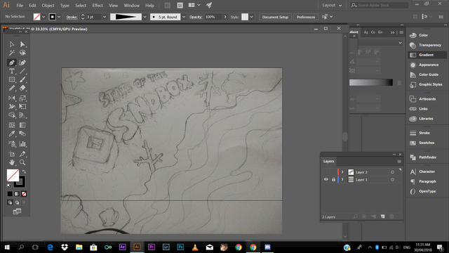
After that, I've imported to Adobe Illustrator CC, I've just took a picture of my draft on my phone, sending it via bluetooth
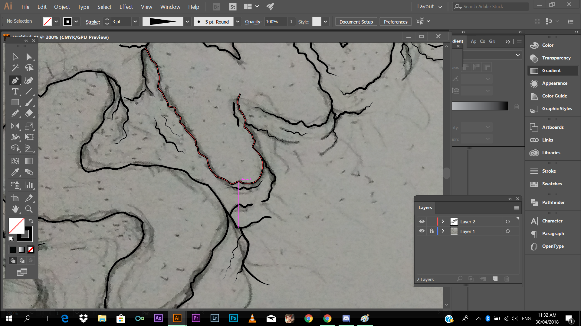
I've started tracing using pentool
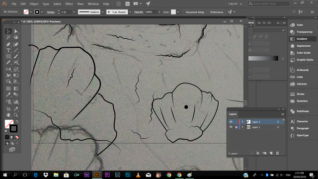
Tracing every element in the draft.
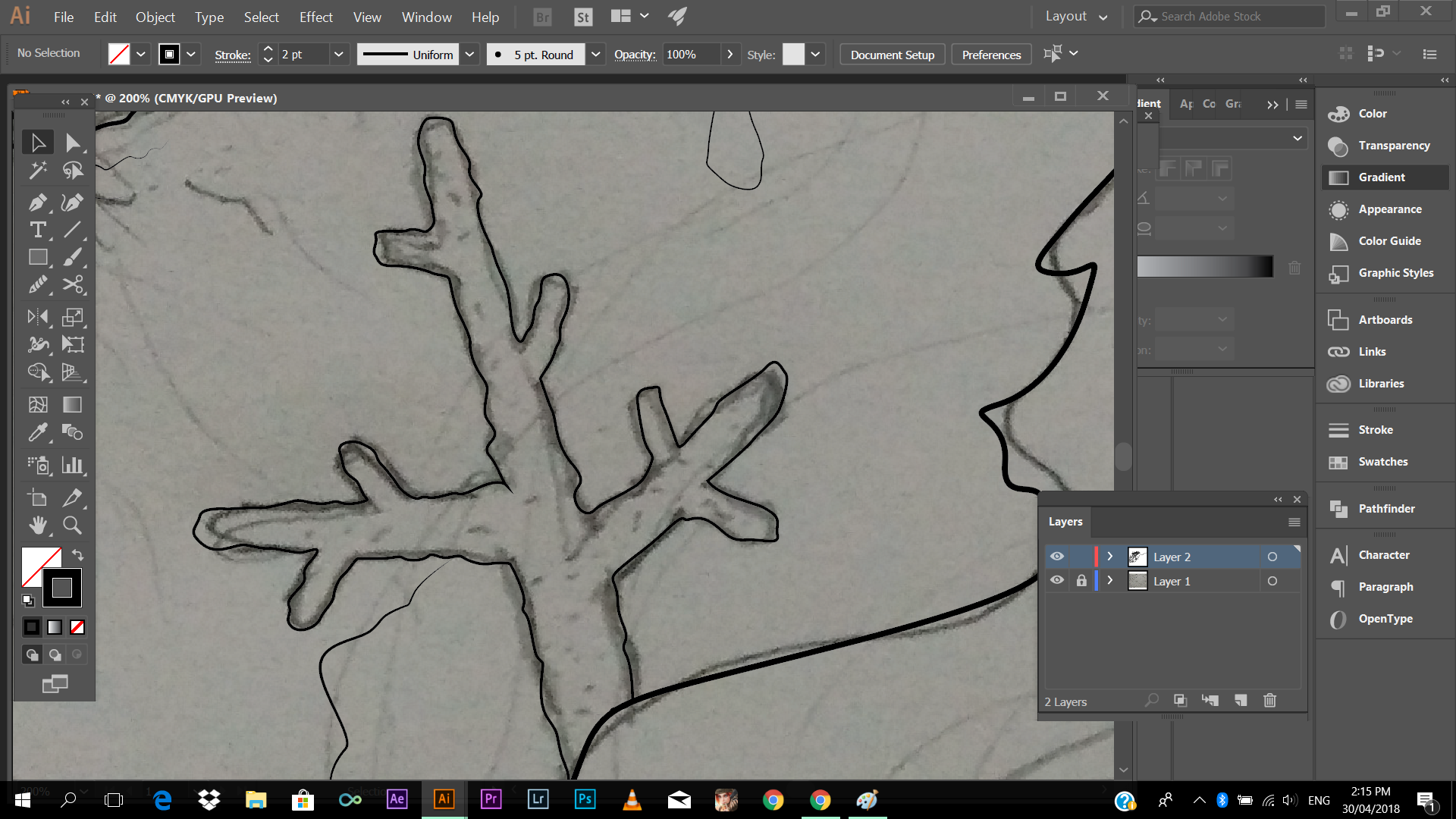
Tip: You can always, unhide the layer of your reference so that you can see your progress and for you to see what going tracing your reference. In that way, you can also be encouraged in doing your work, of course, you can slowly see the everything is coming to life.
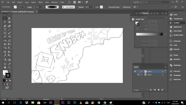
After I'm done tracing everything, I've started adding color to my work (using @sndbox color palette)
Then, I start with adding shadows (to give depth)
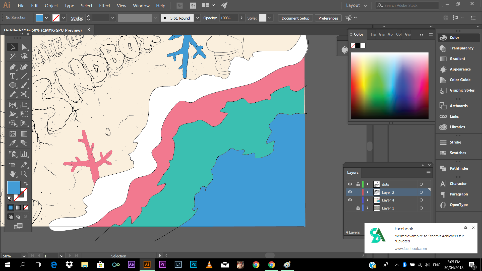
Adding shadow to every element
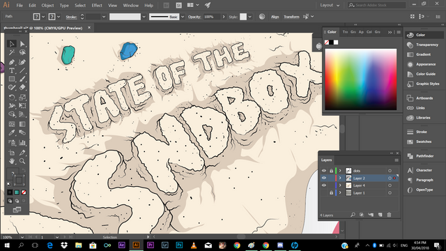
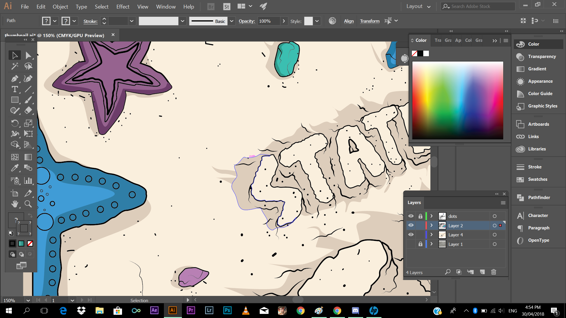
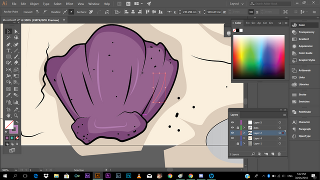
And after I'm done adding shadows, I've started adding highlights to make it more livelier
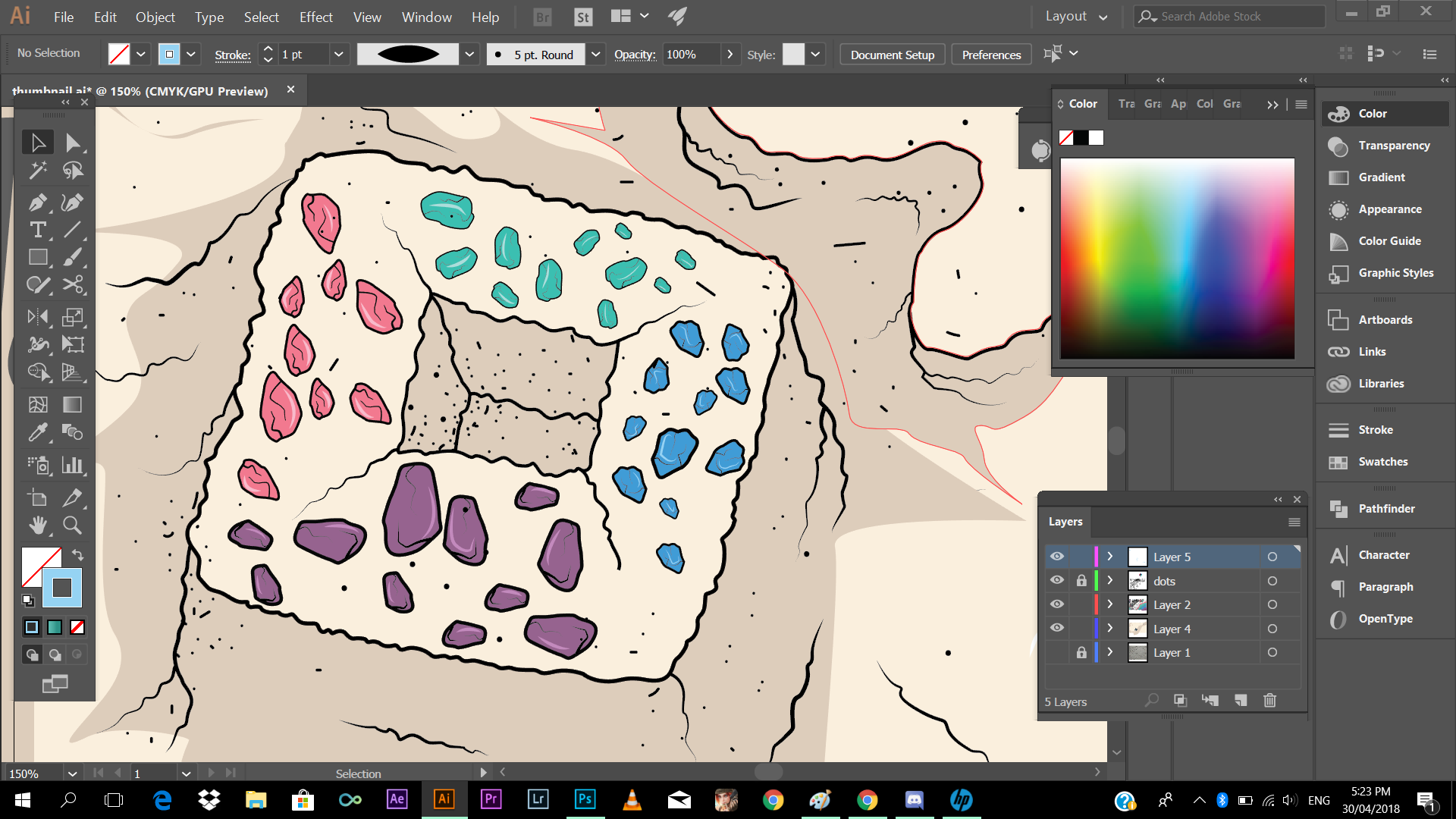
And one thing I've enjoyed in Illustrating, is adding colorful pebbles ( logo's color) to @sndbox 's logo. I don't know but, it gives me the wonderful feeling of childhood when I was kid having fond of collecting picking pebbles, segregating them to the color of their own.
And ready to save (I've forgot to make a screenshot, I've imported my unfinished work to Photoshop CC, just to add a vignette, but just a minor additions)
Thanks again guys! Have a blessed day! Steem On!
And check this awesome bloggers ✍
@mikaelasinsuat4
@dandalion
@qyugmo
@ishanvirtue
@ediah
@jgonzalez2134
@mermaidvampire
@korinkrafting
@kothy
@looserwin
@kennik
Please do support
@slothicorn
@steemph
@stellabelle
@surpassinggoogle
@steemgigs
@stateofthearts
@steemitachievers
@steemitfamilyph
@artzone

I really like the idea and the freehand drawing....good job
Thank you so much, since I don't have a graphical pen tablet, I used to do it on a paper, take a picture, import on the computer, snd trsce using mouse. 😃😃😃
You've received an upvote from @slothicorn! Click Here to Read our New Curation Policy And Updated Rules
(@ghulammujtaba)
Thank you so much @slothicorn