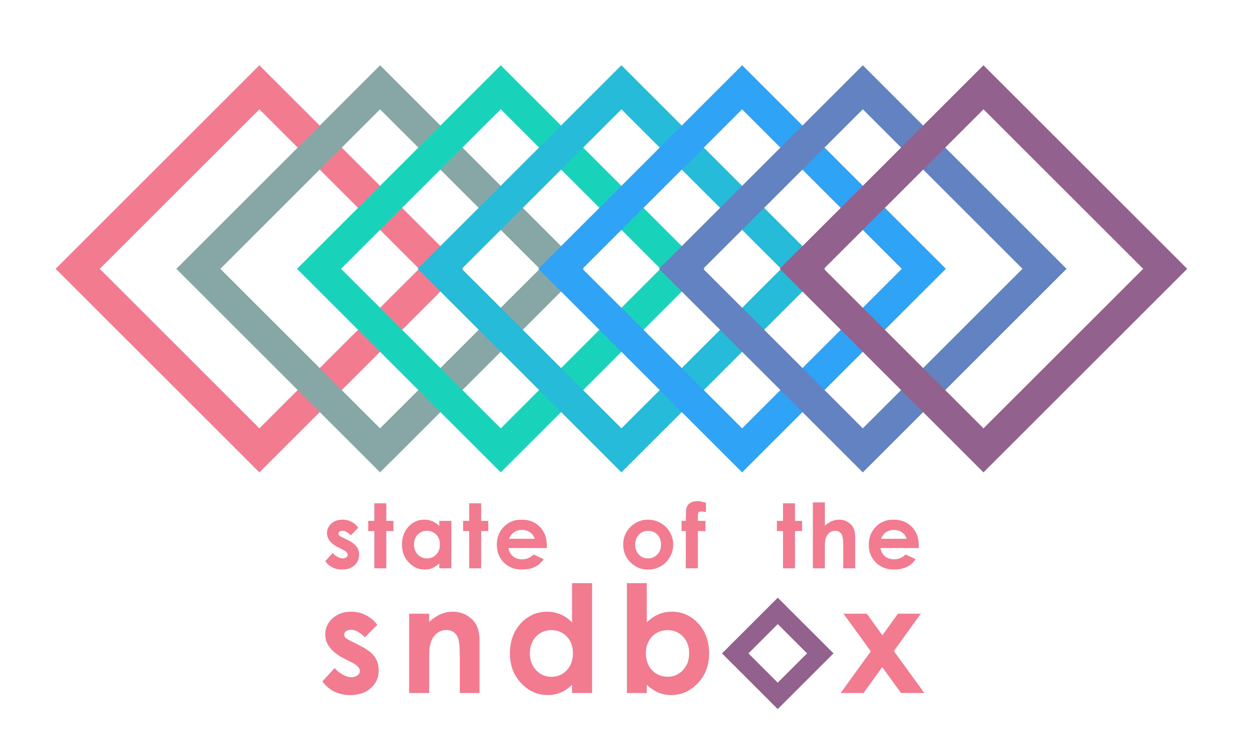
State of the Sndbox Competition Entry
Hello everyone!
Ok so not only is this my first post since I joined steemit but it's also my first competition. This competition entry is for @sndbox's The State of Sndbox thumbnail competition.
Link to their post : https://steemit.com/competition/@sndbox/the-state-of-the-sndbox-monthly-thumbnail-competition-7-usd300-upvote-prize-pool
Inspiration:
To get into the modern style mindset I referenced a quote by Mies van der Rohe: "less is more."
What can I say, I'm a fan of simplicity so with this design the concept was to go with the bare-bones and deconstruct the 3d sandbox into 2d representation with a gradation of the required color palette. Keeping it simple and to the point.
Program: Adobe Illustrator
Typeface: Century Gothic
Color palette: provided by @sndbox
Sidenote: this exercise was a fun break from my current studio project which is due in 2 weeks. I'll post my final design and process for that at the end of the month so be on the look out.
Show me some love and give me an upvote if you dig it!
Enjoy!

Welcome! Good luck!
Thanks for checking out my blog!
I dig your entry for the competition and wish you luck. I like the minimalist approach you are taking. I'm trying to learn Adobe Illustrator and I am looking forward to posting some of my work with that here too.
Thanks! Illustrator is awesome, I mainly use it for architectural graphics but would like to expand into illustrations.
hi.....I just stared here, i am based in Malta , i cook and go on adventures around Malta,....Lets support each other ..
.png)
Congratulations @alex.sanchez! You received a personal award!
Click here to view your Board
Do not miss the last post from @steemitboard:
Congratulations @alex.sanchez! You received a personal award!
You can view your badges on your Steem Board and compare to others on the Steem Ranking
Do not miss the last post from @steemitboard:
Vote for @Steemitboard as a witness to get one more award and increased upvotes!