Data Visualization In R With plotly
Hi there. In this post, I showcase some plots in R with the plotly package. I have been using this plotly cheatsheet as and their website for R as references.
Although I use ggplot2 a lot in R, I think that plotly has some good features and the plots look pretty clean for the most part.

Plots
- Scatterplot
- Line Plot
- Area Plot
- Bar Chart
- Histogram
- Box Plots
- 3D Scatterplot
To install plotly into R/RStudio use the code install.packages("plotly"). After installation, use library(plotly) to load in the package into R/RStudio.
The main function for plotting in plotly is plot_ly().
Scatterplot
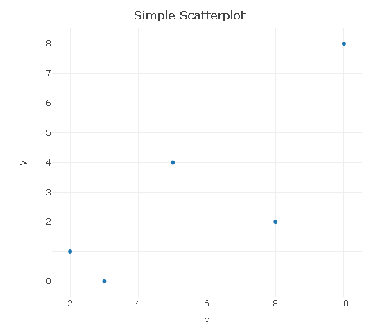
Generating a scatterplot is not too difficult. I think adding in labels and a title can be somewhat tricky as it takes time to get through some of the documentation.
# Scatter Plot

plot_ly(x = c(2, 3, 5, 8, 10), y = c(1, 0, 4, 2, 8), type = "scatter", mode = 'markers') %>%
  layout(xaxis = list(title = "\n x"),
         yaxis = list(title = "y \n"),
         title = "Simple Scatterplot \n")
Line Plot
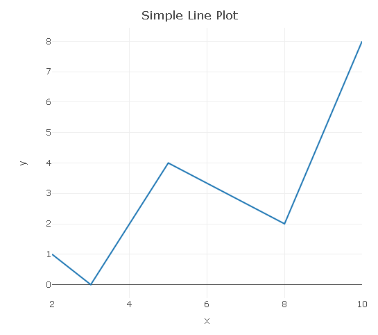
A line plot is basically a scatterplot with a line(s) going through the points.
# Line Plot:

plot_ly(x = c(2, 3, 5, 8, 10), y = c(1, 0, 4, 2, 8), type = "scatter", mode = "lines") %>%
  layout(xaxis = list(title = "\n x"),
         yaxis = list(title = "y \n"),
         title = "Simple Line Plot \n")
Area Plot
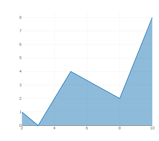
A further extension would be adding a filled area under the line (curve).
# Area Plot (Area Under A Line/Curve)

plot_ly(x = c(2, 3, 5, 8, 10), y = c(1, 0, 4, 2, 8), type = "scatter", mode = "lines",
        fill = 'tozeroy')
Bar Graph
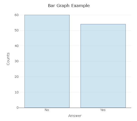
In the plotly bar graph, you need to input values for the horizontal axis and the counts in the vertical axis. I have changed the opacity to 0.5 to have the blue bars be lighter.
# Bar Chart (Fake Survey):

plot_ly(x = c("Yes", "No"), y = c(54, 60), type = "bar", opacity = 0.5,
        marker = list(color = 'rgb(158,202,225)',
        line = list(color = 'rgb(8,48,107)', width = 1.5))) %>%
  layout(xaxis = list(title = "\n Answer"),
         yaxis = list(title = "Counts \n"),
         title = "Bar Graph Example \n")
Histogram
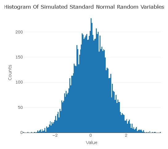
In this histogram example, I simulate/generate/sample 10000 standard normal random variables and plot the results in a histogram. The resulting histogram approximates the standard normal distribution density (bell shaped curve).
# Histogram:

norm_rv <- rnorm(n = 10000, mean = 0, sd = 1)

plot_ly(x = norm_rv, type = "histogram") %>%
  layout(xaxis = list(title = "\n Value"),
         yaxis = list(title = "Counts \n"),
         title = "Histogram Of Simulated Standard Normal Random Variables  \n")
Box Plots
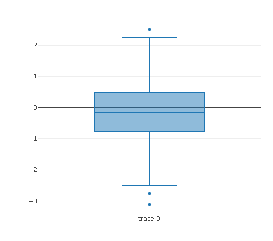
# Box Plot:

plot_ly(y = rnorm(100), type = "box")
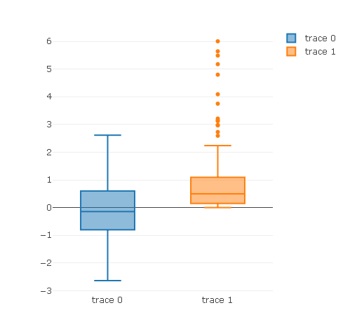
The add_trace() function allows for an additional box plot. The second box plot is for chi-squared random variables. (A chi-squared random variable is the square of a normal random variable.)
plot_ly(y = rnorm(100), type = "box") %>%
  add_trace(y = rchisq(n = 100, df = 1, ncp = 0)) # Two box plots
3D Scatterplot
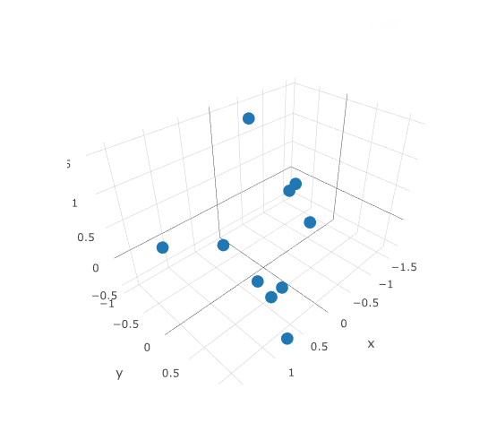
You can create three dimensional scatter plots in plotly by having the type as scatter3d and having x, y and z. In my computer and RStudio, I found it hard to play with the 3D output. The image below could be better.
# 3D Scatter Plot:

plot_ly(x = rnorm(10), y = rnorm(10), z = rnorm(10),
        type = "scatter3d",
        mode = "markers")
Edit: Fixed a few typos.
Good intro-post. I'm interested in what kind of jobs I could get to make use of the data visualisation techniques I've been learning. Are you doing this kind of stuff professionally, or just learning it for enjoyment?
Thanks!
Thank you for your comment @runtime.
For enjoyment and for employment into stats and/or data science.
I think there is good demand for data visualization skills but I can't say for sure. Data visualization can be supplemented with skills in data cleaning, data extraction and data analysis (with prediction).
i was just starting out on ploty, have not gotten the hang of it yet. great technical blogs. are you developing anything on top of steem block-chain ?
With
plotlyand other data visualization tools in R and Python, there is a lot of syntax involved and it can be confusing. I would say to start with the plotly cheatsheet link above and their documentation.Are you using R or Python?
No I am not.
please upvote to me https://steemit.com/food/@anos/ice-cream-steak-with-strawberry and follow me
@dkmathstats welcome to steemit community very nice post have a good day ahead thankyou